How do I create an outline and a drop shadow from an original font file to make two different fonts but be able to use these two fonts for an online program that my company uses for their customers to place orders. I would like for the original font file to be the inside color and the outline font with drop shadow be the 2nd color. It's really hard to describe what I need by typing it out - I hope you can understand what I am trying to do. I REALLY NEED HELP WITH THIS PROBLEM. Is there any trainiing classes available for this software?
Thanks,
mccoya
How do I create an outline and a drop shadow from an origina
-
Bhikkhu Pesala
- Top Typographer

- Posts: 9878
- Joined: Tue Oct 29, 2002 5:28 am
- Location: Seven Kings, London UK
- Contact:
To be honest, making a pair of different fonts is probably not the way to go, though making an Outline version of a font is not difficult. See Working with GlyphTransformations. Tools, Glyph transformations, and open one of the three available Outline scripts. Run that on the whole font or on selected glyphs.
The drop shadow is more difficult.
The easier method is to use a DTP program to add whatever font effects you want. Save the result as a PDF or PNG and put that online.
A picture is worth a thousand words. This is what the outline script will do to a standard font. Left before manual adjustment, right afterwards.
-
Dave Crosby
- Typographer

- Posts: 793
- Joined: Mon Feb 23, 2004 1:13 pm
- Location: Enoch, Utah
Colors
True Type Fonts only do two colors, usually black and white.
Perhaps more accurately stated: The one ink color and the page color.
I think you will need to make your Outline Font, type out your message then use some kind of drawing program to make the drop shadow portion of each individual message.
I hear "Gimp" has much improved. Irfanview is good, as are Paint.net, Corel, and PhotoShop.
You may like to look at the work of Pia Frauss:
viewtopic.php?t=416
Good luck on your projects.
Aut nunc aut nunquam
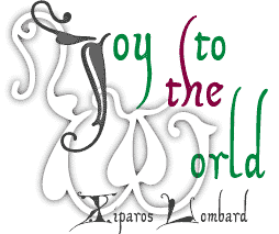
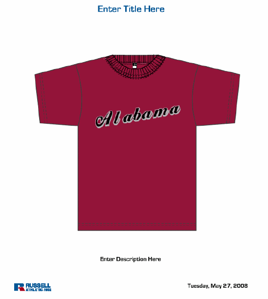
I created the drop shadow in Illustrator CS3 and coppied each letter and pasted it in FontCreator. and that worked out ok - then I deleted the drop shadow and just kept the inside of the drop shadow for the first color and the drop shadow is the 2nd color. Now I have a problem with the spacing - I have tried moving the right lines for each letter in and that did not mork - then I tried doing the kernning for each pair of letter and that did not work. Do you have any suggestions? I have got to load this font to an online program that my company uses for our customers to place orders - so they need to be able to type out what they want on their garment and have an idea of what it will look like. Like if they wanted "BE HAPPY" on a tee shirt they could use this font and view what it would look like on a tee shirt. I would attach a picture but I can't figure out how too attach one.
Thanks,
mccoya
Thanks,
mccoya
-
Bhikkhu Pesala
- Top Typographer
- Posts: 9878
- Joined: Tue Oct 29, 2002 5:28 am
- Location: Seven Kings, London UK
- Contact:
-
Bhikkhu Pesala
- Top Typographer
- Posts: 9878
- Joined: Tue Oct 29, 2002 5:28 am
- Location: Seven Kings, London UK
- Contact:
I have returned a modified version of your font.
Some glyphs like f, g, p, y need a negative left side-bearing in italic fonts. Continue to adjust the bearings until you're satisfied.
Use the Comparison Toolbar (F11) with first capital N on each side of the glyph, then lowercase o. Adjust the bearings for capital N first, then run through the font adjusting the bearings of the other glyphs.
I also ran Font, Validate to remove any validation errors.