Trajan The Movie

Please try to keep all the discussions in the main forums on topic! If you have anything else, related to fonts, you want to share, please post it here!
Post Reply
Dick Pape
Top Typographer
Top Typographer
Posts: 1360
Joined: Wed Oct 01, 2003 1:19 pm
Location: North Dallas, Texas

Trajan The Movie

Post by Dick Pape »

If you've not seen it: http://www.youtube.com/watch?v=t87QKdOJNv8
Trajan:
Image
Last edited by Dick Pape on Fri Mar 28, 2008 4:16 pm, edited 1 time in total.
William
Top Typographer
Top Typographer
Posts: 2038
Joined: Tue Sep 14, 2004 6:41 pm
Location: Worcestershire, England
Contact:

Post by William »

I had not seen the Trajan font before.

I searched for Trajan at http://www.itcfonts.com and found the following.

http://www.itcfonts.com/fonts/detail.htm?pid=201733

That page refers to Adobe and Linotype.

I found the following at Adobe, starting from the http://www.adobe.com/type web page.

http://store1.adobe.com/cfusion/store/h ... &code=1724

http://store1.adobe.com/type/browser/pdfs/1724.pdf

At Linotype, starting from the http://www.linotype.com web page I found the following.

http://www.linotype.com/1547/trajan-family.html

http://www.linotype.com/8565/trajanregular-font.html

http://www.linotype.com/47727/trajanpro ... ermap.html

William Overington

28 March 2008
William
Top Typographer
Top Typographer
Posts: 2038
Joined: Tue Sep 14, 2004 6:41 pm
Location: Worcestershire, England
Contact:

Post by William »

Well, I was wondering if I could find a photograph of the original inscription on the net and maybe try to make a font from it.

I have found the following.

http://en.wikipedia.org/wiki/Trajan%27s_Column

I note in particular the following comment in that page, wondering if that would be a major problem or something for which an adjustment could be made.
This is perhaps the most famous example of Roman square capitals, a script often used for stone monuments, and less often for manuscript writing. As it was meant to be read from below, the bottom letters are slightly smaller than the top letters, to give proper perspective.
http://en.wikipedia.org/wiki/Trajan_%28typeface%29

http://penelope.uchicago.edu/~grout/enc ... olumn.html

There is in that latter page a picture of some of the lettering. It is a jpg file named column3.jpg.

I have experimented with trying to import it into FontCreator all at once, experimenting with the threshold value used for the import. That was interesting, though I think that maybe I should try again by making pictures of individual letters using Microsoft Paint (perhaps saving as bmp files so as to avoid any losses to the image which might occur if I save to jpg again), and importing those bmp files.

William Overington

28 March 2008
Dick Pape
Top Typographer
Top Typographer
Posts: 1360
Joined: Wed Oct 01, 2003 1:19 pm
Location: North Dallas, Texas

Beating a Dying Horse

Post by Dick Pape »

Image
"This detail from the lower left corner of the inscription shows the letterforms in detail. Incised on a marble slab measuring four-and-a-half by ten feet, the lower edge is ten-and-a-half feet above the ground. This requires that the letters, themselves, vary in size, which they do by an inch, the first lines of the inscription, the ones farthest away from the viewer, being larger than those which are closer. Too, the same letter can vary in thickness and width to maintain the correct proportion between other letters. Such symmetry and balance convinced Catich that "the Trajan alphabet is the best roman letter designed in the Western world, and the one which most nearly approaches an alphabetic ideal." And, indeed, the inscription has served as the model for all subsequent Roman capital letterforms.

The lettering inscribed on the base of the column is termed scriptura monumentalis or capitalis monumentalis, a form of majuscular (capitals) used for larger architectural inscriptions. Like all capital letters in the Latin alphabet since the second century BC, it is shaded, the vertical strokes twice as thick as the horizontal ones. Here, too, the height of the letter is approximately eight and one-half to nine times the width of the vertical stroke, an ideal ratio for the letter type."
William
Top Typographer
Top Typographer
Posts: 2038
Joined: Tue Sep 14, 2004 6:41 pm
Location: Worcestershire, England
Contact:

Post by William »

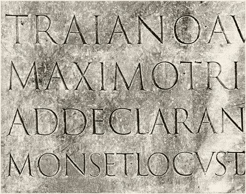
Having produced trajan_m.bmp by using copy and paste of the letter M and its surroundings from the column3.jpg image mentioned above, using the M that is the first letter of the second row in that jpg image, I had found that FontCreator made a good attempt at producing the letter M in a glyph using the Tools | Import Image... facility. I found that as I altered the threshold level that the preview varied. I found that a threshold value of 110 was, subjectively, about best, though there was a lot of blobs in the glyph.

So, I tried a different approach. I remembered that FontCreator provides a facility to have a background image. I do not remember having used it before. I started a new font and drew by manually drawing a contour, an M, in the M cell, by drawing directly into the computer using trajan_m.bmp as the background to act as a guide for the drawing activity. I used monochrome setting (which was the setting already there) in default colour at scale 1600.00.

Later I drew by manually drawing a contour, an M, in the m cell, by drawing directly into the computer using trajan_m.bmp as the background to act as a guide for the drawing activity. I unchecked the monochrome setting and drew at scale 2400.00.

Later, I made the advance width of both M and m to be 2048 font units.

I named the font TRAIAN Experiment 001 in TRAEX001.TTF, using the TRAIAN spelling, as on the column, to differentiate the name of the font from the name of the existing font.

There is one problem at validation, which could be corrected automatically by FontCreator, though I left it in so as to conserve (just in the 001 font) the original artwork as I drew it.

This is just some experimental tests, yet I thought that some readers might like to have a look at the results so I have uploaded the font to the web.

http://www.users.globalnet.co.uk/~ngo/TRAEX001.TTF

William Overington

31 March 2008
William
Top Typographer
Top Typographer
Posts: 2038
Joined: Tue Sep 14, 2004 6:41 pm
Location: Worcestershire, England
Contact:

Post by William »

Here is some transcript.

----

Monday 31 March 2008

09:58 am

Earlier this morning I produced the TRAEX001.TTF font.

Use TRAIAN Experiment 002 as the working font.

Delete the contour from the M glyph.

Try to redo the M, using trajan_m.bmp by using the monochrome checkbox unchecked and adjusting the scale and x and y positions to position the background image of the M from the baseline to the CapHeight line.

X position 0
Y position -406
scale 2400.00

Set the advance width to 2048 font units.

Copy the glyph to m.

Try making trajan_t.bmp using copy and paste of the first letter of the top row of column3.jpg.

Try to add a T glyph into the font.

X position 0
Y position -64
scale 2400.00

Set the advance width to 1536 font units.

Copy the glyph to t.

Try producing trajan_c.bmp from the C from the third row down.

Try to add a C glyph into the font.

X position 0
Y position -124
scale 2632.00

Set the advance width to 1536 font units.

Copy the glyph to c.

Try producing trajan_l.bmp from the L in the bottom row, as it appears to have a clearer surviving lower serif than the L in the third row.

Try to add a L glyph into the font.

X position 0
Y position -189
scale 3100.00

Set the advance width to 1024 font units.

Copy the glyph to lowercase l.

Test the font.

11:07 am.

----

The font is available on the web.

http://www.users.globalnet.co.uk/~ngo/TRAEX002.TTF

William Overington

31 March 2008
William
Top Typographer
Top Typographer
Posts: 2038
Joined: Tue Sep 14, 2004 6:41 pm
Location: Worcestershire, England
Contact:

An example of the Trajan font in use

Post by William »

Earlier this morning I was looking at a pdf about digital broadcasting.

It is issue 28 of DVB-Scene and is available from the following web page.

http://www.dvb.org/news_events/dvbscene_magazine/

Being interested in typography I used File Properties... Fonts within Adobe Reader in order to display the list of fonts used in the publication.

I noticed that each font name has a logo next to it. Some have TT, some have the letter a in red and one has a letter F.

I looked down the list of fonts, which is alphabetically arranged, and the last entry is TrajanPro-Regular.

As many (though not all) of the other fonts are fonts from families such as Arial and Helvetica, finding Trajan in the list seemed an interesting item.

So I tried to find the Trajan!

I found it and viewed it at various magnifications, including the 200% and 400% values offered. I then found that Adobe Reader would accept a custom magnification of 300% and that seems to me to produce an excellent display.

William Overington

2 December 2008
Post Reply