Page 1 of 1
Working on a new font
Posted: Thu Jan 28, 2010 3:24 pm
by Lesley Prince
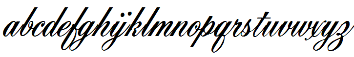
I am working on a new font called Erasmus for use in historically linked designs. So far I have finished the preliminary elements for the lowercase letters, but I'm not sure if it works. I have attached a jpeg showing the letters and highlighting the aspects that are bothering me. If anyone feels able and willing to do so, I would be very grateful for any feedback, critique and comments.
Best wishes
Lesley Prince
Re: Working on a new font
Posted: Thu Jan 28, 2010 5:56 pm
by Dave Crosby
Hi Lesley,
It looks good to me, but remember Perfect is a matter of opinion, and some people will never accept someone else's ideas.
Try using Comparison (Open glyph editing window, F11 or select View / Toolbars / Comparison) and scroll through the characters to see where Bearings or points need to be moved to suit YOU.
Re: Working on a new font
Posted: Thu Jan 28, 2010 7:03 pm
by Jowaco
This looks like a very interesting, lovely typeface in the making. Look at Pia Frauss's fonts. Use the Search function and her fonts were shown, and could be downloaded from, the Gallery Forum once upon a time, but I haven't looked recently.
Are you planning to join up the glyphs in the text ensuing (i.e. is it a cursive font)?
Joe.
Re: Working on a new font
Posted: Thu Jan 28, 2010 7:08 pm
by Bhikkhu Pesala
I think it would work better if fully joined up like Ancestry script:
- Joined Ancestry Script.png (6.95 KiB) Viewed 7271 times
However, there is no rule that says it must be joined:

- Not Joined Embassy Script BT.png (6.88 KiB) Viewed 7270 times
See Dave's tutorial on
Joining Flowing Scripts
Some nice archaic scripts by
Pia Frauss can be found on her site.