I decided to try this technique so as hopefully to produce an additional font.
I made a copy of my working font CHRON026.TTF Chronicle Text 026 (which is the font from which I produced CHRONTXT.TTF Chronicle Text version 0.26 which is available on the web, that production by deleting the unused glyph positions still left in from the original Font Creator "new" file and then recalculating the ranges in Format | Settings ... | Ranges). The copy is CHROL026.TTF Chronicle Text Lozenge 026. Readers wishing to try the experiment practically can use a copy of Chronicle Text version 0.26 if they so wish.
Details of Chronicle Text are in the Gallery forum.
viewtopic.php?t=679
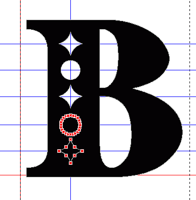
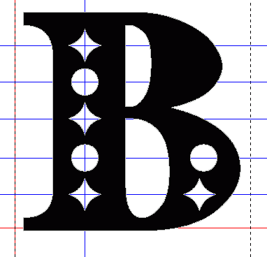
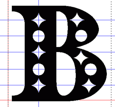
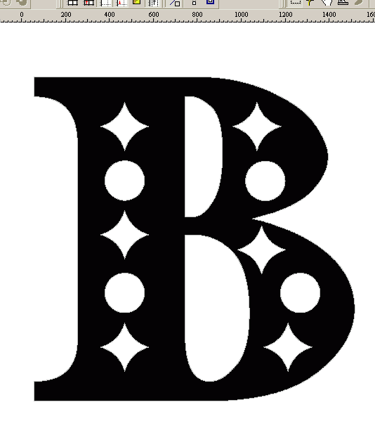
Firstly I produced a counterclockwise countour within the glyph for e with the following four on-curve points.
256, 1024
152, 768
256, 512
360, 768
This contour I then copied onto the clipboard and then went through the a..z and A..Z alphabets pasting that contour onto the glyph in those glyphs where it fitted within the clockwise contour or did so if it were moved horizontally 256n font units where n is an integer. This was most of the characters, all except S, V, X, Y, Z and s, v, x, z.
I then added an extra, unmapped, glyph with the above contour and a clockwise contour with the following points.
256, 1128
464, 768
256, 408
48, 768
Another clockwise contour was added to that glyph so that the above contours would not be shifted to the left when saving the font.
0, 0
0, 256
256, 256
256, 0
I then produced the S, V, X, Y, Z and s, v, x, z for the font by applying the clockwise lozenge and the using Select All and Edit | Join Contours | Union and then adding on the counterclockwise lozenge so that it fitted within the clockwise lozenge. Both lozenges were sometimes moved the same distance horizontally, though always 256n font units horizontally, never vertically.
This has produced a font which, in my own opinion, is rather stylish, almost like ice crystals rather than snow, which I am hoping to publish.
Thank you for a very interesting and useful idea for a way to produce an additional font. For this particular application of the idea I used only one counterclockwise contour and only moved it horizontally, so all of the lozenges are horizontally level within a line of text.
I am thinking about how to apply the idea to some of my other fonts. I am already thinking of a thin vertical line 80 font units wide with rounded ends for Quest text.
William Overington