If your font lacks a Euro symbol, the Complete Composites feature can help you to make one.
• Use insert Character and insert the Euro Symbol (8364) from the Unicode block, Currency Symbols.
• Right-click on the empty glyph and select "Complete Composites" or click the toolbar icon. Decompose the composite to make the glyph simple.
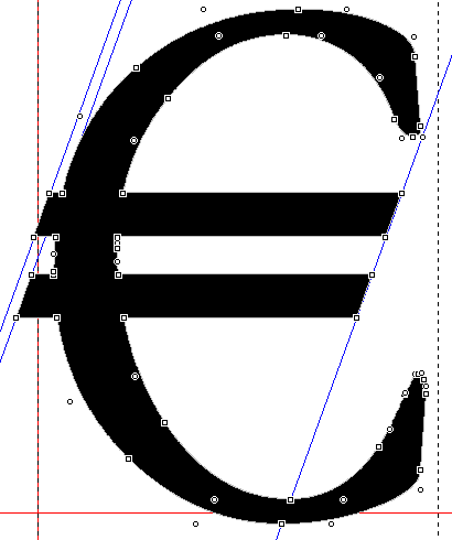
• Select the two nodes as shown in the image below and press "g" to create a diagonal guideline between the two.
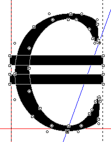
• Drag the nodes on the cross bars horizontally using shift to restrain vertical movement until they snap to the guideline.
• Copy the guideline by holding down control and dragging it to the other end of the bar.
• Drag the nodes to snap to the guidelines.
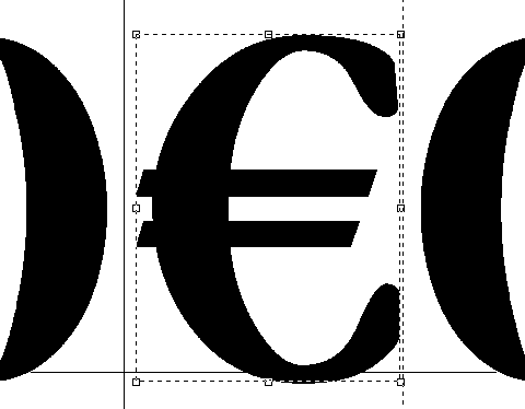
• Switch to contour mode, select all three contours, and use "Get Union of Contours" to combine them into one.
Your finished Euro Symbol should look something like this: