[CLOSED] Xor of two contours.

Post your bug reports here. Include information that helps us to understand and reproduce the bug.
Post Reply
Julian Griffin
Posts: 14
Joined: Thu Jul 02, 2015 10:52 am

[CLOSED] Xor of two contours.

Post by Julian Griffin »

Hello,

   If I have two contours that overlay, they are Xor'ed at the overlap. Meaning that where they overlap is white.

   But this is only true for point sizes less than 65. For point sizes 65 and above the contours render correctly.

At point size 64:
Clipped from the Test Font (F5) window
IP 64.PNG (1.3 KiB) Viewed 10373 times
But at point size 65:
Clipped from the Test Font (F5) window
IP 65.PNG (746 Bytes) Viewed 10373 times
This is the glyph as it appears in the glyph editing window:
Clipped from the Edit Glyph window
IP Overlap.PNG (14.37 KiB) Viewed 10373 times

   I first noticed this when I exported a font and tried it in a document. What was in the Test Font window (F5) was not the same as the exported font. I put this down to improvements to FC9. But I usually have the Test Font (F5) set to 72 point. On creating the logo attached, I changed the point size of Test Font (F5) down in incroments, I found the at 65 point it rendered correctly, but below this the contours rendered as if Xor'ed together; that is, where contours meet they cancel each other out.

   The Xor'ing can also be seem on the right two contours of IP 64.PNG, but as the overlap is small it is harder to see.
Clipped from the Test Font (F5) window that had been magnified
IP 64 Magnified.PNG (6.94 KiB) Viewed 10373 times
Regards Julian.
Erwin Denissen
Moderator
Moderator
Posts: 11158
Joined: Fri Oct 04, 2002 12:41 am
Location: Bilthoven, The Netherlands
Contact:

Re: Xor of two contours.

Post by Erwin Denissen »

Julian Griffin wrote:If I have two contours that overlay, they are Xor'ed at the overlap. Meaning that where they overlap is white.
I don't know how the Windows rasterizer works internally, but the OpenType specification clearly states contours that need to be filled black must have a clockwise direction. If we want to make a white area inside an existing contour we must make the direction of the new contour counter clockwise.

Contour direction is determined by seeing in which direction the point index values increase or decrease. Contour direction is from the smaller point index to the larger. The general rule is that the contour direction should be such that "black is on the right". Using the glyph "O" as an example, the outer contour should travel clockwise, and the inner contour counter clockwise.

Overlapping contours is not recommended, but if it is needed then make sure the contours have the same direction.

Several well known fonts do have composite glyphs which do have overlapping composite glyph members.
Erwin Denissen
High-Logic
Proven Font Technology
Julian Griffin
Posts: 14
Joined: Thu Jul 02, 2015 10:52 am

Re: Xor of two contours.

Post by Julian Griffin »

Thank you Erwin for your quick response,

   I think I understand Clockwise and Anticlockwise. The trouble comes when Clockwise contours overlap but are not fully enclosed. And even then it is only a problem if the point size is 64 or below. I have tried this in MS Word, and the same is true, but the point size break is 40 point and below.

   Let me try to show the problem in a better way.

I will create a "Plus" symbol "+".
If I create 2 contours, both Clockwise:
IP Two Contours Apart.PNG
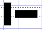
IP Two Contours Apart.PNG (978 Bytes) Viewed 10361 times
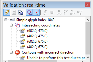
The Real-time Verification shows that both contours are in the Clockwise direction; there are no errors.
IP Validation.PNG
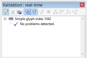
IP Validation.PNG (6.49 KiB) Viewed 10361 times
Then I overlap them and keep both contours Clockwise:
IP Two Contours Overlap.PNG
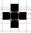
IP Two Contours Overlap.PNG (794 Bytes) Viewed 10361 times
Which is what I want "+".

If I make the horizontal contour Anticlockwise, I get this:
IP Two Contours Overlap 1 Clockwise 1 Anticlockwise.PNG
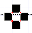
IP Two Contours Overlap 1 Clockwise 1 Anticlockwise.PNG (806 Bytes) Viewed 10361 times
Which is not what I want.

Interestingly, when the contours overlap, the Real-time Validation reports a Direction Error. Meaning that whatever the direction of the horizontal contour, when I overlaps the vertical contour the direction is wrong.
Both contours are Clockwise
IP Two Contours Overlap Verify Both Clockwise.PNG (10.64 KiB) Viewed 10361 times
Vertical contour is Clockwise, horizontal contour is Anticlockwise
IP Two Contours Overlap Verify 1 Clockwise 1 Anticlockwise.PNG (10.82 KiB) Viewed 10361 times
   As I wish for a 'Plus' sign I want both contours to be Clockwise.

   But the real point of this bug report is that the Xor'ing is point-size related. At one point size the contours are Xor'ed, at another point size they are not. At point 64 and below they are Xor'ed, at point size 65 and above they are not. And it is even worse than that, in FC9 it is at point size 64/65, In MS Word 2007 it is 40/41.
Point size 65 and above.
IP Plus 65.PNG (268 Bytes) Viewed 10361 times
Point size 64 and below.
IP Plus 64.PNG (298 Bytes) Viewed 10361 times
   During development, I like to keep the contours separate as this means that the Bold Transform Wizard produces fewer plaited nodes.

   If one contour is fully enclosed in another contour, the Clockwise / Anticlockwise works perfectly. The problem is if one contour is not fully enclosed by the other. When the contours overlap, FC9 reports a direction violation error whatever the direction of the contour, and at large point sizes the contours are rendered correctly, but at smaller point sizes they are Xor'ed. And it is application dependent where the point size break occurs.

I am on Windows 8.1 using FC9 and MS Word 2007.

Regards Julian
Erwin Denissen
Moderator
Moderator
Posts: 11158
Joined: Fri Oct 04, 2002 12:41 am
Location: Bilthoven, The Netherlands
Contact:

Re: Xor of two contours.

Post by Erwin Denissen »

The Font Test dialog is within FontCreator uses common Window controls, and thus use the Windows rasterizer. Same goes with Word, as it is also from Microsoft. I don't know why one breaks with 64, but both are not FontCreator related issues.

Best you can do is to join the contours (merge).
During development, I like to keep the contours separate as this means that the Bold Transform Wizard produces fewer plaited nodes.
For a future release it might help if we add a "fix intersecting contours" feature on export.
Erwin Denissen
High-Logic
Proven Font Technology
MikeW
Posts: 625
Joined: Mon May 20, 2013 2:51 pm

Re: Xor of two contours.

Post by MikeW »

I'm using Windows 8.1 64-bit and this doesn't happen to me. Neither in FC nor Word 2010.
capture-003481.png
capture-003481.png (7.1 KiB) Viewed 10358 times
Erwin Denissen
Moderator
Moderator
Posts: 11158
Joined: Fri Oct 04, 2002 12:41 am
Location: Bilthoven, The Netherlands
Contact:

Re: Xor of two contours.

Post by Erwin Denissen »

Julian Griffin wrote:Interestingly, when the contours overlap, the Real-time Validation reports a Direction Error. Meaning that whatever the direction of the horizontal contour, when I overlaps the vertical contour the direction is wrong.
It just says it can't determine such problem due to other problems detected earlier.
Erwin Denissen
High-Logic
Proven Font Technology
Julian Griffin
Posts: 14
Joined: Thu Jul 02, 2015 10:52 am

Re: Xor of two contours.

Post by Julian Griffin »

Hi, Thank you for your responses.

   I have just tried Windows Notepad and it exhibits the same problem as I get in FC9 and MS Word. But the break is at 64/65 point; just as in FC9.

   So this would suggest that the problem is in the Windows rasteriser. Either in the interaction of Windows rasteriser and the data written to the font file by FC9, or the interaction of Windows rasteriser and TrueType &/or OpenType file format. It may be in the font smoothing technology in use on a particular machine, because other glyphs (ones with fine detail) change how they are rendered at the 64/65 point mark.

   MikeW, if I could imposes, would you run your test again at other point sizes, just to see if your's is correct all the way down to small point sizes.

   I too am on Windows 8.1 64 bit.

   I get the same effect with TextMaker.

   So it would seem to be Windows at fault. But two overlapping Clockwise contours seems to be a legitimate construct in TrueType & OpenType. By the time the font is rasterised it is out of FC's hands. But unless every single other font created on every other font editing application merges all contours prior to writing the installable font file, this effect should be commonly evident. As it is not, it suggests that there is something in the data of fonts created in other font editors that may not be written or is written in FC9.

   "Fix intersecting contours" or "Merge intersecting contours" on export and Test Font, seems a good way forward.

Thank you both for your patience Julian. :)
MikeW
Posts: 625
Joined: Mon May 20, 2013 2:51 pm

Re: Xor of two contours.

Post by MikeW »

Julian Griffin wrote:...MikeW, if I could imposes, would you run your test again at other point sizes, just to see if your's is correct all the way down to small point sizes.
Yep, this is in Word at point sizes ranging from 10 to 72. This is the same display no matter what application I use (including FC).
capture-003482.png
capture-003482.png (14.15 KiB) Viewed 10347 times
Julian Griffin wrote:Thank you both for your patience Julian. :)
Absolutely no worries.

This issue you are having is one reason why software developers, no matter if they are Microsoft down to the lowliest shareware developer, have so much fun making Windows applications. There is a near endless combination of hardware and software in a particular computer that it is mind boggling.

My personal opinion as regards the issue you are facing is that it could be video drivers. First thing I would do is to go to the video card maker's site and check if there are new drivers.
Julian Griffin
Posts: 14
Joined: Thu Jul 02, 2015 10:52 am

Re: Xor of two contours.

Post by Julian Griffin »

Hello MikeW,

   The video driver did indeed update, but to no avail.

   I then updated every driver listed in the Device Manager, and then I run a WIndows Update. And again some video hardware was updated. But again to no avail.

If anyone has a suggestion let me know and I'll try it out.

Until we post again, Julian :?
Erwin Denissen
Moderator
Moderator
Posts: 11158
Joined: Fri Oct 04, 2002 12:41 am
Location: Bilthoven, The Netherlands
Contact:

Re: Xor of two contours.

Post by Erwin Denissen »

Do send me the font project file and I'll test it on my system.
Erwin Denissen
High-Logic
Proven Font Technology
PJMiller
Top Typographer
Top Typographer
Posts: 977
Joined: Tue Jun 16, 2015 8:12 pm
Location: Sheffield, South Yorkshire
Contact:

Re: Xor of two contours.

Post by PJMiller »

I do not experience this problem, I am using Windows 7, 64 bit. However I tested a font created by Font Creator on a Windows XP machine at work and it did exhibit the problem.

However this should not be an issue, for a simple glyph you should not overlap contours, if you are going to overlap contours you should make them into a union. For a composite glyph it is legitimate to overlap contours from different components of the composite.

Hope this helps.
Julian Griffin
Posts: 14
Joined: Thu Jul 02, 2015 10:52 am

Re: Xor of two contours.

Post by Julian Griffin »

Hello Erwin,

   My font is attached. It is still underdevelopment.

   There are two glyphs that show this effect, U+E010 and U+E741.

   And just to make sure it was not because I am using the Private Use area, I have added an overlapping Square and Circle to the Double Quote glyph U+0022, ", Shift+2.

   1) Open the font
   2) Test font (F5)
   3) Type a "
   4) Change the font size incrementally from 12 to 144

   At some point you should see a Square & Circle with a hole become a fully black glyph.
Point size 64.PNG
Point size 64.PNG (2.77 KiB) Viewed 10317 times
Point size 65.PNG
Point size 65.PNG (1.71 KiB) Viewed 10317 times
NOTE: The fourth glyph in the screen shots is U+2219. At point 64 it is grey [the effect I wanted]. But at point size 65 it looks like radiating lines. It is in fact a set of concentric circles.

   I also changed all the setting of WIndows Clear Type, but this had no effect on the result either.

Regards Julian
TPA No Custom Names WiP.fcp
(163.83 KiB) Downloaded 326 times
MikeW
Posts: 625
Joined: Mon May 20, 2013 2:51 pm

Re: Xor of two contours.

Post by MikeW »

I don't have time tonight to try and figure this out, it does happen in your project file. However, if I copy offending glyphs to a new file, or into one of my projects, it doesn't happen.

Mike
Erwin Denissen
Moderator
Moderator
Posts: 11158
Joined: Fri Oct 04, 2002 12:41 am
Location: Bilthoven, The Netherlands
Contact:

Re: Xor of two contours.

Post by Erwin Denissen »

I didn't see any additional contours with the " sign, but I was able to test U+E010 and can confirm this odd behavior.

Within the font project you have set the export settings to CFF outline format. While replying to this topic I assumed you where generating a TrueType based OpenType font.

This post at typedrawers discusses this as well, but no solution either, except for making sure contours don't overlap:
http://typedrawers.com/discussion/517/w ... g-contours

Better avoid overlapping contours, but if you need them you might be better off with TrueType based outlines.
Erwin Denissen
High-Logic
Proven Font Technology
Alfred
Top Typographer
Top Typographer
Posts: 1030
Joined: Thu Apr 18, 2013 8:08 am

Re: Xor of two contours.

Post by Alfred »

Erwin Denissen wrote:This post at typedrawers discusses this as well, but no solution either, except for making sure contours don't overlap:
http://typedrawers.com/discussion/517/w ... g-contours

Better avoid overlapping contours, but if you need them you might be better off with TrueType based outlines.
I've just read this in the submission guidelines at MyFonts:
MyFonts wrote:All overlaps between glyph parts must be removed from font files (you can keep them in your private work files).
FC14 Pro (Help) + MT11.0 Pro (Help) • Windows 10
Post Reply