William wrote:sevry7 wrote:
What remains? In my case, a cell is needed for the stand-off long S ...
I have not seen the term "stand-off long S" before.
Wide long-S. The small long-S H would use a stand-off long-S. A small long-S E would not. That's all. In other words, one uses a different long-S, depending, instead of specifying composite-glyphs/cells for each possible ligature.
William wrote:
With an OpenType font, in those parts where glyph substitution is used, the glyph does not need to be mapped to a Unicode code point as the glyph is selected using the glyph substitution rules which a font designer has added into the font.
Again, I would assume it's a table. That is, if "CT" is found, then the Unicode CT cell is associated with it in the table and that it what is displayed when the text is 'flowed'. If a small "SS" were found, the table would point to the proper ligature. And in my case if small "SH" were found, it would point to two letters/glyphs, one for small wide long-S, and one for the small H. Of course, as I have seen alternate forms for "SS", I don't know how alternates would be triggered (perhaps by a tag juxataposed with the letter if one is using HMTL?).
Short of all that, when I said 'hardcoded', I meant that all the Unicode callouts are specified right in the HTML formatted text. That means the text can't be searched, for all the embedded special characters. In my example, I also have an English translation that doesn't use ligatures. But for some of the still standard ligatures, I would rather than it did.
Instead, as a workaround or hack, I use a series of regular expressions (regexp, or regex) to filter the HTML formatted text to remove all of the hardcoded ligatures, placing the result in a new page/window so that it might be searched. So in the example I showed, previously, the filtered resulted would show "CT" instead of the "CT" ligature.
But again, I'd just as soon that the filtered result, itself, retain a few ligatures because these simply look better. With open type extensions this would be possible. Without it, even a few hardcoded ligatures would make the document unsearchable, unless the search phrase itself included the Unicode codes.
William wrote:
because all glyphs in a font have a glyph number yet all glyphs in a font need not be mapped to a Unicode code point.
The 'character' is the one thing, and its mapping particularly to a Unicode value is another. I didn't mean to be confusing, if I was, previously.
William wrote:
What I was trying to suggest is that if someone is making a TrueType font with ligature glyphs in the Private Use Area, because he or she cannot, or does not in some situation, produce OpenType fonts then the TrueType font could contain notes, in some format which is both human readable and machine understandable, in the Description part of the TrueType font, so that at some later stage the font could, in principle, be converted to an OpenType font using an automated method.
In other words, just explain the idiosyncratic mapping, as a sort of essay embedded in the font, so that conversion to some future standard, as yet unknown, might be made easier? Wouldn't that information be self-evident to someone using a program like Font Creator?
William wrote:
Chrontxm
You've made changes. What do you think of the extra 'FBxx' glyphs suggested previously. Those are some very common ligatures.
If one could take those off the table, it leaves, as suggested before:
small long-S F L (E793)
small long-S F F (don't know if this is needed)
small F long-S L
small F double long-S
small double long-S T (E75C)
small I T
small A, E, I, O, U with script S (italic font)
You include, in addition
small double long-F T (EECE)
But then you have a requirement for the others, as well.
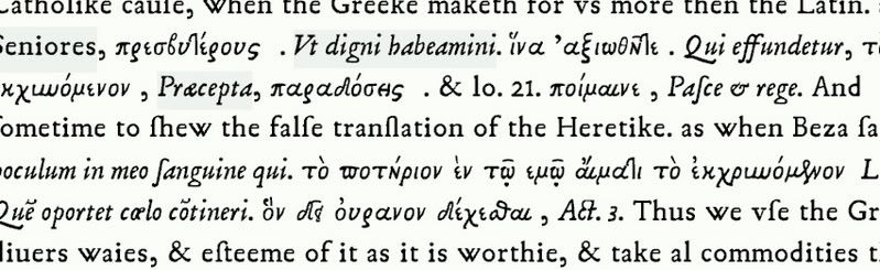
What about (you can see the 'script' S in the word, Catechumenus, in the previous example - and IT was suggested by the other previous example in the thread):
EEE0 small long-S F L (E793)
EEF1 small F long-S L
EEF2 small F double long-S
EEF3 small double long-S T (E75C)
EEF4 small double long-F T (EECE)
EEF5 small I T
EEF6 small A small script S (italic font)
EEF7 small E small script S (italic font)
EEF8 small I small script S (italic font)
EEF9 small O small script S (italic font)
EEFA small U small script S (italic font)
I mentioned that there are alternatives, as often found in Greek ligatures and abbreviations. Perhaps alternatives would not merit a Unicode composite, but would simply be an alternative font, or just the bold version of the font, etc. So instead of worrying about an alternate long-S, one just has the long-S, and that's it, and no A script small S, etc, either (though I think this latter might benefit from having it specified in Unicode)?
I could give an example, as well, of some of the greek abbreviations and ligatures I selected, from among MANY, which I placed in 3A5x, 3A8x, and 501x:
As I mentioned in another thread, the grayscale works very well, even in small size fonts. However, it does require that Font Smoothing be enabled in Windows. If it isn't, the font looks awful. I wouldn't mind having the option to hint in Font Creator. It's been suggested, before.
