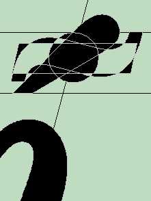
While editing an Open Type font to add some characters for my own use, I noticed these anchor points on some accents, such as this combining caron illustrated below:
The contour has only one point. I managed to create such a contour by drawing a triangular contour, then deleting two of the nodes. Surprisingly, the contour doesn't disappear. Perhaps this would be useful for positioning diacritics precisely. Here, I added a contour to the diaeresis accent, using the distribute horizontally align tool to centre the contour between the dots:
Anchor Points
-
Bhikkhu Pesala
- Top Typographer

- Posts: 9878
- Joined: Tue Oct 29, 2002 5:28 am
- Location: Seven Kings, London UK
- Contact:
-
Dave Crosby
- Typographer

- Posts: 793
- Joined: Mon Feb 23, 2004 1:13 pm
- Location: Enoch, Utah
-
Myrna Larson
- Posts: 30
- Joined: Sat Dec 09, 2006 4:03 am
- Location: Madison, WI, US
I know I must be missing something here, but I just opened a diaeresis mark in the edit window, drew a short bar contour below it, then selected all 3 contours and clicked on Align/Distribute Horizontal. This centered the bar between the two dots.
I didn't have any 1-point contour. Why do you need one? Can you explain further? Where is your 1-point contour? On the top of the bar? Which contours did you select before you did the align?
I didn't have any 1-point contour. Why do you need one? Can you explain further? Where is your 1-point contour? On the top of the bar? Which contours did you select before you did the align?
-
Bhikkhu Pesala
- Top Typographer

- Posts: 9878
- Joined: Tue Oct 29, 2002 5:28 am
- Location: Seven Kings, London UK
- Contact:
I tried using a vertical bar at one point too, but that has to be deleted. A single point contour can remain in the font — it won't print. I discovered such contours already exist in some Open Type fonts.
In the illustrations the one point contour is centred on the top of the capital A. It is shown as little red dot. The diaeresis is aligned precisely by nudging. Align won't always centre it over the apex of the glyph or on the optical centre. Vertical positioning is adjusted by the distance of the single-point contour below the diaeresis.
In the illustrations the one point contour is centred on the top of the capital A. It is shown as little red dot. The diaeresis is aligned precisely by nudging. Align won't always centre it over the apex of the glyph or on the optical centre. Vertical positioning is adjusted by the distance of the single-point contour below the diaeresis.
-
Myrna Larson
- Posts: 30
- Joined: Sat Dec 09, 2006 4:03 am
- Location: Madison, WI, US
-
Bhikkhu Pesala
- Top Typographer

- Posts: 9878
- Joined: Tue Oct 29, 2002 5:28 am
- Location: Seven Kings, London UK
- Contact:
The right way is whatever works for you. I posted this in the discussion forum as a point of general interest. Maybe someone can find another way to use this odd fact about single point contours.
I do use horizontal guidelines for adjusting vertical position, it is horizintal position that is more difficult to judge, especially on italic fonts. The single point contour could be useful there too, but will need to be off-centre. I also use the align tool to centre diacritics horizontally, and have a Perfect Keyboard Pro macro to automate the task because I use it so often.
 Use the shift key to restrain vertical or horizontal position.
Vertical Alignment of Diacritics

One can use bottom alignment, top alignment, or centred alignment. I think that the latter usually works best. In that case horizontal guidelines are not so useful as the vertical position varies. I align all single accents for lowercase, then move them up for uppercase. That is the way that the data for complete composites is designed. (open \FontCreator\Composites\CompositeData.xml). Backup the file and edit it with search and replace if you want to shift the default for all uppercase accents.
For a discussion of the aesthetics of diacritical design see Problems of diacritic design for Latin script text faces by Victor Gaultney, the designer of the very nice Gentium typeface.
I do use horizontal guidelines for adjusting vertical position, it is horizintal position that is more difficult to judge, especially on italic fonts. The single point contour could be useful there too, but will need to be off-centre. I also use the align tool to centre diacritics horizontally, and have a Perfect Keyboard Pro macro to automate the task because I use it so often.
Vertical Alignment of Diacritics

One can use bottom alignment, top alignment, or centred alignment. I think that the latter usually works best. In that case horizontal guidelines are not so useful as the vertical position varies. I align all single accents for lowercase, then move them up for uppercase. That is the way that the data for complete composites is designed. (open \FontCreator\Composites\CompositeData.xml). Backup the file and edit it with search and replace if you want to shift the default for all uppercase accents.
For a discussion of the aesthetics of diacritical design see Problems of diacritic design for Latin script text faces by Victor Gaultney, the designer of the very nice Gentium typeface.