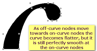
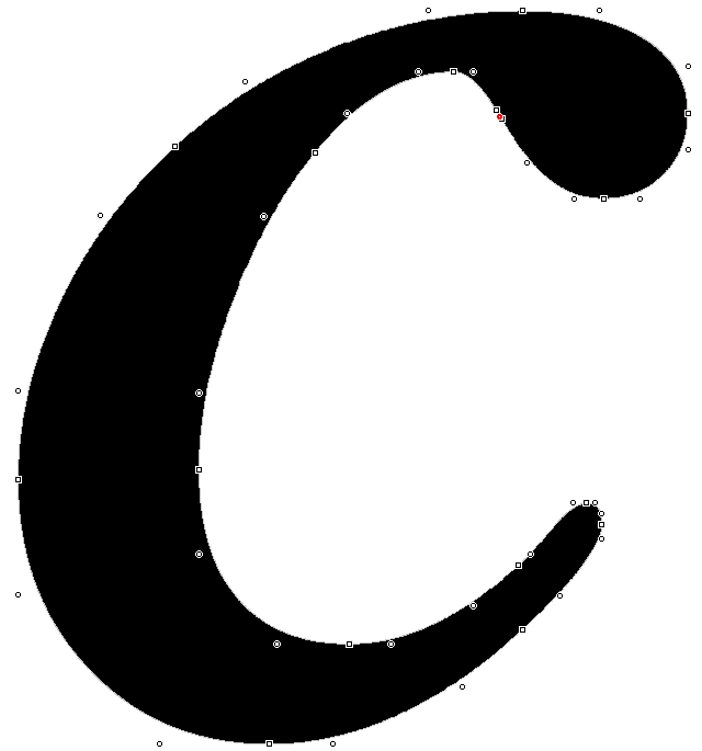
What I mean is that the perfect glyph has just enough nodes, but no more. This makes editing easier, and makes it quicker to get smooth curves. One extra on-curve node between two off-curve nodes will do no harm, but it also does no help.
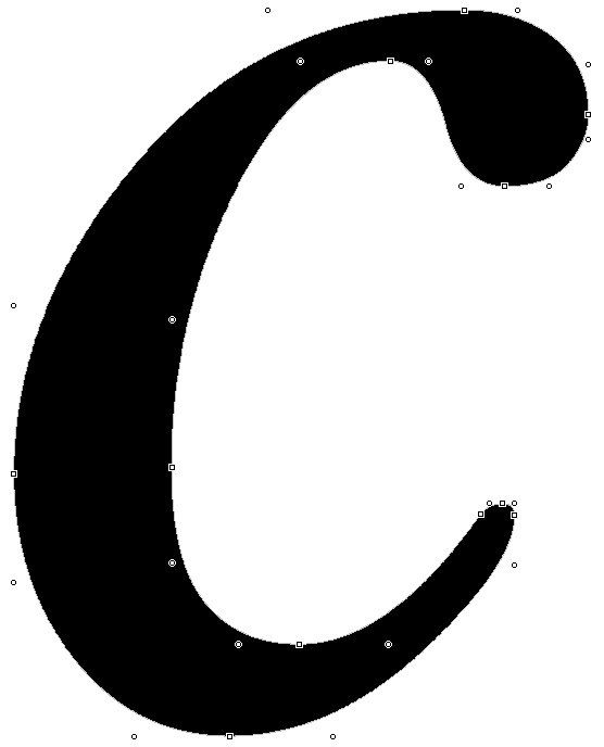
Below is a glyph from a commercial font, below that is a glyph from one of my fonts. You could take a few more nodes away from my glyph, but not without changing its shape significantly. Several nodes could be removed from the commercial glyph, which would improve its smoothness. There is one redundant node marked in red by the glyph validator.
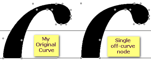
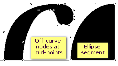
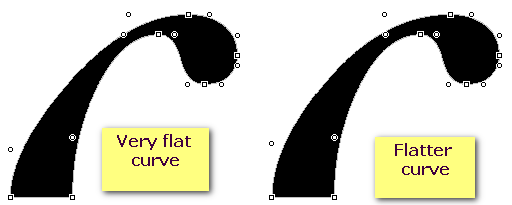
With two off-curve nodes between two on-curve nodes at extreme points, a curve can range from pointed almost like the sharp corner of a rectangle to completely flat, like a straight line. A single off-curve node won't result in a perfect quadrant, and nor will two off-curve nodes, but it can be very close. See the quadrant produced by adding an ellipse from the drawing toolbar.