What to do with ALTS

Discuss FontCreator here, please do not post support requests, feature requests, or bug reports!
Post Reply
Dave Crosby
Typographer
Typographer
Posts: 793
Joined: Mon Feb 23, 2004 1:13 pm
Location: Enoch, Utah

What to do with ALTS

Post by Dave Crosby »

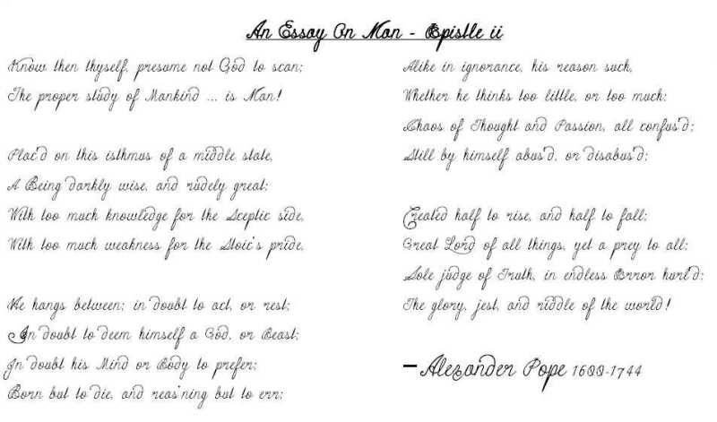
Where in a font should you place alternate versions of letters? Look at the A's, C's, E's, I's etc. in the following image.

Image

Click HERE to Save this early version of the Font

I seem to always bite off more than I can chew. I debated where to place this posting, but settled here, planning on posting the font in the Gallery once I get it fully functioning.

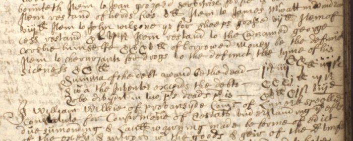
In Researching 1600 - 1800 Scottish Documents, I encountered numerous letter forms difficult to identify. I felt a need to produce a series of fonts using these forms to introduce them in a more identifiable way to other researchers. Some explanations are necessary.

For “$” is the “ball of twine” that interprets as ‘Scott Money.’
For “8" the character often looks more like a “0" or perhaps “9.”
For “I” the similarity to “J” often makes deciphering difficult. Etc.

All of this worked out great, so I should have been satisfied, but no, not I!

Problems began when I tried to reproduce the required ALTERNATE UPPERCASE glyphs used. They are much larger than all normal caps.
:arrow: I have to make all my normal glyphs smaller in this font to make the difference more visible.
:arrow: I have to make a better selection on stuffing them into available glyph boxes.
I ASSUMED [yeah, I know, "assume" makes an ass out of you and me] they would stay in the same symbol order when installed, so I could just count from one glyph to the next. They didn’t.
I assumed that I could place any glyph in a box and have access to it as long as I didn’t change the mapping. I don’t. Any alternatives, explanations or New Naming suggestions?

ROMAN NUMERALS are often encountered in “Testaments Dative and Inventories” [similar to Wills] that need to be reproduced. 1 = i, 2 = y [double dotted]. I mapped them all to the appropriate block, but seem to be unable to provide appropriate Microsoft names to make them accessible. Again, any suggestions?

Other problems are:
Small “s” has TWO forms. What changes do I need to make to access both from the keyboard?
Why don’t the forward and backward quotes [$201C & $201D] function?
I added a Greek alphabet. How do I make it accessible?

Future plans are to provide L in various lengths for longer words, and a wider variety of the back bending “d.” But for now, why bother when I can’t find what I have already made?
Last edited by Dave Crosby on Tue May 09, 2006 4:39 pm, edited 6 times in total.
Aut nunc aut nunquam
Dick Pape
Top Typographer
Top Typographer
Posts: 1360
Joined: Wed Oct 01, 2003 1:19 pm
Location: North Dallas, Texas

Post by Dick Pape »

Hello Dave -- your Essay looks very sixteenth century Scottish! (How would I know?) Good work.

Being a traditionalist I would make the 8 more like an 8 and less like a slashed 0. I would also shorten the tail on the I to make it obviously different from the J. But I don't know your design source.

You can put your alt characters in another ttf to make it easier to design and use.

Sorry you had to lose the Scottish Coat of Arms -- was 10,000 points was too hard to handle for you Dave???

Dick
Dave Crosby
Typographer
Typographer
Posts: 793
Joined: Mon Feb 23, 2004 1:13 pm
Location: Enoch, Utah

Thanks Dick!

Post by Dave Crosby »

Dick Pape wrote:Being a traditionalist I would make the 8 more like an 8 and less like a slashed 0. I would also shorten the tail on the I to make it obviously different from the J. But I don't know your design source.

The Scotts didn't give me a choice. I'm trying to get my source documentation posted to the web for anyone that wants to look at it.

I guess I should make a Modern Version?


You can put your alt characters in another ttf to make it easier to design and use.

I may have to do this as a last resort. I'll try the suggestions in your private e-mail first. Thanks for such useful suggestions!

Sorry you had to lose the Scottish Coat of Arms -- was 10,000 points was too hard to handle for you Dave???

Dick
It started out over 14,000 points! I have eliminated 4,000 overlapping coordinates and still have that many to go before I dare launch it on an unsuspecting public. I hope to get it back in soon.

I'll make your changes and re-post the font.

Thanks Dick!
Aut nunc aut nunquam
Dave Crosby
Typographer
Typographer
Posts: 793
Joined: Mon Feb 23, 2004 1:13 pm
Location: Enoch, Utah

ScotScript

Post by Dave Crosby »

Finally a Solution! Bhikkhu Pesala came up with the winning answer.
The further back in time I researched old Scottish records, the odder and harder to identify letterforms became. The oldest documents I’ve worked with made much use of “the Secretarial Hand.” Some Record makers were impressed with letterforms from their past while others experimented with new forms. They came from a wide backdrop of education, abilities, personalities, foreign influences, health, and sometimes wrote under very trying circumstances.
Image

These typefaces were designed as an aid to reading those old records.

I wish to give special thanks to Erwin Denissen for his masterpiece creation, the Font Creator. Without this intuitive and pliable application, I never would have been able to even begin this project.


When I began this script, I knew I needed regular and alternate glyphs to do justice to the subject. Where to place the “alts” in the font glyph arrangement was a problem difficult to solve until Bhikkhu Pesala presented the idea of placing them in the members of a Font Family as Normal, Italic, Bold, and Bold Italic.

This gave ready access to 4 alts of each character at expected places on the keyboard


Scotscript 1700 is a typeface family of four scripts.
You can download them as a zipfile here:

ScotScript Zip

ScotScr1700 Normal presents the “Gussied up” version of the typeface using the cleanest forms most often found in the 1675-1700 documents I researched. The $ is the symbol used for Scotts money. The & is the way it was most often found in the documents.

ScotScr1700i is the real deal. Often “k” looks like “b” “v” looks like “b”. Numbers are often in Roman Numerals. i = 1, y (double dotted) = 2, C = 100, CCC = 300 ... You will figure it out.

ScotScr1700B has larger caps, and ScotScr1700BI has the largest caps of all.

Install all four versions of the script to get the full benefit. Just select the normal version, and by highlighting a section and using the Italic, Bold, Bold Italic buttons of your wordprocessor you have easy access to interpreting all the letterforms.

Note: AutoNaming alone will not set up Bold, Italic, and Bold Italic. You will need to make changes in Format >> Naming and Format >> Settings too if you wish to use this in your fonts.

Check your font folder with MainType for a quick check to see if all four versions of your font are working correctly.
Last edited by Dave Crosby on Tue Oct 24, 2006 11:46 am, edited 5 times in total.
Aut nunc aut nunquam
Bhikkhu Pesala
Top Typographer
Top Typographer
Posts: 9878
Joined: Tue Oct 29, 2002 5:28 am
Location: Seven Kings, London UK
Contact:

Post by Bhikkhu Pesala »

Nice work. That must have taken you a while. Did you start in April 2004?

The set of fonts work well together. I gave it a bit more leading than 60% — about 75% prevents the collisions which I am sure occur sometimes on real manuscripts.
Scott Script.png
Scott Script.png (36.03 KiB) Viewed 7448 times
The italic (2nd and 4th paragraphs) reminds me of my first visit to Glasgow. When I asked a man the way to the Youth Hostel, he answered in English, but I couldn't understand what he was saying even after two or three repetitions.
My FontsReviews: MainTypeFont CreatorHelpFC15 + MT12.0 @ Win 10 64-bit build 19045.2486
Dave Crosby
Typographer
Typographer
Posts: 793
Joined: Mon Feb 23, 2004 1:13 pm
Location: Enoch, Utah

When did I start?

Post by Dave Crosby »

Did you start in April 2004?
I read everything on the Forum, then downloaded and printed out the manual and studied it for a week. At that point I had decided FC was what I wanted and needed.

I paid for the program, Then downloaded it (what an eccentric!) and started on this font DAY ONE!

I had a version right off, (26 Feb 2004) BUT I wasn't satisfied, and still am not.


As I look at what you just typed in it, I notice that there is still occasionally a problem with the n in can and losing. The tail of the a and i protudes too far into the n.

Those writing "real manuscripts" could care less about collisions. In fact, I think they delighted in them!
They often filled up the page, then turned it 90 degrees and acted as if it were a clean page and continued writing. Bleed through from the other side of the page makes it even worse ... well, some times the hand made ink faded out and that is worst of all ... fire ... mold ... water ... worms ....

What I found so interesting was that they would try so hard to make an "I" look so fancy, then not worry a bit that the rest of it looked like ****.
Aut nunc aut nunquam
Post Reply