Okay!
Firstly, thanks so much once again for your help (and videos!), Bhikkhu! And that thanks goes to everyone else who has offered assistance here, too, of course.

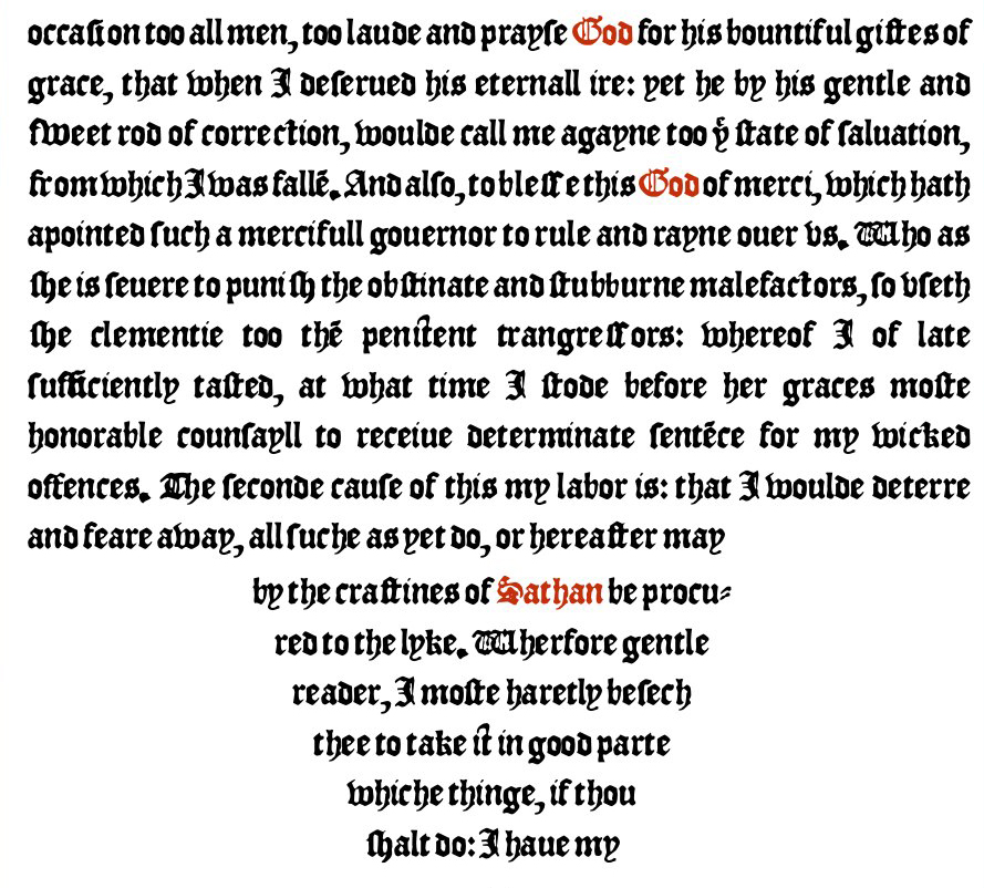
I do have some questions about where I guess I'm a little bit stuck now, but perhaps it might help to explain (and show you) where I'm at now. You'll see here a screenshot of my font -- it's called "Wickednesse."

I made it from scans of a little 1561 book (more like a little pamphlet) called "The Detestable Wickednesse of Magicall Sciences," and what you see in this screenshot is how it displays in an ebook version of that work which I've been making, too -- the font, and the ebook, go hand-in-hand together (although anyone could then use the font however they might want, of course). The text itself isn't actually all that interesting, really -- the usual "hellfire and damnation" sort of thing from that period, but this is hardly a significant work in that genre -- for decades, though, I was intrigued by the font used in that original 16th century document, and wanted to make a font from it. I actually started working on this font a dozen years ago or so, but then put it aside. In more recent years, though, I started getting into ebook design, and a few months ago it occurred to me to do up this curious little text as an ebook, and have it display in the original font -- and that meant finally finishing up that font, of course.
And so this was my re-introduction to type design, after having not really done anything with it (other than minor tweaks to third-party fonts) for over a decade. The only actual "fonts" that I've made in the past, all those years ago, were one of my own handwriting (with a reasonably complete character set) and the first -- and very basic -- version of this Wickednesse font.
Anyway, so here's where I'm at now with this font. From scans of that 1561 text, I was only able to glean a basic upper- and lowercase character set -- not even any numbers or anything beyond that. I had to come up with all the various additional punctuation, accented characters, etc. -- basically everything in the various extended character sets, including Cyrillic, Greek and Coptic (all of which I had to "invent" myself), not to mention all the math symbols and other icons and whatever else. I currently have 1163 glyphs in all.
I don't know if it matters (or if it's of interest), but whenever I got to a point in my font where I wanted to test it out in my ebook and see how it looks (and how everything renders out, as far as ligs, kerning, etc. go) I would do the following...
- First, I run the script to set all my left/right bearings to 62 (I have NO idea if that's a good number, I just came up with it somehow -- long story -- but it seems to have worked out okay, as far as the end result goes). The only thing I changed afterwards was my space -- the "letterspacing" seemed to come out okay, but the "wordspacing" was too close (if you know what I mean), and so I set the L/R bearings for that (space) to 123.
- Then I run autometrics.
- And then I run autokern.
And then I generate my font, embed it in my ebook, open up that ebook in Adobe Digital Editions (ADE -- which is great for testing ebooks in) and that's where this screenshot is from.
Now, looking at the screenshot, if you look closely enough you'll see TONS of ligatures -- I'm rather delighted about that, all my lig lookups seem to be working perfectly now.
But the kerning is off (or, rather, non-existent) on virtually all of those ligs.

This is what you were helping me with in these latest posts -- I needed to add in pair adjustments for all the glyphs in my private use area.
So here's my questions...
1. Is it only the characters in my private use area that I need to concern myself about, i.e. that aren't automatically added in as pair adjustments when you autokern? Or are there other glyphs that I should be adding in manually, too?
2. From your explanations here (including your video tutorials), I've managed to create classes for all the various characters in my private use area, and can see them all listed in the Class Manager, and then from your tutorial I know how to create a new pair adjustment... but is there no automated way to do this step, to kern that character with every other character (AND to also include this character when kerning other characters as well)? Please don't tell me that the only way to do this is to do so manually, one-by-one, one character combination at a time.

3. Back to the screenshot, as I mentioned the kerning is virtually non-existent for all my various ligatures, but apart from those there also seems to be some other more common character combinations that I would have thought that autokerning would have doen a better job at. In particular, the kerning for the lowercase "i" seems rather off in quite a few places. I would have thought that that would have been handled reasonably well with autokerning???
4. Lastly, d'ya like my "it" ligature? I stole the idea for that from you, Bhikkhu!

You can find an example of it fairly easily in this screenshot in the third line from the bottom ("thee to take it in good parte"). I also have one for "ip" as well that's similar.

Well, I think that's about it for the moment, but that's basically where I'm at right now -- and where I'm a bit stuck and/or confused about.
Thanks once again (in advance)!
- Wickednesse ADE 01.jpg (349.3 KiB) Viewed 8529 times