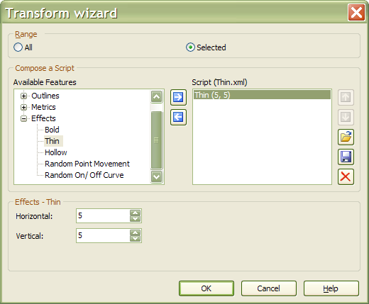
The transform feature is useful for making new typestyles from existing fonts. It is not available in the Home Edition, but only in the Professional Edition or in the thirty-day Free Trial. Please see this comparison chart and the Registration Page for details.
Oblique or Italic • Outline or Hollow • Maths Symbol and Symbol • Condensed Thin • Superscripts • Thin With High Contrast • Small Capitals in the Private Use Area
New Features in FontCreator 10
Optimize Contours • Override Range by Glyph Name • Inverse
New Features in FontCreator 10.1
Unmapped Small Capitals • Unmapped Tabular or Proportional Figures • Unmapped Stylistic Alternates
General Advice for Working With Transformations
Select at least one glyph (e.g. the space glyph) before running transformations. If no glyphs are selected at all, all glyphs in the font will be prepared for transformation, the transformation will take longer, and all hinting will be removed.
Because transformations cannot be undone, copy the glyphs that you are going to transform, and leave them selected. After running the transformation, paste the clipboard contents back into the same glyphs, and undo the paste operation. You can then redo the paste operation if you want to try different values for the transformation.
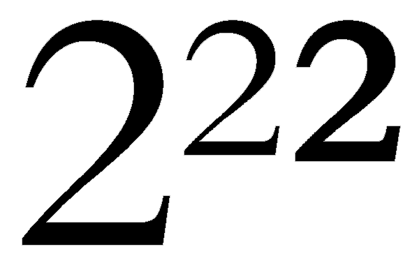
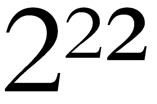
Small Capitals
Before running this transformation, copy the Capital Letters of your font to the lowercase positions, and select them.
The Small Capitals transformation scales the uppercase by about 75%. To compensate for the scaling the stroke weight needs to be increased with a bold transformation.
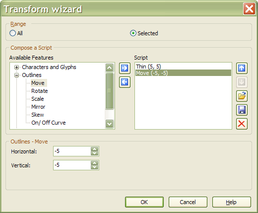
Code: Select all
Scale 73,73, about fixed point 0,0
Bold 22,15 (adjust to suit your font)
Move 22,15 (align visual baselines)
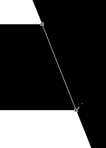
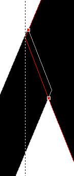
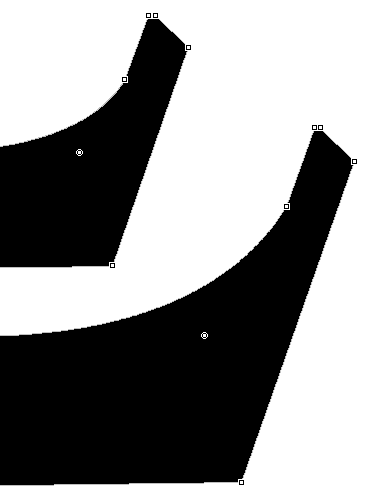
Left side-bearing at x = 0Serifs Are Too Thick
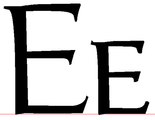
The Serifs are too thick. Zoom in close to see exactly what happened.
All you need to do is select a few nodes and move them to the right:
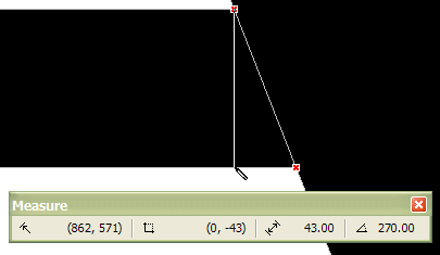
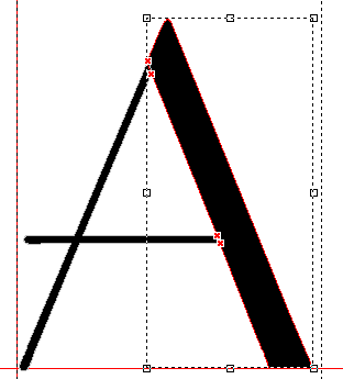
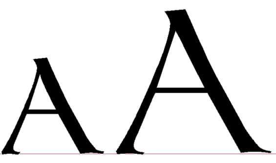
Intersectinh Co-ordinates
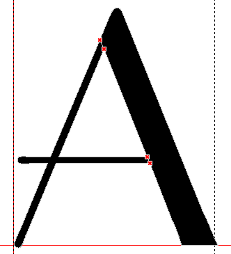
Sometimes when a node is moved it crosses the contour giving a result like this (Capital A).
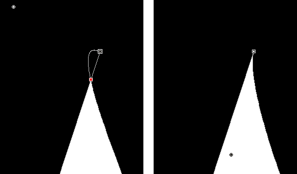
Just move the offending node to correct this problem.
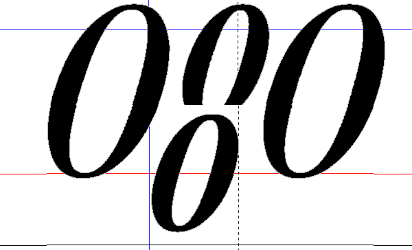
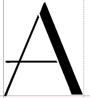
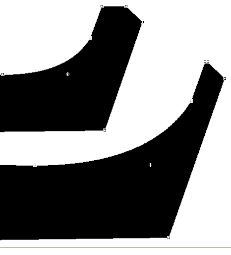
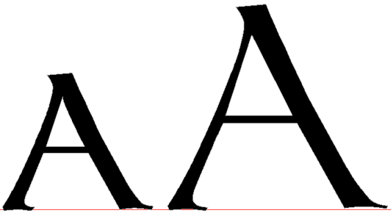
Thin Strokes
Thin strokes are made bolder by the same amount as thick strokes.
Ideally, they should be made bolder in proportion to their original weight.
Use the lassoo tool to select the nodes that need to be moved.
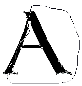
Move them to the left until the strokes are in the correct proportion.
Reduce the advance width by the same amount.