Using Guidelines to Maintain Symmetry
-
Bhikkhu Pesala
- Top Typographer

- Posts: 9890
- Joined: Tue Oct 29, 2002 5:28 am
- Location: Seven Kings, London UK
- Contact:
Using Guidelines to Maintain Symmetry
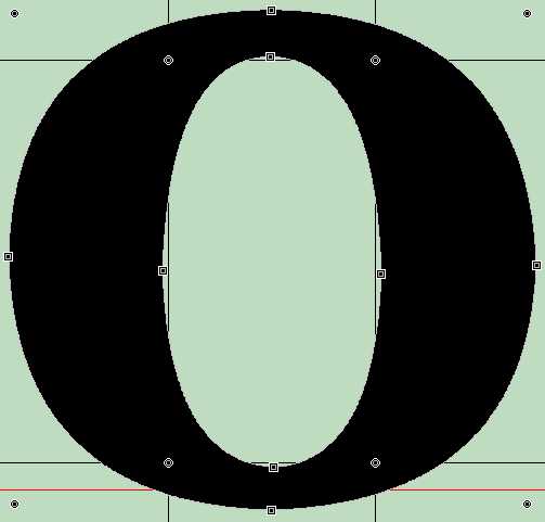
Making a smooth curve is not too hard if you have only a few points to manipulate, but to make an elipse symmetrical is difficult unless you use guidelines. I found that by drawing guidelines just inside the on-curve extreme points and snapping the off-curve points to the guidelines, I could easily get a symmetrical curve.
Last edited by Bhikkhu Pesala on Mon Mar 15, 2004 12:47 pm, edited 1 time in total.
-
Bhikkhu Pesala
- Top Typographer
- Posts: 9890
- Joined: Tue Oct 29, 2002 5:28 am
- Location: Seven Kings, London UK
- Contact:
Keeping Serifs Symmetrical
Guidelines are helpful too to keep serifs the same weight and shape.
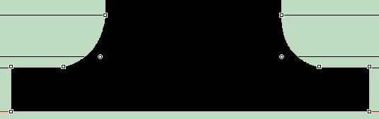
Serifs on uppercase and lowercase letters may not be the same weight, but the serifs on all lowercase letters should be the same.
Thse are my own opinions. I welcome correctiions or suggestions for better methods from more experienced typographers.
Serifs on uppercase and lowercase letters may not be the same weight, but the serifs on all lowercase letters should be the same.
Thse are my own opinions. I welcome correctiions or suggestions for better methods from more experienced typographers.
Last edited by Bhikkhu Pesala on Mon Mar 15, 2004 12:56 pm, edited 1 time in total.
I always create the characters without the serifs, then go in and make the serifs on a typical character. I take that character, split the contour so the serif is isolated, select the serif, copy, hit undo, then paste the serif in any character that shares the serif style. I usually use the lower case L or I for the serifs on b,d,f,h,i,j,k,l,m,n,p,q,r,u, and maybe y. I will edit 'a' for use on d, u, and maybe t. v for w,x, and maybe y. My z, s, e, and c are rarely serifed. Of course, I make almost every character out of the canabalized parts of other characters. My current font is up to around 1100 characters now, including diacritics and ligatures, and I couldn't have done that from scratch on every character.
-
Bhikkhu Pesala
- Top Typographer
- Posts: 9890
- Joined: Tue Oct 29, 2002 5:28 am
- Location: Seven Kings, London UK
- Contact:
Joining contours
I am working on existing fonts to make them a bit smoother. I have used your method for splitting contours before, but I find that joining them can be more difficult. Have you ever tried to make Ø slash by joing O and / for exmaple? I just gave up. Ł slash is quite time-consuming at best. I just could not get it to work at all on one font. I always got one of two resuls:
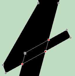
OR
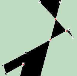
OR
Last edited by Bhikkhu Pesala on Mon Mar 15, 2004 12:50 pm, edited 3 times in total.
-
Bhikkhu Pesala
- Top Typographer
- Posts: 9890
- Joined: Tue Oct 29, 2002 5:28 am
- Location: Seven Kings, London UK
- Contact:
Diagonal Guidelines
To create a diagonal guideline, just select two distant points on a diagonal stroke and press G. Then you can move it aside and create another one. Diagonal guidelines are very helpful to make sure that diagonal strokes are even and parallel. I also align the slanting ends of serifs to the diagonal guides.
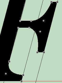
Diagonal guidelines can be set to a precise angle by double-clicking on them. They can be rotated by holding down the shift key while rotating them with the mouse.
Diagonal guidelines can be set to a precise angle by double-clicking on them. They can be rotated by holding down the shift key while rotating them with the mouse.
Last edited by Bhikkhu Pesala on Mon Mar 15, 2004 12:55 pm, edited 1 time in total.
Re: Joining contours
I know it's not pretty, and it takes a long time, but that's exactly what I did. I spent a lot of time at high magnification, reading the coordinates for where the curve of the O intersected the slash. Luckily, the mouse shows up on the rules on the side, so you can read it. Then, there was all the time I took with a superimposed O trying to adjust the off-curve points so that the O-slash had the same curve as the O. It was not fun, but I don't know of any other way to get the consistency that I demand of myself.Bhikkhu Pesala wrote:I am working on existing fonts to make them a bit smoother. I have used your method for splitting contours before, but I find that joining them can be more difficult. Have you ever tried to make Ø slash by joing O and / for exmaple?
-
Bhikkhu Pesala
- Top Typographer
- Posts: 9890
- Joined: Tue Oct 29, 2002 5:28 am
- Location: Seven Kings, London UK
- Contact:
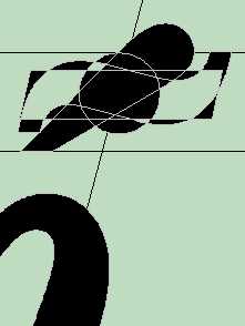
Aligning Accents
Guidelines are essential for aligning accents. I find that I need two for lowercase and two for upper case. In each case (pun not intended) the lower guideline marks the lowest point of any accent, and the top guideline marks the top of the dot accent or diareisis. In italic fonts, a diagonal guideline through the centre of the stroke helps to position accents horizontally. Illustrated below is the í acute from Century 731 Italic BT with the macron, tilde, and dot accents overlayed.
For a full discussion see this Dissertation by Victor Gaultney on Diacritical Design
For a full discussion see this Dissertation by Victor Gaultney on Diacritical Design