Character position problem in Postscript

Get help with FontCreator here. Please do not post feature requests or bug reports here.
Kalvos
Posts: 13
Joined: Sun Mar 25, 2007 3:24 am

Character position problem in Postscript

Post by Kalvos »

Hi,

First post, but longtime Font Creator user.

A problem has come up twice over the past few years: the mis-positioning of one character in a font, but only when it is turned into a Postscript file with certain applications.

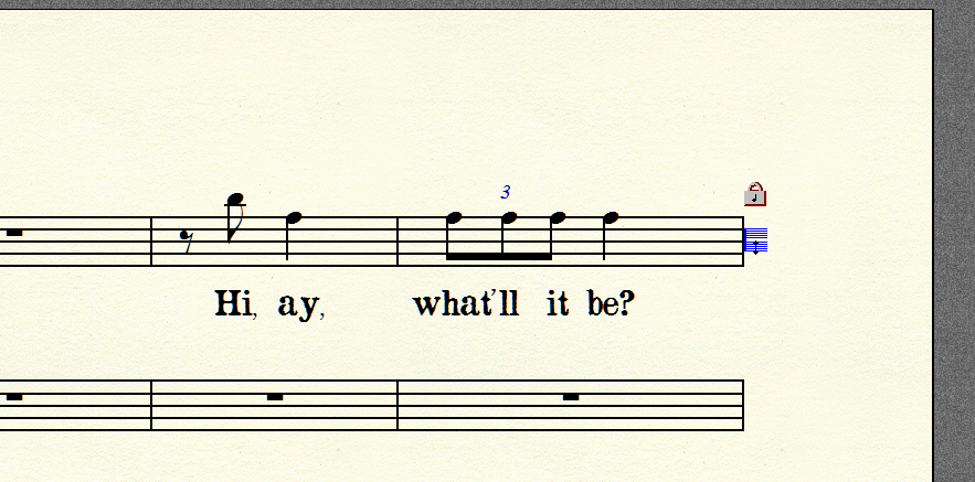
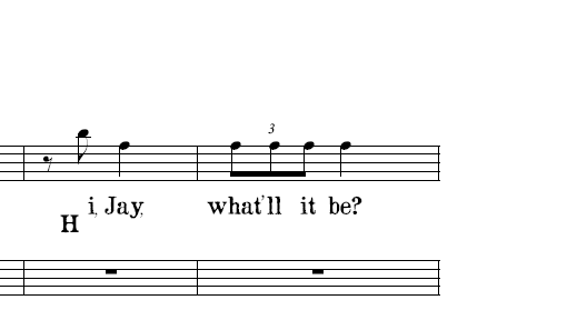
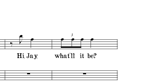
Here are two sample images; the first is how it looks in the source, and the second is the Postscript file as viewed with Ghostscript. (It's the same in Distiller; Ghostscript is just faster.)

Image
Image

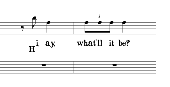
I've moved the character into other slots to test it; it's just the one character, not the slot. I've tried modifying the character, and when moving it, I was sure only to marquee the character, in case there was something outside the creation frame.

It compiles Postscript properly in MSWord and printing to PDF works. In Finale, it fails.

I've used custom fonts from many folks, and it's only happened with two fonts created in Font Creator.

It's not much to go on, but where would I start? (This is a font-in-progress based on old opera score texts.)

Thanks,
Dennis
Erwin Denissen
Moderator
Moderator
Posts: 11155
Joined: Fri Oct 04, 2002 12:41 am
Location: Bilthoven, The Netherlands
Contact:

Post by Erwin Denissen »

Can you send a copy of your font directly to me? I'll see if I can identify your problem.
Erwin Denissen
High-Logic
Proven Font Technology
Erwin Denissen
Moderator
Moderator
Posts: 11155
Joined: Fri Oct 04, 2002 12:41 am
Location: Bilthoven, The Netherlands
Contact:

Post by Erwin Denissen »

I've investigated your font (Opera-Lyrics.ttf), but I can't find any problems there. So I assume it is an issue with the conversion to PostScript, done by external applications. You might want to try to reduce the complexity of the glyph (e.g. remove some points). Let us know your results.
Erwin Denissen
High-Logic
Proven Font Technology
Kalvos
Posts: 13
Joined: Sun Mar 25, 2007 3:24 am

Post by Kalvos »

Thanks for taking a look.

I sent another font (RevereFinale) and PDF sample along with my new scanned one, and it has the same offset problem -- but in a different glyph slot and with a different offset (offset left rather than down). It has many fewer points. It's just a 16th-note flag and stem; similar and more complex glyphs in the same font (such as a 32nd-note flag) work fine.

Can you point me to the factors (other than boundaries, which seem correct) that might throw off a Postscript compiler? Even as I clean up the "H" in the Opera-Lyrics font, reducing the points, the offset doesn't change.

As I say, it doesn't affect printing to a Postscript printer (even if printing to file), just when compiled to a Postscript file. I need a real Postscript file to produce clean PDF or EPS files in Finale.

I don't know where to begin looking for other positioning data that a PS compiler would use.

Thanks again,
Dennis
Erwin Denissen
Moderator
Moderator
Posts: 11155
Joined: Fri Oct 04, 2002 12:41 am
Location: Bilthoven, The Netherlands
Contact:

Post by Erwin Denissen »

Hi Dennis,

You might want to contact Adobe, maybe they are already aware of this issue.
Erwin Denissen
High-Logic
Proven Font Technology
Dick Pape
Top Typographer
Top Typographer
Posts: 1360
Joined: Wed Oct 01, 2003 1:19 pm
Location: North Dallas, Texas

hmmm

Post by Dick Pape »

(Nice looking font btw) Does this same problem occur using a different font?
Kalvos
Posts: 13
Joined: Sun Mar 25, 2007 3:24 am

Different font

Post by Kalvos »

Hi Dick,

The problem occurs (so far) in just two fonts, both created with FC.

In the first (Opera Lyrics), the character is offset down (to the bottom of its baseline); in the second (RevereFinale), it is offset left (to the left of its bearing). Some other fonts I've done in FC are just decorative elements, and I've never used them in Finale.

I posted the whole question yesterday over at comp.fonts, and one person has had a look at the font. Other than finding a few minor errors (I left off the Macintosh naming), he's not found anything, but reprocessed the font in FontLab. I'll run a test on it today -- install, change lyrics font in Finale, compile PS.

Then I'll report back here.

Thanks for the kind words on the font. The credit really belongs to those metal font designers in the 1880s at G. Schirmer, where these characters were on individual steel striking dies that embossed metal plates. (On the Henle publishing site, there's a great video of metal plate engraving, which is still done there on some special editions.)

Dennis
Kalvos
Posts: 13
Joined: Sun Mar 25, 2007 3:24 am

FontLab version worked

Post by Kalvos »

Dick,

The font reprocessed in FontLab does not exhibit the character shift problem during Postscript compilation.

I altered the old font in Font Creator using the same steps the person did in FontLab: included the Macintosh naming, deleted glyphs above $00FF, changed the vendor code to "mm", deleted the default box in the $0000 position, and reinstalled. No change. The FontLab version works while Font Creator version does not.

Now I'm going to open them side by side in Font Creator and see if there are any other differences.

Dennis
Kalvos
Posts: 13
Joined: Sun Mar 25, 2007 3:24 am

"Identical" fonts, different results

Post by Kalvos »

Here are the final results that I can produce.

http://maltedmedia.com/images/finale/hi-jay-bad.gif
http://maltedmedia.com/images/finale/hi-jay-good.gif

The first was produced with the Font Creator-originated font, with all its parameters changed to match the FontLab-modified font.

The second was produced with the FontLab-modified font, after being run through Font Creator.

Here are the two fonts:
Font Creator: http://maltedmedia.com/images/finale/Op ... Smooth.ttf
FontLab: http://maltedmedia.com/images/finale/Op ... Test02.ttf

I have tweaked every parameter I could find in the Font Creator-originated font to match the FontLab-revised font (which, as I say, was run through Font Creator just to kind of scrub it with whatever Font Creator does).

Suggestions welcome, as I'd hate to run into this problem again on a short deadline. Dick? Erwin? :)

Many thanks,
Dennis
Erwin Denissen
Moderator
Moderator
Posts: 11155
Joined: Fri Oct 04, 2002 12:41 am
Location: Bilthoven, The Netherlands
Contact:

Post by Erwin Denissen »

Hi Dennis,

Good to know you have find a solution, too bad it didn't work with FontCreator :?. I'll be more than happy to look into this, and generate a couple of slightly modified versions of the fonts for you to test. Do let me know if you are willing to put some effort into this, so I can start with making those changes.
Erwin Denissen
High-Logic
Proven Font Technology
Kalvos
Posts: 13
Joined: Sun Mar 25, 2007 3:24 am

Happy to...

Post by Kalvos »

Yes, Erwin, I'm happy to test. As you know, I've been using Font Creator for a long time and found it perfect for the little bits and pieces of work that needed a font rather than an image.

This has tripped me up twice, and it seems it might be specific to FC-originated fonts. Maybe even something in the default font file?

I'm leaving for three weeks residency in Portugal followed by a week in the Netherlands, and will be able to give it my attention in mid-May ... so no rush. (I'll buy you a Duvel when I'm in town -- I'm staying with friends in Utrecht Centrum from April 29-May 7, which means you're nearby in De Bilt. I hope to enjoy Koninginnendag again, too!)

Thanks,
Dennis
Bhikkhu Pesala
Top Typographer
Top Typographer
Posts: 9877
Joined: Tue Oct 29, 2002 5:28 am
Location: Seven Kings, London UK
Contact:

Post by Bhikkhu Pesala »

One obvious thing to try is Font, Validate, to remove off-curve extremes, but since these exist in both fonts, I don't think it will solve the problem.

One odd thing about the fonts that I noticed is the extreme kerning of C and hyphen, which is due to the unusually high position of the hyphen. Automatic kerning has shifted the hyphen inside the bowl of the capital "C". I would recommend clearing the kerning, and trying again with automatic kerning from file. There are lots of very odd kerning pairs.

The Fontlab font uses Trimmed Table Mapping, instead of Byte Encoding Table for Macintosh Platform, and adds a Unicode 2.0 mapping. Again, I don't know if this will make any difference, but it might be something to investigate. Format, Mappings to change to Trimmed Table mapping, and Format Platform Manager to add the Unicode 2.0 and onwards, BMP only platform.

The FontLab font contains some extra tables due to automatic hinting. Again, I don't see how this could affect the position of the capital "H".
My FontsReviews: MainTypeFont CreatorHelpFC15 + MT12.0 @ Win 10 64-bit build 19045.2486
Kalvos
Posts: 13
Joined: Sun Mar 25, 2007 3:24 am

No change with Trimmed

Post by Kalvos »

Hi Bhikkhu,

Fonts were both already valid (no off curves, etc.). That's the very first thing that I made sure of. And the person that converted the font didn't touch the characters themselves.

I noticed the kerning, but a C-hyphen combo is not likely to appear in an opera libretto. :)

The change to Trimmed Table Mapping has been made, but the resulting font is still problematic. (I should mention again that this is the second font originated from a Font Creator blank template that has a misplaced character.)

Dennis
Bhikkhu Pesala
Top Typographer
Top Typographer
Posts: 9877
Joined: Tue Oct 29, 2002 5:28 am
Location: Seven Kings, London UK
Contact:

Post by Bhikkhu Pesala »

Tools, Options, Validation, Local detection will show that there are still off-curve extremes.

One tiny difference between the two "H" glyphs in the two fonts that might be material (and might help Erwin find a bug)

1. The First node on the FontCreator glyph is an off curve point, and is also an off-curve extreme.

2. The first node on the FontLab glyph is an on curve point.

Try this to debug this problem:
  • Change the first node on the Font Creator font
  • Enter Points mode
  • Deselect the glyph
  • Press "W" to select the first node
  • Press "W" again to select the second node (on curve)
  • Right-click and set it as the first point.
If that doesn't fix the font, then change the Validation options to local, and run the validation wizard again. See if that fixes the problem.
My FontsReviews: MainTypeFont CreatorHelpFC15 + MT12.0 @ Win 10 64-bit build 19045.2486
Kalvos
Posts: 13
Joined: Sun Mar 25, 2007 3:24 am

Joy

Post by Kalvos »

Hi Bhikkhu,

Thanks so much. That did it.

The default validation is "global". I didn't even know about the local validation because it's not indicated in the Font->Validate window itself.

How are they different? This is not explained in the manual. I thought I had fixed all of these, but clearly there are hundreds more errors of a different kind.

Dennis
Post Reply