Using Font Creator Program 4 (henceforth "FCP") from High Logic, and Adobe Photoshop.
1) Get FCP.
If you haven't already, that is. A 30 day trial version can be downloaded here: http://www.high-logic.com/fcp.html
The information in this tutorial applies to version 4, public as of summer 2003.
2) Design your font.
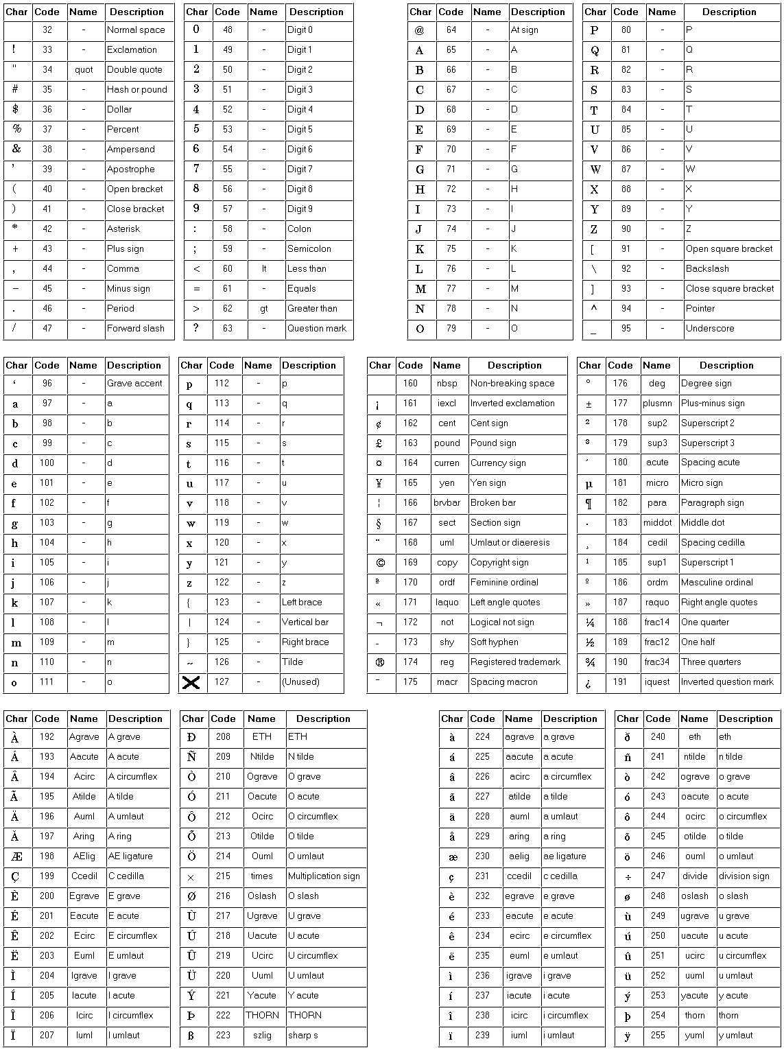
Write your glyphs (characters) on paper using your writing implement of choice. A fairly complete list of glyphs can be obtained here: http://www.htmlhelp.com/reference/charset/latin1.gif
You can of course pick and choose which characters you wish to include. For a comic lettering font for example, you may want to skip small letters. For a title font you may want letters only, skipping numerals and punctuation.
3) Scan it.
Scan as high-resolution (600 DPI) monochrome bitmap. Be careful to get the base line perfectly horizontal.
4) Split the glyphs.
Copy and export the glyphs from the bitmap to individual files in the .BMP format. You can use the glyph list above as a reference for naming the files, since the FCP follows the same naming scheme.
Since there are a couple of steps do for each glyph, you will want to make this process as smooth as possible.
Here's how to do it in Photoshop 7:
- Make sure guides are visible, and that the "snap to grid" option is selected (that is, both view->snap and view->snap to->guides). Make guides around all your glyphs, i.e. one guide above and one below each line of glyphs, as well as between them. Each glyph should have some whitespace around it on each side.
Bring up the rectangular marquee tool options, and set Style to "fixed size" and size to roughly the same size as the grid size formed by the guides.
Set up a macro for copying and creating the new glyph file. (Basically ctrl+C, ctrl+N, set Mode to Bitmap and Width and Height to your marquee size, Ok, ctrl+V, ctrl+W)
Select and export the glyphs one by one, using the rectangular marquee tool and your macro.
5) Create a new font file.
Open FCP and create a new file. Give it a name. Leave the default settings for Character Set and Font Style. A window called "Yourfont.ttf" appears, containing greyed out "ghost" versions of all glyphs.
6) Import the glyphs.
Again, this is a repetetive process, so I recommend using the keyboard shortcuts in order to speed things up. To speed things up even further, you might want to check out a keyboard macro program, as suggested in this post by Bhikkhu Pesala.
For each glyph,
- Open it, either by double-clicking it or selecting it and pressing enter. The Glyph window appears.
Choose Tools->Import Image (Alt+L, Alt+I)
Choose Load (Alt+L)
Browse to the folder containing your character bitmaps, and open the current glyph file (i.e. A.BMP) by typing it into the "Filename" box, or by double-clicking it in the browser window.
 Typing is generally faster, since you only have to type the first few letters, then select the desired filename using the Down arrow.
Choose Generate (Alt+G). The bitmap data is vectorized. If necessary, adjust the vertical placement of the glyph, by Selecting All (ctrl+A) and using the arrow keys. Since generated glyphs are placed relative to the baselines (the red intersecting lines), this is necessary for characters that should extend over these lines; for instance "," and "j".
If necessary, adjust the spacing lines (black, vertical, dashed lines). These should normally be about one whole grid square from the glyph on each side, except brackets and the like, which should have less space on the inside.
Close the Glyph window (Ctrl+F4).
For a glyph bitmap of 200x200 pixels, Size Multiplier should be about 10.
7) Re-map glyphs (Optional: Single case fonts only)
To make single-case fonts (for instance ALL CAPS ones), there are basically two approaches: the Quick Way and the Right Way.
The Quick Way is to simply select all letters (A..Z) and copy them to the other case (a..z). This is bad for a couple of reasons: for one, the font file will unnecessarily bloated, since the same set of glyph data is stored twice. And more importantly, it means more kerning pairs, which translates to more work for you in the end. If this doesn't bother you though, then by all means, go right ahead.
The Right Way is to add a new character mapping for each one of the letters, like so:
- Choose Format->Mappings... (Alt+O, Alt+M)
If you are making a PC font, select "Microsoft Unicode" in the Platforms list.
Highlight a glyph in the Glyphs list.
Choose Select (Alt+S)
Find and select the desired mapping (for example "LATIN SMALL LETTER A"), and press Ok.
If a warning dialog appears about the character already being mapped to another glyph, just click OK.
You may erase the unused letters (a..z) in the main window, but I would recommend this only if you know that you will not be needing them later.
8 ) Auto Kern it.
- Choose Tools->Auto Kern...
Choose Next.
Select the character you wish to auto kern in the left-hand list, and choose ">" to bring them to the right-hand list. You will probably want to kern them all. Be aware though, that there is an upper limit of 128 characters at a time for auto kern.
Choose Next.
For a reasonably tight font, type 300 into the "White space between characters" box.
Choose Next. Kerning pairs are automagically calculated.
You are now ready to take your font for a test drive.
- Choose Font->Install... You will be asked if you wish to save the font.
Choose Yes. The Font Installation Wizard appears.
Choose Next, Next and Finish. Your font is now installed.
 If you run into problems writing the font, try closing other applications which use fonts (such as Word or Photoshop).
If still no go, check the "Launch Windows Fonts Folder" box, and remove the old version of the font manually.
Open up any application that can handle TTF fonts, for example Photoshop, and type away.
You will most likely discover a bunch of visual quirks and problems. Pay special attention to how the text flows in larger blocks.
- PROBLEM
 All characters appear too close together or too far apart.
SOLUTION
 Adjust the Metrics (individual vertical spacing), using Tools->Auto Metrics
You will probably have to do the kerning all over again after this.
PROBLEM
Some characters appear too close together or too far apart.
SOLUTION
Adjust the kerning pairs, using format->kerning.
PROBLEM
 Some characters do not appear at all!
SOLUTION
Either you missed importing them, in which case you just have to do that, or the characters in question have no mapping, in which case you will have to add mapping for them using Format->Mappings.
PROBLEM
 Some characters need minor adjustments.
SOLUTION
Adjusting individual anchor points in the Glyph window is fairly straight-forward.
PROBLEM
Diacritical marks (little marks above or below some non-english characters) appear clipped.
SOLUTION
Adjust the top or bottom lines (solid, black, horizontal lines) in the Glyph window.
11) Describe it.
FCP adds some copyright information automatically to the english language version. You will probably want to change some of it, at least add your name as the copyright owner. The TTF format also supports a bunch of additional data about the font. To edit it, do as follows:
- Choose Format->Naming.
For PC fonts, choose Microsoft Unicode under Platform.
Select English in the Language list.
Change or uncheck the undesired information, and press Ok.
There is even more information added by FCP as default. This can be found and modified in the Advanced Naming section, found by pressing the "Advanced..." button.
These forums have a Gallery section, where you can post a link to your font to have other FCP users give their input on your work.
13) Mac export (Optional)
If you want Mac users to be able to use your font, you will have to convert it to Mac TTF. There is a tool called CrossFont from Acute systems that does this. It is shareware and costs $45 to buy. It can be downloaded here: http://www.asy.com/scrcf.htm
Usage of this software is outside of the scope of this tutorial, though, sorry.
14) Buy the program.
If you haven't already and enjoy the program, please consider purchasing it. It's not only much easier to use than other professional font design programs out there, it's reasonably priced as well.
HAPPY FONTING!
Johan C. Brandstedt
2003-09-04
Download my free fonts at http://johancb.freelancers.net.
Comments and suggestions are welcome!