Try Copy and Paste Special. Check all of the boxes and select overwrite same mappings.
Then sort the font and delete all of the unmapped glyphs from the end of the font.
Search found 6083 matches
- Fri Sep 04, 2009 6:36 am
- Forum: FontCreator - Support
- Topic: Merging Fonts-replace glyphs
- Replies: 1
- Views: 6766
- Thu Aug 27, 2009 6:09 am
- Forum: General Font Discussions
- Topic: Basic size question
- Replies: 1
- Views: 2975
Re: Basic size question
If the font used is Courier New 12 point, then the way to tell which printout is most accurate is to measure it.
Ten characters should be exactly 1" and ten lines of single-spaced text should be exactly 136 points, or 1.89"
Ten characters should be exactly 1" and ten lines of single-spaced text should be exactly 136 points, or 1.89"
- Thu Aug 20, 2009 11:19 am
- Forum: FontCreator - Support
- Topic: TTF to TTC
- Replies: 4
- Views: 13006
Re: TTF to TTC
No. It can extract the TTF fonts from a Truetype collection, but cannot create TTC files.
I don't see the benefit of TTC files, and don't know of any program that creates them — maybe FontLab does (I don't see any option to export TTC, not even in Asia Font Studio). Why do you want to create one?
I don't see the benefit of TTC files, and don't know of any program that creates them — maybe FontLab does (I don't see any option to export TTC, not even in Asia Font Studio). Why do you want to create one?
- Tue Aug 18, 2009 12:55 pm
- Forum: FontCreator - Support
- Topic: Stopping anti-aliasing.
- Replies: 4
- Views: 4230
Re: Stopping anti-aliasing.
From the Format menu, Smoothing, delete any grayscale settings.
- Sun Aug 16, 2009 6:28 pm
- Forum: FontCreator - Support
- Topic: overlapping glyphs
- Replies: 3
- Views: 5524
Re: overlapping glyphs
Combining diacritical marks (accents) usually have an advanced width of zero and a negative left side bearing.
- Wed Aug 12, 2009 4:00 am
- Forum: General Font Discussions
- Topic: Can a font go bad???
- Replies: 6
- Views: 8116
Re: Can a font go bad???
I don't know why anyone would want this font. I find it hard to believe it was actually designed to look like that. It is just some poor quality scans converted to a font. The font slows to a crawl in FontCreator too, just on trying to open it in the Font Test window. Each glyph consists of hundreds...
- Tue Aug 11, 2009 6:54 am
- Forum: FontCreator - Support
- Topic: Problem with importing vectors
- Replies: 6
- Views: 5684
Re: Problem with importing vectors
When it's not giving me the "no contours" issue, it's converting all of my vectors into "clumps". This had not been a problem before while I was using AICS3 and FontCreator 5.x, but now seems to be an issue since I've upgraded both (AICS4, FC6). Without a sample AI file there is...
- Mon Aug 10, 2009 2:55 pm
- Forum: FontCreator - Support
- Topic: Font Black Outline
- Replies: 1
- Views: 3205
Re: Font Black Outline
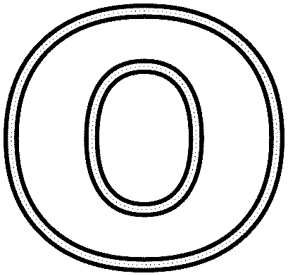
If you're using the Trial Version or the Professional Edition, you can use the Outline Glyph Transformation. There are three different weights to choose from and you can modify any of them to suit your font.
Is this what you want?

Is this what you want?

- Sat Aug 08, 2009 4:57 pm
- Forum: Implemented Feature Requests
- Topic: Autokerning Improvements
- Replies: 8
- Views: 14500
Re: Autokerning Improvements
This autogenerated kerning pair with a value of -611 is clearly wrong. The white space value was set to 200.
An option on the Autokern dialogue to limit the "Maximum absolute kerning value" might help in some cases, but it wouldn't solve this particular problem.
An option on the Autokern dialogue to limit the "Maximum absolute kerning value" might help in some cases, but it wouldn't solve this particular problem.
- Fri Aug 07, 2009 5:37 am
- Forum: General Font Discussions
- Topic: Can a font go bad???
- Replies: 6
- Views: 8116
Re: Can a font go bad???
A copy of the font or a link to download it would help.
- Tue Aug 04, 2009 5:23 am
- Forum: FontCreator - Support
- Topic: Adding OpenType features
- Replies: 1
- Views: 2015
Re: Adding OpenType features
Yes. Glyph Substitutions are made using Postscript Names, not mapping values. Read the Tutorial thread on Adding OpenType features. You would give your sy ligature a postscript name such as "sy" and use a lookup table like this: feature ligatures liga { lookup ligaSub; } lookup ligaSub { s...
- Mon Aug 03, 2009 7:26 am
- Forum: Gallery
- Topic: My Handwriting Font
- Replies: 1
- Views: 4938
Re: My Handwriting Font
You can attach images to your posts. It is much more convenient.
- Sat Aug 01, 2009 6:48 pm
- Forum: FontCreator - Support
- Topic: Why the bold option doesn't work ?
- Replies: 6
- Views: 7681
Re: Why the bold option doesn't work ?
In format--> settings --> panose, the weight is "bold" (number 8 ), and all the other fields are "any" (number 0). The Panose weight was set to 8 because you created the font as a bold font. In fact, the stroke weight is not heavy enough for a bold font. Windows doesn't know tha...
- Sat Aug 01, 2009 5:14 pm
- Forum: FontCreator - Support
- Topic: Why the bold option doesn't work ?
- Replies: 6
- Views: 7681
Re: Why the bold option doesn't work ?
It would have been better to post the font, but it looks like a bold type style. If that's the option you selected when starting a new font in FontCreator, then it will be bold. So, Word won't make it any bolder. If it was defined as regular, it would. At a guess from your screenshot of the Font Tes...
- Sat Aug 01, 2009 3:47 pm
- Forum: FontCreator - Support
- Topic: Why the bold option doesn't work ?
- Replies: 6
- Views: 7681
Re: Why the bold option doesn't work ?
Have you created a bold version of your font?