Adding OpenType features: Long GSUB Strings

Wow!

I put the computer on at about ten to eight and saw your posts.

Wow! I then quickly checked the glyph names and saw that they are zero one two three etc not 0 1 2 3 etc.

I could hardly wait to get the OpenType text edited and find out what would happen!

Wow, the font works a treat, after keying two characters PagePlus X5 changed the displayed glyph as I keyed each of the following characters slowly in a sequence.

::3456789

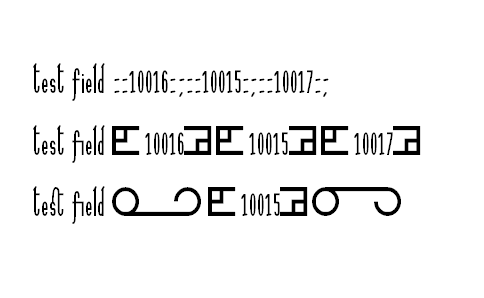
Then the test using the actual examples that I wanted to use in the research.

::10016:;

::10017:;

This is now amazingly successful.

Thank you for spotting the problem.

Earlier I wrote as follows.

I managed to get the sub colon colon → lsmbob; substitution to work in PagePlus X5 and the sub colon colon 3 → big3; seems to have been recognized in some way as, although the big3 glyph did not become displayed on the screen in PagePlus X5 at first, when I was deleting something it suddenly became displayed and I do not know how!

I have now realized that glyph 3 is the space, so it looks like I had got colon colon space on the screen at some stage.

Here is the new font and the OpenType code.
Ligatures 004.otf (21.4 KB)

script latn {
  feature Ligatures;
}

feature Ligatures liga {
  lookup LigaLookup;
}

lookup LigaLookup {
  sub f f i -> ffi;
  sub f f l -> ffl;
  sub f f -> ff;
  sub f i -> fi;
  sub f l -> fl;
  sub longs t -> longst;
  sub s t -> st;
  sub c t -> c_t;
  sub f j -> f_j;
  sub d a -> d_a;
  sub colon colon three four five six seven eight nine -> big9;
  sub colon colon three four five six seven eight -> big8;
  sub colon colon three four five six seven -> big7;
  sub colon colon three four five six -> big6;
  sub colon colon three four five -> big5;
  sub colon colon three four -> big4;
  sub colon colon three -> big3;
  sub colon colon one zero zero one six colon semicolon -> ls10016;
  sub colon colon one zero zero one seven colon semicolon -> ls10017;
  sub colon colon -> lsmbob;
  sub colon semicolon -> lsmbcb;
}

Thank you again.

William

Its better to attach the project file, then the opentype code is embedded in it — i.e. no need for anyone to copy/paste and create a project file. It also contains the font export settings, which as we learnt before, can stop a script from being used.

The forum accepts *.fcp files without zipping them. For large files or multiple projects, archive as *.7z with 7-Zip to reduce the size.

Excellent. I’m glad it works!

We’ve thought about automatically setting the export settings to use the custom script as soon as one defines it, but we haven’t implemented it yet.

I have just tried the original font in PagePlus X5.

I got it to work doing exactly precisely what I had told it to do! Although that was not what I had thought that I had told it to do!

I keyed colon colon space exclamation

Then it did not work with the double quote so I had to turn off the autocorrecting to smart quotes.

Then it worked!

Then numbersign dollar percent ampersand

An interesting experience!

William

Funny, but it also shows how powerfull the new OpenType layout features are!

It does show how easy it is to test OpenType features and debug scripts using FontCreator. I already prefer it to the OpenType Compiler, in spite of it not yet supporting some features that are supported in the OT Compiler. It is a lot more efficient to be able to correct the glyph names or scripts, and retest the changes in the Font Test Window, or use the WOFF test in Firefox, and see how the OT features interact with each other.

A warning: Experimental stuff like this is fine to test FontCreator and see what it can do, but don’t add features just for the sake of it. Give some thought to how practical it is, and how well your font will work if someone is using it in an application that doesn’t support OpenType.

In a post in this thread, timestamped at 25 Apr 2013 09:13 I wrote as follows.

Later in the same post I wrote as follows.

I refer to the following post in another thread.

Now, as it happens, I have been informed that encoding has been declined and I have been advised to use markup.

I do not want to use xml as I think, though I am not totally sure, that that would require the whole document to become an xml document.

I want a markup bubble within a plain text document.

I feel that using special characters would be the best, yet that has been declined, so I am now thinking about using a markup format of two colons followed by five (or more if needed) digits followed by a colon and a semicolon.

That way, the coding can be displayed in plain text.

I am now thinking of having a liga table for the markup bubble brackets and dlig for whole glyphs, which would require a total of nine characters to be glyph substituted, maybe more if the system expands, though nine will be enough for now.

I have not yet tested this out in a font, but I note that dlig is before liga in the default template.

Also, if the system is ever implemented, the markup bubbles would not usually be displayed as each markup bubble would become replaced at the receiving computer by a sentence localized into the local language.

I would prefer standardization of the list of localizable sentences to be done by a standards body, though that might not be possible.

William Overington

24 May 2013

I have now made a font Ligatures 006 with the following OpenType code.

script latn { 
    feature DiscretionaryLigatures;
    feature Ligatures;
}

feature DiscretionaryLigatures dlig {
    lookup dligSub;
}  

lookup dligSub {
    sub c t -> c_t;
    sub s h -> s_h;
    sub s t -> s_t;
    sub colon colon one zero zero one six colon semicolon -> ls10016;
    sub colon colon one zero zero one seven colon semicolon -> ls10017;
}

feature Ligatures liga {
    lookup ligaSub;
}

lookup ligaSub {
    sub f f i -> f_f_i;
    sub f f l -> f_f_l;
    sub f f -> f_f;
    sub f i -> fi;
    sub f j -> f_j;
    sub f l -> fl;
    sub d a -> d_a;
    sub longs t -> longs_t;
    sub colon colon -> lsmbob;
    sub colon semicolon -> lsmbcb;
}

I then tested the font using Serif PagePlus X5.


This graphic shows the display when three lines of the same text are formatted as follows.

upper line: dlig and liga both turned off
middle line: dlig turned off and liga turned on.
lower line: dlig and liga both turned on

Please note that dlig substitution has taken place before liga substitution.

William Overington

24 May 2013

A quick tip for changing the order of precedence of features.

My fonts have a bug in that if Standard Ligatures are enabled (which they are by default), Petite Capitals are broken, e..g.

firefox will be displayed as fiREFOX instead of FIREFOX.

To fix this, there is no need to edit the entire script. Just change the order of features so that the Small Capitals or Petite Capitals appear before the ligatures:

script latn { 
    feature PetiteCapitals;
    feature PetiteCapitalsFromCapitals;
    feature DiscretionaryLigatures; 
    feature Ligatures; 
}

My copy of Ligatures 004 seems to lack a glyph for the ‘sh’ ligature. Have you added some new glyphs since then?

Thank you for your interest.

Yes, I added the sh ligature because I did not have an sp ligature that was in the High-Logic default template code from which I started, so I changed it.

Here is the font.
Ligatures 006.otf (20.3 KB)
I got the sh ligature glyph from my Sonnet to a Renaissance Lady font that is available from its own thread in the Gallery section of this forum.

Most of the glyphs in the Ligatures 006 font all come from either the Sonnet to a Renaissance Lady font or from the Localizable Sentences 034 font. The exception is that I made the da ligature specially. This is because I wanted a non-standard ligature to test the font in PagePlus X5.

There is a list of ligature code points that I devised some years ago.

The basic characters for the series of Localizable Sentences fonts all came from the Sonnet to a Renaissance Lady font some years ago..

William

That is interesting. I had not realized that the font can change the order of precedence.

Thank you.

William

Thank you. I have downloaded the new font and shall have a play with it.

An experiment that I tried when testing the Ligatures 006 font was as follows.

Install the Ligatures 006 font. I used a temporary installation by double clicking on the file name of the font in Windows Explorer, the font not being in the fonts directory.

Open PagePlus X5.

Start a new publication using A4 landscape.

Draw a large text frame.

Go to 100% magnification.

Click in the text frame and type the word test.

Highlight the word test and format it to the font Ligatures 006 at 24 point.

Keeping the word test highlighted, use Format Character to open the dialogue panel.

Click on the + sign that is to the left of the word OpenType.

Click on the word Details.

Add a tick to the checkbox that is to the left of the word dlig, by clicking on the checkbox.

Add a tick to the checkbox that is to the left of the word liga, by clicking on the checkbox.

Click OK.

Note that the word test now has an st ligature glyph in it.

Click immediately to the right of the word test.

Press the spacebar.

Slowly key the following characters, one at a time, observing what happens to the display.

::10016:;

That is, colon colon one zero zero one six colon semicolon. This note is just because the colons and the semicolon may not be displayed that clearly in this forum post.

The interesting thing is that after the colon colon, the glyph for the localizable sentence markup bubble opening bracket is displayed, but that substitution does not stop the later substitution for the whole nine character sequence.


Please open the file glyphnames.dat in WordPad.


Considering all of this, I thought of the following possibility.

Suppose that, hypothetically, PagePlus had an extra checkbox for an OpenType table that has precedence over dlig.

Suppose, however, that that table is not a table supplied by a font but is a table in a .dat file supplied with PagePlus.

Suppose further that that table is not in the same format as a dlig table but is in a format such that one example line is as follows.

::10016:; The following question has been asked.

If the checkbox for using that table were checked, then when the sequence ::10016:; were detected, the text after the first space on the line would be used to replace the ::10016:: in the display.

Now, as the OpenType system would simply be replacing ::10016:; by whatever text was on the line after the first space, the text in the file could be in any chosen language.


The system would be updateable when more sentences were published in a standards document by updating just the .dat file.

Now, although I have done some scientific programming I do not know how to implement the above idea myself, so I do not know how straightforward or difficult it would be for an expert programmer with the specific skills and knowledge of both programming and OpenType software to implement the above idea.

If any reader tries the experiment using a software application other than PagePlus X5, it would be helpful if he or she could please post the results of the experiment in this thread.

William Overington

25 May 2013

This morning I have made a test font using what I have learned in this thread, what I have learned in the following thread and trying some of the glyphs that I made yesterday.

It works well in Serif PagePlus X5.
Ligatures_006_plus_aalt.otf (21 KB)

script latn { 
    feature DiscretionaryLigatures;
    feature Ligatures;
    feature AccessAllAlternates;
}

feature DiscretionaryLigatures dlig {
    lookup dligSub;
}  

lookup dligSub {
    sub c t -> c_t;
    sub s h -> s_h;
    sub s t -> s_t;
    sub colon colon one zero zero one six colon semicolon -> ls10016;
    sub colon colon one zero zero one seven colon semicolon -> ls10017;
}

feature Ligatures liga {
    lookup ligaSub;
}

lookup ligaSub {
    sub f f i -> f_f_i;
    sub f f l -> f_f_l;
    sub f f -> f_f;
    sub f i -> fi;
    sub f j -> f_j;
    sub f l -> fl;
    sub d a -> d_a;
    sub longs t -> longs_t;
    sub colon colon -> lsmbob;
    sub colon semicolon -> lsmbcb;
}

feature AccessAllAlternates aalt {
    lookup AccessAllAlternates;
}

lookup AccessAllAlternates {
    sub ls10016 -> [ls10016.alt];
    sub ls10017 -> [ls10017.alt];
}

William Overington

19 November 2013

I can kinda see what you are doing, but the Access All Alternates (aalt) is not supposed to be used as a regular feature. It’s meant to be used as an alternative access to substitutes that would not be accessible for features that are not supported by the host application. See Registered features, a-e (OpenType 1.9.1) - Typography | Microsoft Learn for more info about aalt. You’d be better of using ‘salt’ or ‘calt’.

Thank you.

I will try to make another font using salt instead of aalt.

William Overington

22 November 2013

Here is the font.
Ligatures_006_plus_salt.otf (21 KB)
It works well in Serif PagePlus X5.

script latn { 
    feature DiscretionaryLigatures;
    feature Ligatures;
    feature StylisticAlternates;
}

feature DiscretionaryLigatures dlig {
    lookup dligSub;
}  

lookup dligSub {
    sub c t -> c_t;
    sub s h -> s_h;
    sub s t -> s_t;
    sub colon colon one zero zero one six colon semicolon -> ls10016;
    sub colon colon one zero zero one seven colon semicolon -> ls10017;
}

feature Ligatures liga {
    lookup ligaSub;
}

lookup ligaSub {
    sub f f i -> f_f_i;
    sub f f l -> f_f_l;
    sub f f -> f_f;
    sub f i -> fi;
    sub f j -> f_j;
    sub f l -> fl;
    sub d a -> d_a;
    sub longs t -> longs_t;
    sub colon colon -> lsmbob;
    sub colon semicolon -> lsmbcb;
}

feature StylisticAlternates salt {
    lookup StylisticAlternates;
}

lookup StylisticAlternates {
    sub ls10016 -> [ls10016.alt];
    sub ls10017 -> [ls10017.alt];
}

William Overington

22 November 2013

There is a new research publication.

William Overington

17 February 2014