I feel like such a moron! On the one hand, I know WAY more about type design than the average non-typophile, and yet compared to most type designers out there I feel like I know next to nothing at all.
About 15 years ago, I started designing a blackletter font in Fontographer – which, of course, eventually went caput. I put it aside, and then about a decade or so ago, I started working on it again in FontCreator (v. 5)… but then eventually backburnered it once again. It’s only just in the last couple of weeks that I thought I’d take another stab at it and see if I could finally get it finished, and upgraded to the latest version of FC (v. 10).
I’m so confused about where, and how, to insert several ligatures that I have – never mind doing the lookups for them (which I used to do in FontForge), I’m not even at that point yet, all I want to do is insert a few extra characters.
I don’t understand the “insert character” dialog box. Like, it asks you to choose another font to grab a character from – huh? I don’t get that. Is there no standardized list of characters that can be inserted into a font? Why is it based on a pre-existing font?
I did find the slots for certain ligatures – for example, fi, ffi, ij – but with this being an old blackletter-style font, the use of the long-s is VERY important, and I have a bunch of additional ligatures for that.
How do I go about adding them in? I also have one (perhaps more to come) ligature that doesn’t exist in any other font that I have – rr (where one r looks different) – and I’m clueless where/how to insert that one.
I feel so stupid, that I can’t seem to figure this out on my own (let alone searching the forums here – not to mention google – seems to be of no avail). I’m amazed that there’s no tutorial – for dummies, no less – on how to do this.
Can anyone please help? Thanks so much, in advance!
The Insert Character dialog lets you use a display font. This should be one like MS Unicode that contains as many mapped characters as possible so that you can choose them visually without knowing the code-points. The glyph outlines are not inserted. New glyphs are created that use the chosen characters’ mappings and glyph names. Afterwards, you can generate some glyphs using Complete Composites, e.g. longs might use lowercase f as a starting point, so you just delete the extending arm to make it look like a longs.
If you have the Pro version, use the Glyph Transformation script for “Ligature Collection.” If not, just paste this into the Insert Characters dialogue: $EEC5, $EEC8-$EED0, $EED9-$EEDC, $FB00-$FB06 (61125, 61128-61136, 61145-61148, 64256-64262 decimal code-points)
The longs ligatures for historical ligatures are mapped to the Private Use Area. The Medieval Unicode Font Initiative made several proposals, but I think most haven’t been accepted yet.
Any other ligatures that you need can be added in the Private Use Area, or as unmapped glyphs. Unmapped glyphs can usually only be accessed with OpenType substitutions.
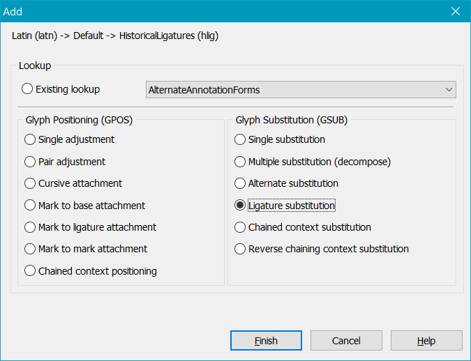
Several of my own fonts contain an Historical Ligature feature that uses a glyph substitution lookup like this:
lookup HistoricalLigatures {
  sub A A -> AA;
  sub A O -> AO;
  sub A U -> AU;
  sub A V -> AV;
  sub A Y -> AY;
  sub O O -> OO;
  sub V Y -> VY;
  sub a a -> aa;
  sub a o -> ao;
  sub a u -> au;
  sub a v -> av;
  sub a y -> ay;
  sub o o -> oo;
  sub s s i -> longssi;
  sub s s l -> longssl;
  sub s t i -> longsti;
  sub s t r -> longstr;
  sub s b -> longsb;
  sub s h -> longsh;
  sub s i -> longsi;
  sub s k -> longsk;
  sub s l -> longsl;
  sub s p -> longsp;
  sub s s -> longss;
  sub s t -> longst;
  sub s adieresis -> longsadieresis;
  sub s odieresis -> longsodieresis;
  sub s udieresis -> longsudieresis;
  sub s -> longsudieresis;
  sub v y -> vy;
}
So, if users type “si” with the feature enabled, they get longsi ligature, etc.
I don’t have MS Unicode on my system. Is this the font you mean?..
Pretty steep price on that, at “only” $370! Yikes!
If you have the Pro version, use the Glyph Transformation script for “Ligature Collection.” If not, just paste this into the Insert Characters dialogue: $EEC5, $EEC8-$EED0, $EED9-$EEDC, $FB00-$FB06 (61125, 61128-61136, 61145-61148, 64256-64262 decimal code-points)
I do have the pro version, but I couldn’t find any script for “Ligature Collection.” Do you mean by going under Tools → Glyph Transformer?
I tried instead the second method you suggested, i.e. Insert → Characters, and then in the “Codepoints” box at the bottom I just copied/pasted what you wrote above ($EEC5, $EEC8-$EED0, $EED9-$EEDC, $FB00-$FB06). That added in 17 slots for new characters to the end of my character set (not sure if I’m wording that correctly), including three that are already named (ff, ffl and st).
So apart from those three already-named ones, do I just use use the other slots as I see fit, I just put whatever I want in whichever slots?
Any other ligatures that you need can be added in the Private Use Area, or as unmapped glyphs. Unmapped glyphs can usually only be accessed with OpenType substitutions.
I understand (I think) “Any other ligatures that you need can be added in the Private Use Area,” but all the rest I’m too much of a neophyte for.
I’m not quite sure that I understand this OpenType thing. Like, I have TTF fonts that have TONS of alts and ligatures, and they work just fine, they’re not OTF fonts – I thought those were two different font formats. Or are TTF fonts basically OTF fonts? Is it basically simply a different file extension?
Pardon my cluelessness. I also don’t know how to add in unmapped glyphs, too – it seems as though in the “insert character” dialog box you have to specifically choose particular characters/slots that already exist, but how do you add in just an unspecified “unmapped glyph”?
Thanks, I took a peek at the links, and also searched this forum here, but one other thing that I can’t figure out how to do is the lookups for each ligature. Looking what the FC manual has to say about lookups is virtually useless. There’s a whole section on lookups starting at p. 110, but I have absolutely no idea what any of it means, or what those little snippets of code are referring to.
I guess that’s what I meant by a “for dummies” tutorial. It’s beyond me why someone can’t just write something that says “Do this, then do this, then do this, and that’s how you accomplish what you’re trying to do.” That’s how I learned how to do lookups in FontForge – but naturally it would be nice to be able to do everything right in FC instead, of course.
Several of my own fonts contain an Historical Ligature feature that uses a glyph substitution lookup like this:
Oh, wow! You really went all out, eh? You made ligatures for things like AA, AO, etc.? That’s rather unusual.
Interesting, too, that you automatically substitute longs in place of s like that – in a way that’s handy, but I don’t think I’ll do that for my font. Interesting idea, though!
Thanks again for your help, Bhikkhu – at least I’ve got 17 additional slots in my font now. That’s a start!
It used to be shipped with Microsoft Word (and Office), but not anymore. You could use Segoe UI if you are mostly interested in Latin based characters.
I thought it was installed by default for many users, but apparently no longer. There are many others that are free. Junicode has good coverage of Medieval ligatures.
That’s what I meant. Click the folder icon to open existing scripts. I don’t recall if Ligature Collection is included with a default installation.
Pretty much, but some systematic method is best. Be aware that FontCreator’s complete composites feature uses a lot of code-points in the PUA area for it’s own purposes. See the Appendix in the PDF tutorial on the Tutorials page on Complete Composites. We’re currently working on something to avoid the need to use PUA codepoints.
To create a font that is easy to use it’s important to understand how to use OpenType features. Not all applications support them, but no one want to keep hunting and pecking to insert ligatures or other special glyphs like Small Capitals or Ordinals.
Insert glyph will insert one or more unmapped glyphs with a generic name generated from the glyph index like _2667. If, say, you wanted to create an rr historical ligature, you could rename it as rr.hlig and add an OpenType Historical Ligature feature (like my code above) to automatically replace “rr” typed by the user with the single “rr.hlig” glyph. The text string as copied from a PDF file or word-processor would still be “rr” so “error” won’t produce a spell-check warning, and the text will still display in any application, even if it does not support OpenType features.
However, in OpenType aware applications, the rr ligature form would be displayed instead of rr.
I find that I learn best by clicking buttons in dialogues and looking at tooltips and text in context. If the manual tried to explain every little step it would be so verbose that no one would read it.
Then maybe you don’t need OpenType feature for your font at all? If you’re happy for users to hunt and peck in a glyph palette to insert each longs or to hold down the Alt key and type 0383. I would not want to use such a font if I had a real project that needed to be published.
I have no idea where you’re seeing these screenshots – is this supposed to be in that Glyph Transformer thing? Because it’s not in mine (I just downloaded v. 10 last night).
I’ll reply to your previous reply shortly – I just woke up from a nap and badly need some coffee first.
You can enter the magical world of OpenType layout features through the OpenType Designer. On the main menu select Font, and then click OpenType Designer.
There is nothing there, because your font has no OpenType features yet.
You can click the “Code Editor” button at the bottom, and you’ll be asked if you want common OpenType features. That might be a good way to start experimenting with it.
Re MS Unicode, while searching for it earlier I think I read that it comes installed with certain MS software, like Word, Excel, etc. – none of which I have (I use WordPerfect as my word processor, among other programs).
I did google, find and download Junicode, though! Looks like a pretty nifty font, actually (if only for the “completeness” of its character set).
That’s what I meant. Click the folder icon to open existing scripts. I don’t recall if Ligature Collection is included with a default installation.
Unless I’m looking in the wrong place, I don’t think it is there by default.
[Aha! Erwin just answered that question, how to get it there!]
Be aware that FontCreator’s complete composites feature uses a lot of code-points in the PUA area for it’s own purposes. See the Appendix in the PDF tutorial on the Tutorials page on Complete Composites. We’re currently working on something to avoid the need to use PUA codepoints.
I have no idea what “PUA codepoints” are.
To create a font that is easy to use it’s important to understand how to use OpenType features. Not all applications support them, but no one want to keep hunting and pecking to insert ligatures or other special glyphs like Small Capitals or Ordinals.
Understood.
Insert glyph will insert one or more unmapped glyphs with a generic name generated from the glyph index like _2667. If, say, you wanted to create an rr historical ligature, you could rename it as rr.hlig and add an OpenType Historical Ligature feature (like my code above) to automatically replace “rr” typed by the user with the single “rr.hlig” glyph. The text string as copied from a PDF file or word-processor would still be “rr” so “error” won’t produce a spell-check warning, and the text will still display in any application, even if it does not support OpenType features.
However, in OpenType aware applications, the rr ligature form would be displayed instead of rr.
Understood, too.
Re your mentioning switching out a regular s for a longs instead…
Then maybe you don’t need OpenType feature for your font at all? If you’re happy for users to hunt and peck in a glyph palette to insert each longs or to hold down the Alt key and type 0383. I would not want to use such a font if I had a real project that needed to be published.
Well, one of my main interests in recent years has been ebook design, and most readers do render ligs, etc. automatically. I didn’t even know that was possible, actually (that certain software could render those “on the fly” like that), until I got into designing ebooks!
One thing that really surprised me just now – and also from what you said earlier about what you do (if I understood you correctly) – is that when I went in the OpenType Designer and automatically entered in all the usual “common features,” it added in switching out a regular s for a longs (under “HistoricalForms”). You don’t want to do that, though! Not every single s in these old texts (which is what I’ve been making into ebooks) should be swapped out for a longs – just as with the use (and substitution of) u and v in those old texts, it depends on placement (and occasionally context). And so if I’m doing up a text where the longs is used at all, then I insert that as a longs – just as I also have to manually insert u or v wherever appropriate.
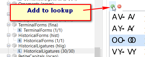
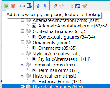
With that said, I think I might be able to make some headway with this now – yippee! The only question for the moment that I have, though, is if I start adding in more unusual ligatures (like that rr one I mentioned before), where do I put them? Running that wizard thing just now (that Erwin mentioned), in my font it added in stuff under…
DiscretionaryLigatures
Ligatures
HistoricalLigatures
HistoricalForms (the only item here is swapping out longs in place of s – which, as I said above, I think is a terrible idea to do automatically, because it invariably inserts errors throughout the document)
For any new ligs I make/add in, how do I know where to put them, as far as those four categories go? Like, would that rr lig that I made go under DiscretionaryLigs, or HistoricalLigs?
That’s it for the moment – however briefly. I’m sure I’ll be back again.
There is a problem with Microsoft Word. It doesn’t allow discretionary ligatures to be turned on independently of historical ligatures (which is a really stupid design decision in my opinion) so you can only have both or neither.
As many users of fonts will be using them with Microsoft Word this is a problem.
I eventually put the discretionary ligatures for ‘Kelvinch’ in as contextual ligatures which can be switched on with standard ligatures (i.e. you can have standard ligatures or standard + contextual). I know this isn’t the way you are supposed to use contextual ligatures but it solves the problem.
Yes I agree that MS Word is not a good solution but one must be realistic, more than 90% of the people using your fonts will be using them with MS Word.
I think 90% of those users out there probably don’t even know what a “serif” is, let alone what “opentype features” are – heck, even I am only now starting to grasp the concept of the latter (thanks to this thread), even though I’ve been interested in printing history and typography for decades and making use of those “features” for years now (despite not entirely understanding them, apparently), and even after years of dabbling off-and-on with type design. And so I don’t think one needs to overly concern oneself too much with whether or not users out there will be able to access certain characters because not only are they not even looking for them, but I dare say that even if you told them that they were there, and available to use, they wouldn’t be interested in availing themselves of them anyway.
By the way, I did want to say thank you – very much! – for the help here with my original query! Even just looking at the program, I can see that I still have a LOT to learn about FontCreator (and type design in general), but you’ve given me a really good start in resolving that major hurdle re those ligs. Thanks a bunch!