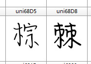
As shown in the picture, the glyph on the left is thin and the right is thick. How to make all the glyphs look even? How to realize batch operation? I have a lot of glyphs to deal with. I’m too tired if I do it by hand.
Is there a master who can help me? Thank you very much!
Sorry,that’s not what I mean. I’m not sure which is thick and which is thin, because I have nearly 7000 glyphs. So I want to pick out the thin glyphs in batches.
Why are some of your glyphs thinner? Were they copied from another font?
If the lighter glyphs were added at the end of the font then sorting the font by glyph index instead of code-point might help you.
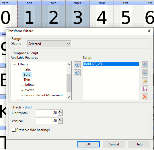
Otherwise, there is no automatic way to decide which glyphs are too light, and by how much. You can measure individual horizontal and vertical strokes to calculate the desired weight increase required, but selecting the glyphs will have to be done manually.