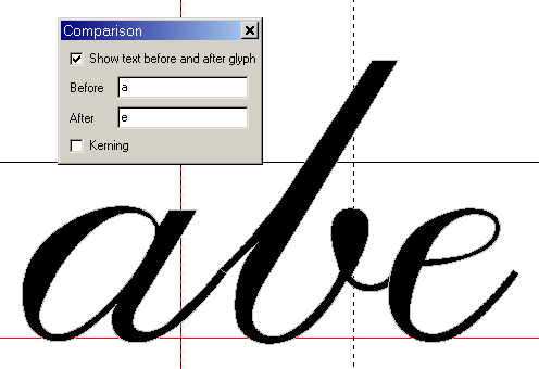
Look at some existing script fonts to see how the professionals do it. Use the Comparison Toolbar (F11) to see how different letter pairs will look together. Scroll through the font with Alter + Left/Right Cursor. Adjust the right side-bearings to change the advance width of each glyph before trying to use kerning. Try not to rely on kerning to get the spacing right. Not all programs support it, and some users will turn it off anyway. Lowercase letters should join neatly without kerning.
For details, see Dave Crosby’s tutorial on Joining Flowing Scripts