The following thread is of interest in relation to the previous post in this thread.
The thread is entitled
Finding the code point of a character
and it references the above post in this thread.
William Overington
8 February 2016
The following thread is of interest in relation to the previous post in this thread.
The thread is entitled
Finding the code point of a character
and it references the above post in this thread.
William Overington
8 February 2016
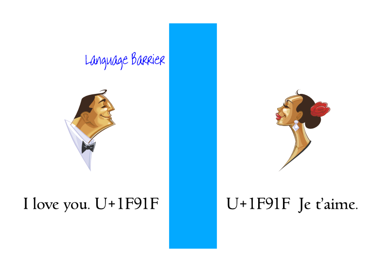
An everyday analogy to compare and contrast methods of communication of meaning through the language barrier.
I am trying to develop an everyday analogy so as to compare and contrast methods of communication of meaning through the language barrier.
I am considering the following four methods at present:
by using human translation by a translation expert,
by human translation by someone with general education level knowledge of translation,
by machine translation,
by localizable sentences.
I am thinking of an analogy of moving freight by road or by rail.
Human translation by an expert would be analogueized as a dedicated door to door lorry service.
Localizable sentences would be analogueized as railway transport.
I write to seek views please as to whether that analogy helps convey what I am trying to achieve with localizable sentence technology.
I would expect to add details of the relative advantages and disadvantages of each of the options in various situations, including such factors as:
the accuracy in conveying meaning,
the financial cost of conveying meaning,
the timeliness of conveying meaning,
the readily-availableness of conveying meaning.
However, for the moment, I seek views of how the analogy appears to work or not work please.
William Overington
2 March 2016
Does that mean the same as “analogous to”, or is there a subtle difference? 
I presume you mean “ready availability”. 
I’m sorry to say that it doesn’t work for me. 
BTW, William, your posts would be easier to read if you were to avail yourself of the markup features provided here. For example, you wrote:
Perhaps it’s just me, but I think it 's clearer when formatted as follows:
I am considering the following four methods at present:
- human translation by a translation expert;
- human translation by someone with general education level knowledge of translation;
- machine translation;
- localizable sentences.
Thank you for replying. This is very helpful.
So my original and the new version would be as follows.
Localizable sentences would be analogueized as railway transport.
Localizable sentences would be analogous to railway transport.
Are those the same?
I had not thought of that when I wrote the sentence.
Firstly, I did at the time wonder if there is an existing word analogueized yet thought that it conveyed what I was trying to say, so I used it.
I should have checked the dictionary at the time!
So that is not listed as such.
Well, I am unable to quite explain why at the moment, yet I do think that there is a subtle difference, in that “analogous to”, to me, perhaps implies a two-way analogous relationship, and “analogueized as” implies a one-way only relationship.
For example, one could have the voltage in a particular resistor and capacitor network as analogous to the temperature in a physical object, such as a brick.
So that if one raises the voltage at the edge of the network, that is analogous to the temperature of the outside of the brick being heated. For example, as sunshine falls onto the brick in the morning.
One can then measure the way that the voltage somewhere else in the resistor and capacitor network varies with time and relate that to how the temperature at some known point within the brick varies with time.
The simulation need not be in real time: for example, maybe the simulation runs at a thousand times faster than the heating of the brick.
Having established the basic calibration of the analogy, bigger simulations can then be performed, such as cycling the brick through the outside temperatures of a year’s weather.
There is a lot more to it than that, but just mentioned so as to give an idea of the distinction of meaning that I am perhaps sensing.
Whereas with “analogueized as” there is not such a detailed correspondence and maybe only to a subset rather than to the whole thing.
I was trying to get at the concept that localizable sentences could in some circumstances be very convenient for localization of the meaning that one wishes to convey, though only where there is a pre-planned existing collection of sentences for a particular purpose, such as, for example, talking about the weather; for example, seeking information about relatives and friends after a disaster; just as railway transport can be very convenient if there is already track laid to where one wants to go. So sending a large quantity of something to London from a town that is on the railway could be very convenient, yet some other transportation needs would just not be possible using the railway system.
Yes, you are correct. Oops.
Thank you.
Thank you for your comment.
That is very helpful.
I was thinking of using the analogy in a presentation about standardization to try to convey why I feel that localizable sentence technology would be useful. If it does not work, then it is best not used.
Yes, that is a good idea. Thank you.
William
I am researching on trying to produce a mathematical model of the language barrier.
This is part of my research on communication through the language barrier using a collection of whole sentences each encoded as a Unicode character.
Here is a link to my research notes page.
The page is linked from the following page.
In the Trying to produce a mathematical model of the language barrier page,
I have produced various document elsewhere in relation to the invention itself.
Many of those documents are available from links in the library.htm page mentioned above.
William Overington
Wednesday 27 April 2016
I have for some time been writing a novel based around my ideas on using encoded localizable sentences for communication through the language barrier.
I have been publishing each chapter on the web as I proceed. Each chapter is published in PDF (Portable Document Format) format. There is no overall plan for the novel, I just tried to start writing. As I proceeded I have been sending each chapter to the British Library as an email attachment for legal deposit and receipt has been acknowledged, so the novel is archived as part of the British Library’s collection.
Some readers of this thread may like Chapter 5 of the novel where there are a number of illustrations of symbols, each symbol designed by me and included in the PDF document by using a font that I made using Font Creator.
localizable_sentences_the_novel_chapter_005.pdf (29.9 KB)
29.90 kilobytes
The illustrations are included direct from a font (that is, not by making a png graphic and embedding the graphic in the PDF document) and I used a Private Use Area mapping for the symbols.
I find it interesting that this is only possible because of the way that (many? all?) personal computer operating systems these days are designed so that fonts are all in a common font folder and application programs each use fonts from that common folder and that the same font formats are used by (many? all?) producers of software packages.
If any reader would like to have a look at the rest of the novel, there is a web page from which all the chapters and a few other files are linked, though most of the novel does not feature fonts and the novel also ranges over other topics as well as localizable sentences, yet maybe some readers might enjoy the novel and find interest in the topics that are mentioned.
William Overington
Friday 17 February 2017
Edited on Friday 3 March 2017 to include the size of the PDF document as being 29.90 kilobytes.
I noticed the following web page.
http://unicode.org/emoji/charts/emoji-candidates.html
On that web page is the following.
http://unicode.org/emoji/charts/emoji-candidates.html#1f91f
I also found the following.
http://unicode.org/pipermail/unicode/2016-February/003343.html
http://unicode.org/pipermail/unicode/2016-February/003344.html
Now certainly the encoding of that symbol is not being suggested as the encoding of a localizable sentence, yet I find it interesting to compare and contrast that symbol and its potential application for communication through the language barrier with the symbols that I am suggesting for communication through the language barrier. Certainly the symbols that I have suggested cannot be expressed in a personal encounter using a hand gesture, though they could be available printed on card, though that is not so convenient as a hand gesture.
Yet when sent as encoded symbols using an electronic communication link there are more similarities between the proposed U+1F91F and the symbols that I am suggesting.
Some readers might like to have a look at the idea for a movie in Chapter 17 of my novel where the symbols for communication through the language barrier would be printed on card. Could hand gestures be used there? Sometimes?
http://www.users.globalnet.co.uk/~ngo/localizable_sentences_the_novel_chapter_017.pdf
Going back to the symbol for the proposed U+1F91F character, given that there can be font variation in implementing symbol images I am wondering if a stylized graphic symbol might be useful in order to achieve a clear display on some mobile devices.
William Overington
Monday 20 February 2017
Some readers might like to have a look at this research document relating to localizable sentence technology that I have produced.
barcode_001.pdf (36.6 KB)
36.59 kilobytes
William Overington
Tuesday 28 February 2017
Note added on Friday 3 March 2017 mentioning that the size of the document is 36.59 kilobytes.
Link to the relevant code chart:
William Overington
Saturday 24 June 2017
On Wednesday 21 September 2016 I published Chapter 19 of my novel.
http://www.users.globalnet.co.uk/~ngo/localizable_sentences_the_novel_chapter_019.pdf
In order to produce that chapter I made a special experimental font. LOCSE936.TTF
This was started from a copy of LOCSE034.TTF, a font produced by me that is published on the web.
The 9 was because it was an out of sequence experimental font. It was not LOCSE935.TTF because that had been use for some other experimental purpose, I forget what.
Well, recently, in July, my laptop computer crashed and I bought another laptop computer.
Alas, I had not archived LOCSE936.TTF. I should have done but I had not done so. I often archive things not yet published by sending myself a webmail with the font as an attachment, so then I can recover things from my webmail account. However, for LOCSE936.TTF I had not.
So I decided to produce a font to have the same characters, matching a far as I could the additional glyphs of LOCSE936.TTF as conserved in the above linked document, which has all of them except the circled zero.
I decided to use a new font name Localizable Sentences 971 and file name LOCSE971.
I had thought of using LOCSE937.TTF but I chose to use LOCSE971.TTF in case I needed to iterate the design to get it right, which I may still need to do as I have only done a few checks thus far. Then I could use LOCSE972.TTF and so on as needed.
Fortunately LOCSE034.TTF had all of the digit character glyphs in the Private Use Area at U+ED80 through to U+ED89.
I adapted a copy of the glyph for O for the circle, which may possibly be what I did before.
I adapted a copy of the glyph for f for the integral sign, which is what I did before.
I made a print screen image of an enlarged part of the display of the above linked document, consisting of a display of the integral sign, three circled digits and a capital letter from the Goudita SF font used for the text in the publication so as to try to get the alignment correct.
I worked out that the digits sit on the baseline and the glyphs are 13 units high by 11 units wide, with the unit being 128 font units and that I needed to scale the digits glyphs by 50% both horizontally and vertically.
The circle took a few goes to get correct. I deleted all of the on-curve points, then moved the off-curve points, then added on-curve points back in at the correct places, which is quite straightforward in this particular situation by using w and a to move around the contour and add an on-curve point respectively.
So here is the font.
LOCSE971.TTF (120 KB)
If anyone can think of a way to check out how well the glyphs of the new font match the glyphs of the old font, perhaps detecting any differences between the two I would be interested to know of the technique and the results please. I am wondering particularly about the integral sign.
William Overington
Thursday 3 August 2017
Here is a font with two symbols in it. They are my own designs. They are for Hi! and Bye!. They are intended for informal communication through the language barrier.
I have been using the symbols in the following thread to produce a design for a tote bag.
The font is an OpenType font, made with FontCreator 8, and the two glyphs can be accessed directly at U+E716 for Hi! and U+E718 for Bye! from a symbol selector dialogue panel in an application (provided that the application has such a dialogue panel) and can also be accessed in an application (such as a desktop publishing application) where the liga table is switched on by typing !176 and !178 respectively in the application.
William
Saturday 6 July 2019
hibye002.otf (15.3 KB)
Here is a link to a feature where I have used a special-purpose glyph in a font that I produced using FontCreator to produce a design.
Here is a link to a page that has a link to the font.
The glyph is also displayed in the following chapter of one of my novels.
http://www.users.globalnet.co.uk/~ngo/localizable_sentences_the_novel_chapter_079.pdf
William