I noticed that you have posted again after your post to which I am now replying. I am pleased that your original problem is now resolved. Thank you for publishing the answer.
In relation to some points you raise, here are my thoughts. Hopefully they may be of help in some way.
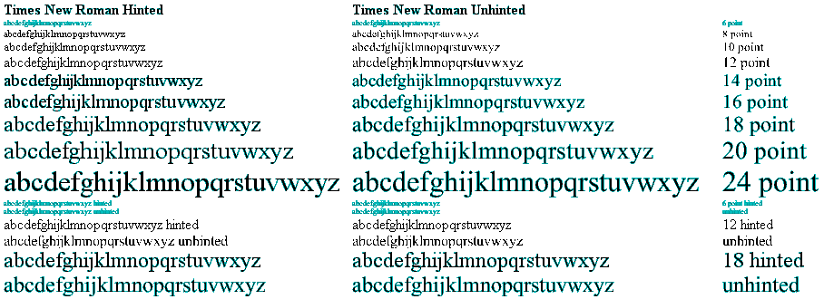
Thanks for the post. I have downloaded your font and tried it. I found that at 14 points, the length of a text string displayed in Wordpad was longer than the same text string displayed in Font Creator’s Preview window. (By about 2/3 of a character in a 40 character string).
I presume as you created your font using FC5 that it does not contain any hints.
That is correct as such. However, I do use a technique of my own which I call mathematical pseudohinting whereby I line up some verticals and horizontals with a 256 font unit grid so as to make the on screen display more predictable at 12 point, 18 point and 24 point. That technique is, I feel, successful: however, it does mean that Quest text can look awful at some on screen sizes such as 14 point!
Does this suggest then that there is some other reason why fonts display different lengths between the FC5 preview and Wordpad? Any ideas?
Only in that as you mention the 14 point size and not the 12 point, 18 point and 24 point sizes, the thing is that Windows uses 4/3 times point size to give size in pixels. So 12 point is 16 pixels, 18 point is 24 pixels and 24 point is 32 pixels yet 14 point would be 18.667 pixels so rounding needs to take place. Point size is vertically, yet horizontally it is also 4/3 * point size * glyph width in font units / 2048 to give pixels. So a glyph 256 font units wide is 2 pixels at 12 point, 3 pixels at 18 point and 4 pixels at 24 point, yet would be 2.333 pixels at 14 point, so some rounding is needed. As Quest text has all glyphs a multiple of 256 font units wide, 12 point, 18 point and 24 point need no rounding, yet at 14 point, most would need some rounding. So, if the rounding were done differently as between programs using the font then different results might be obtained.
Quest text, due to its design rule of all glyphs being a multiple of 256 font units wide, may show the effect more than some other fonts.
Did Quest text respond to the test at 12 point, 18 point and 24 point with no difference in string length detectable please?
William