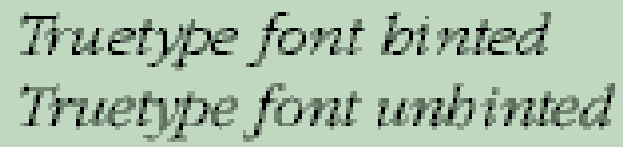
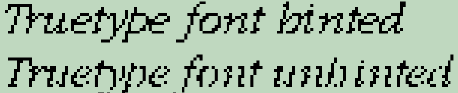
This could be because the font is too spindly, but it more likely because of the lack of hinting information. Font Creator doesn’t yet support characer hinting, which adds pixels at small sizes to thicken lines that would otherwise disappear or be just a single pixel. E.g if font scaling would give a stroke thickness of 1.5 pixels, hinting will scale it up to 2 pixels.
Without hinting, Windows will use grayscale to add a grey pixel where necessary. This is what makes the font look pale on the screen, compared to hinted fonts, but it smoother and easier to read than with greyscaling turned off.
Hinting is important only on screen, at normal or small sizes. When it comes to printing on high-resolution printers, all hinting information is dropped, so it makes no difference.
If the problem is due to the font being spindly, you can use the transform wizard to embolden the font, but this feature is not yet in the official release. If you are comfortable with using beta software, it is available here.
Nice explanation by Vanisaac about greyscale. You can turn off font smoothing in Window Control Panel too.
Hinted and Unhinted 12 pt Fonts, no Font Smoothing
Hinted and Unhinted 12 pt Fonts, with smoothing