Superscripts can be scaled from the existing figures in a font, but if we just scale them, they will be too light compared to the rest of the font.
First, measure the weight of digit 1.
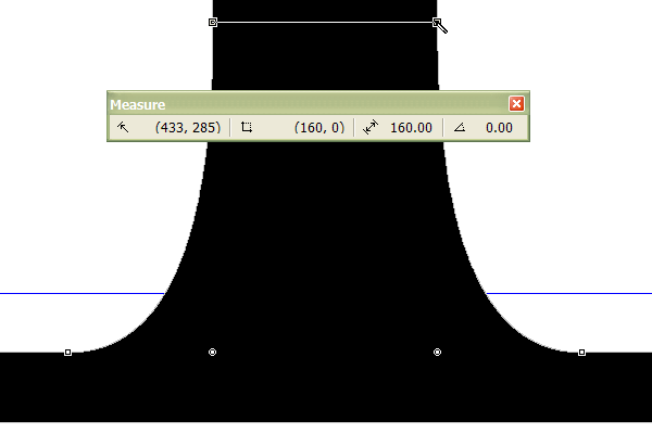
In this font it is 160 funits. If the superscript transformation scales this by 65% horizontally it will be only 104 funits. To compensate, we need to use the bold transform with a horizontal value of 28 funits. This will thicken the stroke by 28 funits in both directions, resulting in a vertical stroke of 160 funits — 104 + 28 + 28.
The horizontal strokes in this font are 140 funits. If the vertical scale factor is 60% the vertical transformation would again need to be 28 (140 - 84)/2
This illustration shows the original digit 2, the digit 2 after scaling (centre), and the digit 2 afer scaling and bold transformation (right).

You can see that with scaling alone, even though we compensate by scaling 65% horizontally but only 60% vertically, the superscript is too light. The weight of the superscript is correct after the bold transformation has been applied. However, the thin strokes and serifs are now too heavy. We need to adjust them manually by moving a few nodes.

Each font will need a slightly different transformation. The superscript transformation installed with FontCreator only suggests average values. You may also prefer to raise the superscripts higher. The transformation is designed to align the tops of superscripts with the tops of numerals. 1¹
The width of the superscripts can be calculated from the figure width. If the figure width is 1000 funits, the superscript width should be set to 650 + 56 funits = 706 funits.
Subscripts
After you have made the superscripts, you can use the Subscript Transformation to insert the Subscripts. This merely creates composites of the superscripts, and moves them down by a fixed value as defined in CompositeData.xml. The most useful position for subscripts as recommended by Microsoft Typography is subscripts that are bisected by the baseline. Depending on the size and height of the superscripts in your font, you will have to adjust them all vertically by the same amount. The widths are normally uniform, and the same as the superscripts.
Superscripts and Subscripts in Italic typestyles may need to be offset horizontally to compensate for the italic angle. The recommended position is centred between figure zeros.