Shouldn’t the italic angle control be disabled when the ‘Italic’ checkbox is unchecked? ![]()
The OS uses that angle setting for angling the cursor.
What about a font that isn’t designed to be an italic but still has a slant to it (I have some). Wouldn’t it still be useful for the OS to present an angled cursor on a “Regular” style that has slanted tension in the design?
Mike
Is that what that’s for – or supposed to be for, anyway? My OS doesn’t angle the cursor over italicized text.
The OS reads and makes available that information to the application. It is then up to the application to utilize that information. Some do, most don’t use that particular information.
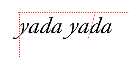
One such application that does…the red slanted vertical line is the text cursor.
This is like some of the other information that most applications often discard. Things like underline position/thickness, strikeout position/thickness, etc., are often ignored. Some applications also don’t use the as-designed underscore and instead use a bog-standard looking on of their own making.
Tis a pity all that. I believe applications ought to respect and use those values. Then again, it would break a lot of fonts with their missing and or poor values entered.
This is like some of the other information that most applications often discard. Things like underline position/thickness, strikeout position/thickness, etc., are often ignored. Some applications also don’t use the as-designed underscore and instead use a bog-standard looking on of their own making.
I definitely agree on that, that things like underlining, etc. should make use of whatever has been provided in the font.
Back to this angle thing, though, I just checked a couple different programs, and I don’t seem to have anything where the cursor gets “italicized,” too, when it’s within italicized text. Is that the ONLY purpose that that angle thing exists in the font properties options, though? As I mentioned earlier, re the font I’m currently working on, the angle seems to vary somewhat between characters – just wondering if that’s anything to be concerned about. If the one-and-only purpose of getting that angle set is simply to angle the cursor, though (if one’s software does that), then I guess it’s no big deal if I don’t have it “perfect.”
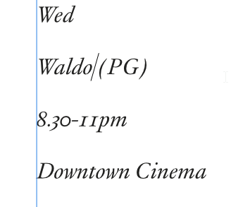
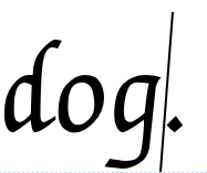
Aside from XDP (Xara Designer Pro) that I used in the previous screen shot, PagePlus & Affinity Designer also slant the cursor according to the font’s numerical setting. MS Word also slants the cursor. This screen shot is from AD:
I would heartily recommend AD (Affinity designer) for font testing. It is relatively inexpensive and no matter how esoteric of a feature I write in a font, it handles them all properly. When it was in beta, there were issues that I worked with Serif to correct and they were within a beta release or two. PagePlus is also good for testing fonts (and, well, the other things it is good for as regards layout work) and is very inexpensive because it will receive no further updates. But AD is modern, current and its OT Feature support is better than PP.
But yes, that is all that setting does. As you are experiencing with your current software, it can mean nothing. Even if I set it at zero, applications that do use that setting (like I listed above) would work just fine. So whether you use it or not is up to you. I find it a pleasant touch when using an application that utilizes that setting.
As for various angles in a font, and if one desires the angle setting to be non-zero, I would place and rotate a guideline on representative glyphs and make a choice re the angle to use.
Mike
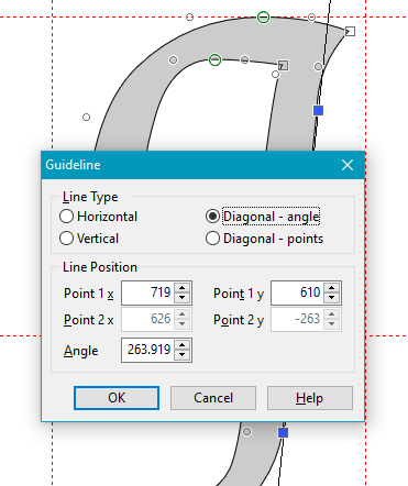
I have a font, Lekhana, in which the Regular style has a slight slant. To calculate the italic angle, select a couple of nodes, and use the g shortcut to create a guideline. Double-click the guideline, and set it to “Diagonal Angle.” Now subtract that angle from 270 to get the italic angle of about 6 deg.
The font test window unfortunately does not display the italic cursor, so test it in another application like PagePlus while the Font Test window is still open.
I have not used this trick in the past, but it does look better when typing in Serif applications, so I might use it in future versions of Lekhana Regular and Bold.
Neat tip on using the nodes for setting the guideline, BP.
Thanks, Mike
As I mentioned earlier, re the font I’m currently working on, the angle seems to vary somewhat between characters – just wondering if that’s anything to be concerned about.
There is an optical illusion which takes place with text. If all your glyphs have the same italic angle then they appear to be different, the tall ones appear to have a greater italic angle than the short ones so you have to ease off the angle a bit with tall characters.
How much ? … Well you have to judge it by eye. The rule of thumb in fontmaking is that if it looks right then its right even if the numbers would suggest otherwise.
Having similar issues with bold style. Took all afternoon to resolve.
I was able to solve it by changing the font name, incrementing the version, changing the font name back, and then incrementing the version. A lot of weirdness with *'s and OTT’s being appended to both the font name and font style in Photoshop.
The big question: what is the best way to prevent this from happening on the machines of customers that already have a regular version on their machine when we release a Bold or Italic version?


