Page 1 of 1
Comparison Cycle
Posted: Sat Jul 14, 2007 3:27 am
by Dave Crosby
I've just downloaded FC 5.6.
Put a caterpillar in a cocoon and it soon turns into a beautiful butterfly.
What would happen if you put a butterfly into a cocoon?
Well, that is what has happened with FC! It is now beyond magnificent

I am blown away with the
Labeled lines for Win ascent, descent, cap height, x-height and baseline.
Why didn't I ask for that years ago?
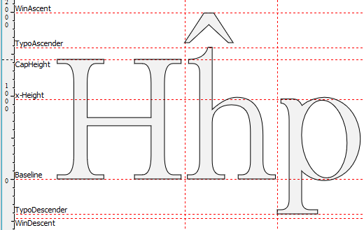
- Metrics Lines.png (19.91 KiB) Viewed 6137 times
And the latest Complete composites! Between Erwin Denissen and Bhikkhu Pesala this has really blossomed!
I was just working with FC on a new font (that I hadn't touched for some months) when I realized there is still one thing I would like.
How about opening the Comparison dialog box and being able to press the arrow keys to quickly zip through how A looks with a, b, c, d, etc. ?
That way we could quickly find where something isn't positioned quite right.

(Sorry I first posted this in the wrong section)
Font Properties
Posted: Sat Jul 14, 2007 3:45 am
by Dave Crosby
Dick Pape just pointed out to me how the new Font Properties works!
Just click on Font >> Properties, Then scroll down the list and click on anything that doesn't look right to you and ZAP, you are right at the offending glyph!
Astounding! Make whatever corrections are needed, and do it all over again for the next possible problem.
What a neat feature!
I LIKE it!
Posted: Sat Jul 14, 2007 4:26 am
by Bhikkhu Pesala
How about opening the Comparison dialog box and being able to press the arrow keys to quickly zip through how A looks with a, b, c, d, etc. ?
Not much different to putting A in the "before" field and zipping through the font from a-z.
I am blown away with the Labeled lines for Win ascent, descent, cap height, x-height and baseline.
Why didn't I ask for that years ago?
I like them so much I wish I had asked for TypoAscender and TypoDescender too.
You can move the xHeight and CapHeight by editing the values on the Ranges Tab (use Contents and Layout version 3). There is also a calculate button there to recalculate the correct value. Moving the CapHeight can be useful if you want to raise or lower all of the accents for Uppercase glyphs when using Complete Composites. A few composites use xHeight, and they can be adjusted in the same way.
Individual bearings can be hidden from Tools, Metrics Options, where the colour and style of the lines can also be changed.
Re: Comparison Cycle
Posted: Sat Jul 14, 2007 7:48 am
by Erwin Denissen
Dave Crosby wrote:And the latest Complete composites! Between Erwin Denissen and Bhikkhu Pesala this has really blossomed!
Actually Bhikkhu Pesala did most of the work. Without his expertise and continuous support, it would never evolved to this mature level.
Bhikkhu Pesala wrote:I like them so much I wish I had asked for TypoAscender and TypoDescender too.
Consider it done!
Posted: Sat Jul 14, 2007 8:36 am
by Bhikkhu Pesala
Posted: Sat Jul 14, 2007 11:37 am
by Dave Crosby
Not much different to putting A in the "before" field and zipping through the font from a-z.

That works! Two heads are always better than one!
Edit:
Oh, but my way allows immediate adjustments to the A, yours to the other letters, so there is a difference. Sometimes I would want to do it my way, other times your way. They both have merit!
Posted: Sat Jul 14, 2007 3:02 pm
by metalfoot
So is this available to all or is it still in Beta?
Posted: Sat Jul 14, 2007 3:41 pm
by Bhikkhu Pesala
5.6 is still in beta, but it is available on request for testing. See this
Announcements Thread
Posted: Sat Jul 14, 2007 4:54 pm
by Bhikkhu Pesala
Oh, but my way allows immediate adjustments to the A, yours to the other letters, so there is a difference.
Yes. I don't see it being easy to make the current Comparison Toolbar scroll from a-z as it is just a dialogue box using text input. It would need a scrollable field that changes a numeric value such as the code-point, then it would have to calculate the glyph from that.