Page 1 of 1
Manual Kerning
Posted: Sat Aug 17, 2013 4:40 am
by pt_crusier_2002
Would it be possible to make the manual kerning pairs like the preview where you can place a glyph on either side of a character, so you could do for example " N A N "instead of just a pair as is now example "N A" this would greatly speed up the process when having to manually kern, also an option to kern all possibilities so you don't have to keep toggling between new and the kerning, very annoying after several hundred pairs of manually kerning a font. I know you have auto kern, but I have yet gotten it to kern as good as manually kerning it myself.

Re: Manual Kerning
Posted: Sat Aug 17, 2013 11:38 am
by Alfred
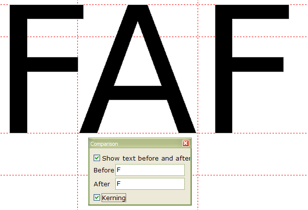
With the current glyph displayed in a Glyph Edit window, you can choose 'View > Toolbars > Comparison' (F11) to display the Comparison toolbar. Type in the text to be displayed before and after the selected glyph, and toggle kerning on and off to see the effect of your efforts.

Re: Manual Kerning
Posted: Sat Aug 17, 2013 7:14 pm
by pt_crusier_2002
Yes, I know about the comparison tool bar, love it, but wish this feature could be put into manual kerning, it would allow much faster kerning if you could do both the left and right kerning at the same time. VersaCad had this feature available back in 1989, made it a breeze to quick kern a font manually.
Re: Manual Kerning
Posted: Sat Aug 17, 2013 10:32 pm
by Alfred
I understand now; I misinterpreted your original post. Sorry about that!

Re: Manual Kerning
Posted: Sun Aug 18, 2013 3:41 am
by Dick Pape
I'm not certain triplets of letters works any better than pairs. There is no spacing (kerning) relationship between NA and AN, or even TA and AT. Case kerning isn't logical in threes: PaP, aTa, etc. You still have two decisions to make. Whenever there are spacing problems using the kerned font, you will fix the pairs which need adjusting, not the triplet.
I also wonder if kerning decisions aren't better made in pairs: AA, AB, AC, AD, ... then the BA, BB, BC, etc. You learn how each leading letter dictates the spacing/kerning to the letter that follows so it goes quicker and is more accurate.
Kerning traditionally is not easy and quick. Professionals spend many days properly kerning a font. Definitely it is an iterative process -- "make manual adjustments, test, and repeat until done". There are many lists of special kerning pairs or kerning words or text which are used to check kerning results. Don't forget foreign words or accented letters.
With auto-kerning you get a large number of illogical combinations, some obviously incorrect pairs and a whole bunch of close enough pairs.
Re: Manual Kerning
Posted: Mon Aug 19, 2013 1:29 am
by pt_crusier_2002
In response to the last reply, I have spent hours at a time kerning fonts in various programs I have used to do the work I need to do with fonts and spacing between letters. And for me from over 30 years experience I have found for basic manual kerning the program I like and found fastest and easiest to kern were the ones where you had the 3 letters "nAn" at a time kern left and kern right, a lot faster than what is present in this program.
I know this program is very professional on what you can do to create fonts, and you can get very nick picky on being very exacting on creating the Master Piece Fonts with lots of features, but you know sometime and in my case I don't want or need to be that picky for what I plan to use the fonts I create for personal use. Ease of use and getting to an output for TTF or OTF font is more important the making it into a Master Font, I have other things to do to make my living, than spend all of it trying to make the fonts I create absolutely perfect. Sometime a Chevy is Better than a BMW, both will get you there depending on your needs.

Re: Manual Kerning
Posted: Tue Aug 20, 2013 10:49 am
by Bhikkhu Pesala
pt_crusier_2002 wrote:I have found for basic manual kerning the program I like and found fastest and easiest to kern were the ones where you had the 3 letters "nAn" at a time kern left and kern right, a lot faster than what is present in this program.
I just don't get how it would make it either easier or faster. Say, you want to kern A and F. The values for AF and FA won't be the same. AF needs no kerning, while FA does. In the case of AT, then it might help, since AT and TA would probably have the same values, so too would AV and VA, or AW and WA, but the majority of pairs are not like that at all.
- Kerning Triplets.png (9.68 KiB) Viewed 13635 times
It would save time when kerning a pair like TA ,if matching kerning pairs were automatically added for TÁ, TÀ, TÄ, TÃ, and also ṬA, ṬĀ, etc. That would make sense as only in a few cases would the pairs need further adjustment, e.g. Ta and Tà might need different values.
Re: Manual Kerning
Posted: Wed Aug 21, 2013 7:31 pm
by pt_crusier_2002
Just like in your above example of the jpeg, I know that "AFA would kern different left and right of the center letter, but instead of just being able to kern a pair of letters would it be possible to program it so that you could kern 3 letters at a time and apply / save the kerning like you can only now do with one pair. Right now I manual kern all pairs even with auto kerning on, for example I will do kern pairs as the manual program is now set up "LA", "AL" if I could do "LAL" kerning keft and right at the same time I could reduce my kerning time in half, cause I would not have to go new kern half as much the way it is now set up in the program.

Re: Manual Kerning
Posted: Wed Aug 28, 2013 3:19 am
by pt_crusier_2002
Attached is an OTF font I developed for Monumental Sandblast lettering it is a font that would be used from 2 1/2"-3" in size. The letter style contain a sunk letter outline with a frosted letter in the center.
Took me many hours to manually kern this font, would of been faster if I could of kerned in 3 letters at a time instead of two pair as it now is in FontCreator.

Have adjusted kerning on font see below forum message to DL a TTF of font.
Re: Manual Kerning
Posted: Wed Aug 28, 2013 4:18 am
by Bhikkhu Pesala
I wonder why most of the glyphs have a large negative side-bearing. If you fix your side-bearings first, you won't need to use kerning on most glyph pairs.
I fixed the spacing, ran the Autokerning wizard, and deleted a few pointless pairs. The result is attached. I realise this is a long way from finished, but it took only a few minutes.
Re: Manual Kerning
Posted: Wed Aug 28, 2013 9:28 pm
by pt_crusier_2002
Been using this program for a short time what do you mean by " negative side -bearing, adjust the side -bearings', anything to get the font to auto kern better would be a great help.
Re: Manual Kerning
Posted: Wed Aug 28, 2013 10:30 pm
by Bhikkhu Pesala
The left-side bearing on most of the glyphs in your font are negative. That would be normal for a combining accent that is designed to sit on top of the preceding glyph, or for a swash or italic
f that curls under the preceding character, but it's not usual. Most regular fonts will have left and right side-bearigns that are approximately equal — maybe they will be bigger for a letter like lowercase i or ll than for a Capital A or W.
Compare your font with mine, opening each glyph in the glyph edit window, and look at the postion of the glyph relative to the y-axis.
See the
FAQ Sticky Thread for an illustration of various typography terms.
Re: Manual Kerning 25 FO Font
Posted: Sun Sep 01, 2013 9:49 pm
by pt_crusier_2002
Reviewed above post about kerning and character positioning being negative on left side of characters, have adjusted each character so that the left edge starts at zero and adjusted right side, did auto kern, then manual kern on some of the pairs, looks better under test for ttf, still learning how to use program. Attached is a revised
TTF 25FO Modified Roman font saved as TTF so I can import into my Gerber Graphix Advantage Program. This font is used in the Monument Industry at 2 1/2" for sandblasting into Granite which would show as a frosted letter with a sunk outline on a polish surface.
Re: Manual Kerning 25 FO Font
Posted: Mon Sep 02, 2013 2:56 am
by Bhikkhu Pesala
pt_crusier_2002 wrote:Reviewed above post about kerning and character positioning being negative on left side of characters, have adjusted each character so that the left edge starts at zero and adjusted right side, did auto kern, then manual kern on some of the pairs, looks better under test for ttf, still learning how to use program.
It's not only that you need to learn how to use the program, you need to learn how fonts are designed. Open a few standard fonts like Times New Roman, Arial, etc., and see if you can find any where the left side-bearing is zero.
improvement to Manual Kern Left and Right at same time
Posted: Mon Feb 01, 2016 2:28 pm
by pt_crusier_2002
Glad to see you keep improving the features. Still wish I could manual kern left and right at the same time instead of just two characters example A|Z|A instead of just Z|A as it is now and has been in the past versions, this would greatly speed up manual kerning.
Had this feature in a drafting program I once had. One of the best and quickest features for kerning an alphabet. Program would use the same Letter on left and right were the same letter, the letter in the middle was the letter they were kerning against. Was able to save kerning info to font table and cut my kerning time in half. Please, Please add this feature, know I have asked you to add this feature in past, must not be explaining myself to you why this would be a great improvement as to what you have now in program. Like your auto kern, but like to see this in the manual kern part of your program. Know it can be done cause like I said I had this feature in an old Monu CAD program I use to use dating back to the 90's.
Others, please add a request posting to this forum for this feature, know it can be done, cause it has been done before in a CAD program in the 90's. As stated above this will greatly reduce any manual kerning time when auto kerning doesn't quite get you there. This would be a lot better than the way it is done now with only a kerning pair. Want to be able to do this B|A|B, not just what we have now A|O.

