Page 1 of 1
Cyrillic cursive
Posted: Wed Oct 05, 2011 6:25 pm
by honest.bern
I have used Font Creator home edition v. 5.6. I added glyphs individually and mapped them using a Unicode chart of cyrillic characters. The hardest part was editting a png file, as I am not used to this format.
This is [i]not[/i] an italic version of cyrillic type. Rather, it aims to be a “copybook” version of current Russian [i]script[/i].
I used the largest version (2,000 × 638 pixels) of the alphabet shown at:
http://en.wikipedia.org/wiki/File:Russi ... rillic.svg. This does not include numbers or punctuation.
This is a work in progress. I welcome all comments and suggestions.
Re: Cyrillic cursive
Posted: Thu Oct 06, 2011 5:49 am
by Dick Pape
Congratulations on getting this font together.
A couple of comments, not in any particular order.
1. Be careful of leaving those remnants of "Include Outlines" in the font. every font you make should only have glyphs in the same style throughout even if this means leaving out important letters.
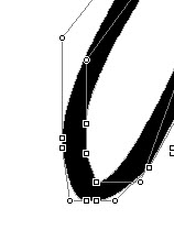
2. Looking closely at the shape of the strokes you will see too many straight line segments where the curves should be smoothly continuous.
- Square segments.jpg (3.62 KiB) Viewed 6532 times
I suspect this comes from having images which are too small for the Import image routines. This can be confirmed by looking at a letter in point mode and see two "on curve" points in a row preceded and succeeded by "off curve" points. (
- 2OnCurve.jpg (6.82 KiB) Viewed 6532 times
These are fixed by removing one of the "on curve" points and moving and adjusting the off curve points on either side. The goal would be to have flowing strokes for each letter as if handwritten.

- After.jpg (4.48 KiB) Viewed 6532 times
3. A cursive script is one of the most difficult fonts to put together if the letters are to be connected which the lower case in this one seems to demand. The leading and trailing strokes must meet when the letters are placed very close together. I don't know Cyrillic letter forms, but a lot of adjustment will be needed here. An example from the sample shows the kind of alignments which are problems where the ad, rg and ge pairs don't smoothly meet.

- Connecting letters.jpg (5.85 KiB) Viewed 6532 times
Re: Cyrillic cursive
Posted: Thu Oct 06, 2011 7:41 am
by Bhikkhu Pesala
Dick Pape wrote:1. Be careful of leaving those remnants of "Include Outlines" in the font. every font you make should only have glyphs in the same style throughout even if this means leaving out important letters.
I strongly disagree. A font without important characters like smart quotes, brackets, and punctuation is useless. The only thing that one can say is that it is important to complete the font by designing suitable glyphs to match the current font design. Digits are especially important, so don't miss those.
Even if some glyphs like £ $ & ¥ € © ® ° ¶ † ‡ • … “ ” etc., do not match the font, they are better than blank spaces or .notdef rectangles in the text when those characters are used.
Unused glyphs like ^ ˘ do no harm at all as no one will type them, and they should be retained for adding accented composite glyphs later. They will also need redesigning to suit an italic cursive font, but at least they are correctly mapped and provide a starting point to save work whenever you're ready to create them, so don't remove them at all. When you're ready to include them in the font, redesign them to match the other glyphs.