Page 1 of 1
Tom Collins
Posted: Sat Feb 23, 2013 4:45 pm
by Ned Ludd
My second foray into fontmaking will be this typeface that is based on a scan from a long lost specimen book. I can't remember the name of the original but mine will be called Tom Collins (it's a tall, cool one).
I may be some time...
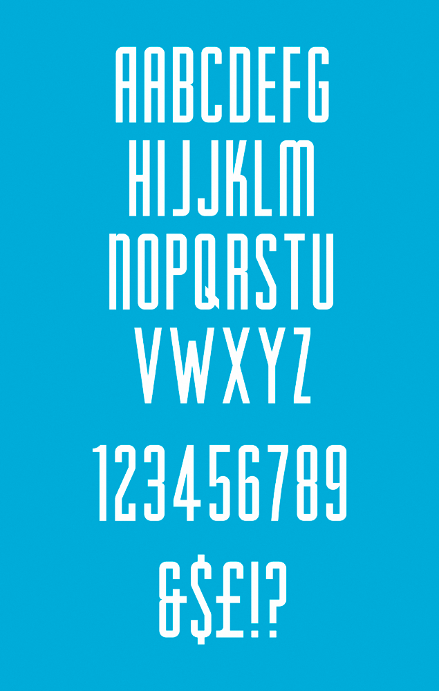
- tom-collins.png (305.24 KiB) Viewed 10251 times
Re: Tom Collins
Posted: Sun Feb 24, 2013 4:01 am
by Dick Pape
Hello. The scan is a nice clean sample. That will help giving good dimensions to your letters.
I have looked for fonts which have some of the same characteristics: parallel strokes on /A, single bar on the /G, /K with a "knee" part of leg, /M with rounded tops and parallel strokes, /Q with cross bar and then in combination with a /W which meets in the center. Haven't found an exact equals so that is good.
Found several names which have tendencies like your sample but nothing with everything.
Hoefler, Jonathan/OdeonCondensedAlternate (also has the /&)
Panache Graphics/RaleighGothic-SmallCapAlt (has similar numbers, but no punctuation)
Harvey, Thomas E/Higherup Normal (has the W)
Stylus Lettering & Typography/Regency Gothic (close on GKAQR and numbers)
Most of them make the /M and /W inversions of one another.
Good luck.
Re: Tom Collins
Posted: Sun Feb 24, 2013 11:42 am
by Ned Ludd
Thanks for looking into it. Just to clarify, the blue image in my original post is the redrawn version with alterations. I scoured the book I thought I scanned it from but no joy. Here's the original scan with possibly the ugliest (and, thus, most identifiable) ampersand I've ever seen. The question mark is none too pretty either, hence my redrawn versions. I will probably change the
W to an inverted
M, possibly the
X to an
8 with the top and bottom cut off, similarly the
Y to a
u with a stalk. I'll also extend the arms of the
T by half a stroke width.
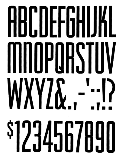
- tom-collins-scan.png (53.28 KiB) Viewed 10241 times
Re: Tom Collins
Posted: Sun Feb 24, 2013 8:13 pm
by Dick Pape
It kinda goes on forever unfortunately ...
Re: Tom Collins
Posted: Sun Feb 24, 2013 8:49 pm
by Ned Ludd
It does, and I don't imagine I need to witter on about every alteration.

I find the drawing process (if you can call Adobe Illustrator ‘drawing’) very relaxing though. It's the technical aspect of creating the font that doesn't relax me so much.
Re: Tom Collins
Posted: Mon Feb 25, 2013 4:07 am
by Dick Pape
We'll give you a call next summer and see if you still find it relaxing!!
Good luck, good drawing and good fonting
Dick.
Re: Tom Collins
Posted: Sat Apr 13, 2013 2:06 pm
by Ned Ludd
And I've changed it again. More consistency between caps and lower case.
Re: Tom Collins
Posted: Sat Apr 13, 2013 5:36 pm
by Dick Pape
I like it!
There is a good design consistency with the three horizontal sections you've used: the arm of the /ABEF, the top of the lc and the top of the uc. I also like the curved foot on the /l, the one-sided cross bar on the /t and possibly the slash on the /0.
One thought, the colon seems short. Similarly the cross bar on the 4 might be low? Also, the "elbow" on the 5 and perhaps the 6 and the 9 (where the bowls connect to the vertical strokes) may need to be more substantial -- it seems right on the /m/n. Could be optical illusion...
The numbers look good by themselves, but use what appears to be a 4 step design - not the three steps used in the rest of it.
I understand it may get weird to have the numbers repeat those dimensions.
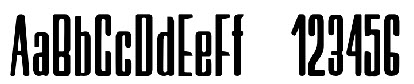
- abcd1.jpg (10.89 KiB) Viewed 10114 times
Good work.
What's next?
Re: Tom Collins
Posted: Sat Apr 13, 2013 7:52 pm
by Ned Ludd
Thanks!
I deliberately wanted the numbers (including currencies) to be different but also to look like they belonged. I may look at the 4 again though. I'll either lower it or raise but make it relate to the 2,3,5 and 9 more.
The colon (and semi-colon) has been a pest. First it was enormous and now, I agree it is too short. I'll have another look.
The font has been sitting dormant since my last visit and when I looked at it yesterday i thought it just wasn't right, hence the changes which I'm very pleased with.
Next on the list is the provisionally titled
Single Malt (yes, they'll all be alcoholically inspired). Another one with rounded outer and squared inner.

- BA-inline.png (177.87 KiB) Viewed 10112 times
Also
Brandy Alexander, inspired by the very early Soviet era.
- brandy.png (251.87 KiB) Viewed 10111 times
Re: Tom Collins
Posted: Sat Apr 13, 2013 9:16 pm
by Dick Pape
That looks like a very nice one too...