Page 1 of 1
gothic grain
Posted: Thu Aug 14, 2014 11:15 am
by Krys
I've been working on this font which is taken from my writing and would welcome comments. I'm not a professional and am still learning.
Re: gothic grain
Posted: Thu Aug 14, 2014 4:26 pm
by Bhikkhu Pesala
I have a long list of suggestions/recommendations. The most important is to fix the metrics as clipping may occur
- Upgrade to FontCreator 8.0. If you're happy with 6.5 that's fine as upgrading would require learning many new things, and 6.5 may be adequate for your needs, but editing your font in FC6.5 reminded me of just how much has been improved.
- Fix the metrics. Format, Settings, Metrics, Maximum, Calculate will do that. However, there's a bit of an issue with the Caps Height because it's calculated from the Capital H, which has a high ascender. I estimated a more sensible value of 1745 from the Capital E and changed it manually.
- The accents are too low. The vertical position of these should suit the lower case, so about half way between x-height and Caps Height is best. After moving these to the right position, Edit, Select Composites, Make Simple, Complete Composites.
- Fix the validation errors. There are many off-curve extremes, redundant points, and intersecting co-ordinates. There are also a few contours with incorrect directions. Notably the lowercase i has one that needs reversing.
- There was a stray contour far to the left in the ÷ glyph. I deleted it. Look for others by using Select All in each glyph and Zooming to the selection.
- The dotless i is a composite glyph, but should be simple. It has a dot, but should not have.
- The advance width of the non-marking return (the 3rd glyph) should be the same as the space width (521 funits)
- Fix the ranges and code pages. Format, Settings, Ranges, Calculate.
- Delete all of the kerning pairs. If you need so many positive kerning pairs then the side-bearings need adjusting. Add kerning pairs only where there is a need for them, e.g. between V or W and lowercase vowels. For a font like this only manually adding pairs is going to work.
I attach my edited version for comparison.
Re: gothic grain
Posted: Thu Aug 14, 2014 7:22 pm
by Bhikkhu Pesala
If you think that the Capitals are too tightly spaced, then increase the side-bearings on each side by 50 funits or so using the Transform Wizard. It think it's OK as it is.
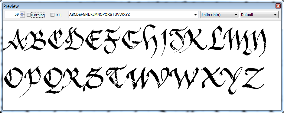
- No Kerning.png (54.75 KiB) Viewed 5516 times
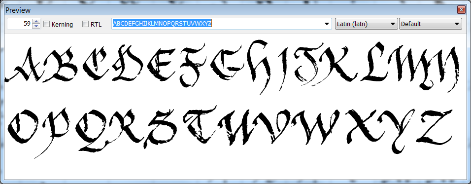
- Increased Side-bearings.png (57.73 KiB) Viewed 5516 times
Re: gothic grain
Posted: Thu Aug 14, 2014 7:41 pm
by Bhikkhu Pesala
Here's a quick job I did by importing the kerning pairs from another font, and manually tidying up the pairs for your font. A few hundred pairs, mostly Upper/lowercase pairs, is all that are needed. Add New pairs or adjust the existing pairs as you like, but don't bother with the Autokern Wizard for this font — it won't give good results.
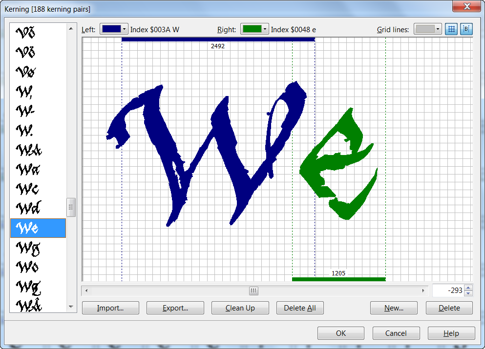
- Kerning.png (73.94 KiB) Viewed 5514 times
Re: gothic grain
Posted: Thu Aug 14, 2014 7:54 pm
by Krys
Thank you for your recommendations and the time that you have taken to help me. I understand most of them and will work my way through them. I agree fully with what you have said and will send my updated version when completed. Have just looked at the kerning advice. Probably basic for you but enormously educational for me. Thanks again