Page 1 of 1
Fonturbia GRAFFITI full color font
Posted: Thu Jun 25, 2015 12:47 am
by zartan917
first ever (I think?) Maybe more to come...
Re: Fonturbia GRAFFITI full color font
Posted: Thu Jun 25, 2015 8:08 am
by Bhikkhu Pesala
Probably the worst font I have ever seen. Almost completely unreadable. I don't know what purpose the black circles in the background serve, but it would be just about legible without them. Gaudy colours, weird shapes, and intersecting contours. I appreciate that not every typeface needs to be the classic forms, but this font is just a mess.
This font, for example, is not a classic design. Nevertheless, it is easy to read.
 BTW:
BTW: FontCreator 9 Project files can only be opened by users with the most recent version of FontCreator. It would be better to offer the TTF for download.
There are also some bugs. The .notdef, nonmarking return, null, and space glyphs should not be used for colour glyph members. There are some stray contours in those glyphs, and the Q glyph is not fully coloured.
Re: Fonturbia GRAFFITI full color font
Posted: Thu Jun 25, 2015 12:06 pm
by Alfred
Bhikkhu Pesala wrote:Probably the worst font I have ever seen.
Go on, Bhikkhu Pesala — tell us what you
really think!!

Bhikkhu Pesala wrote:Almost completely unreadable. I don't know what purpose the black circles in the background serve, but it would be just about legible without them.
For what it's worth, I agree about the poor legibility, although I'm not sure that it would be improved significantly by omitting those black blobs.
Re: Fonturbia GRAFFITI full color font
Posted: Thu Jun 25, 2015 12:13 pm
by Bhikkhu Pesala
Alfred wrote:For what it's worth, I agree about the poor legibility, although I'm not sure that it would be improved significantly by omitting those black blobs.
It definitely helps somewhat.
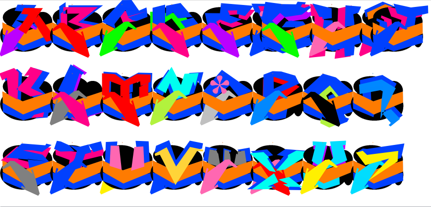
- Fonturbia.png (97.43 KiB) Viewed 5990 times
Fonturbia 2
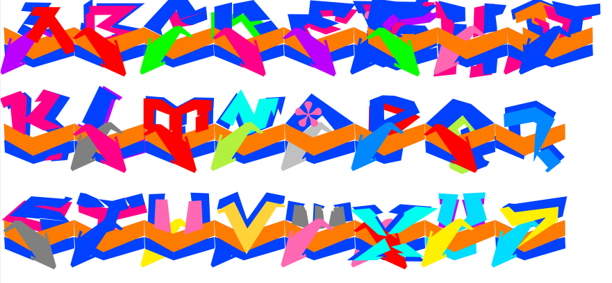
- Fonturbia 2.png (89.73 KiB) Viewed 5989 times
Re: Fonturbia GRAFFITI full color font
Posted: Sat Jun 27, 2015 5:36 pm
by honest.bern
It’s much easier to scrape these graffiti off my screen than off my wall!
The font is effectively cursive, but with multiple lines.
In order to look like genuine graffiti that cover the wall (a space-filling font) it is necessary to disguise the change from one letter to the next. The main way this is achieved is by the orange chevron; this has to start and finish at the same height in every letter. (I would have inverted some of these chevrons for variety.) Most of the letters have a second cursive line in the blue chevron underneath.
Bhikkhu Pesala wrote
“I don't know what purpose the black circles in the background serve, …”
I think the black circles are the classic technique of camouflage: disruptive patterns. They are so noticeable that they draw attention away from the regularity of the cursive orange and blue lines.
Bhikkhu Pesala wrote
“… but it would be just about legible without them.”
I always thought that the text contained in graffiti was less important than the message: “However much time you spend cleaning your property, I can vandalise it again in seconds.”
Honest Bern