Page 1 of 1
Two to try
Posted: Wed Dec 21, 2016 2:15 am
by 1940LaSalle
OK, I'm new at the font creation business, so bear that in mind--but offer whatever feedback you will. One of these I call "Engraved Nameplate" since it reminds me of white-on-black nameplates one found on machines, machine tools, control panels, etc. fifty or more years ago. The other is called "Quasi-Serif" which is approximately descriptive.
I'm sure there are characters in either where the stroke weights aren't all that wonderful, and I'm sure there are a host of other faults. But they have to be test-driven sooner or later...
Re: Two to try
Posted: Wed Dec 21, 2016 6:45 am
by Bhikkhu Pesala
1940LaSalle wrote:I'm sure there are characters in either where the stroke weights aren't all that wonderful, and I'm sure there are a host of other faults. But they have to be test-driven sooner or later
The stroke weights in Quasi Serif are the main issue. The period and comma in Engraved Nameplate are also way too heavy compared to the other glyphs.
Capitals need to be slightly heavier than lowercase, but not by too much.
One easy way to check for uniformity of stroke weights is to open one glyph that you think has the desired weight in the Glyph Edit Window, and use the Background Image Toolbar to copy it. Disable Outline Fills, then scroll through the font to check for glyphs that are too heavy or too light. Below, I have copied the capital I glyph to the background image, then scrolled left to the capital H glyph. You can see that they match for both stroke weight and left side-bearing.
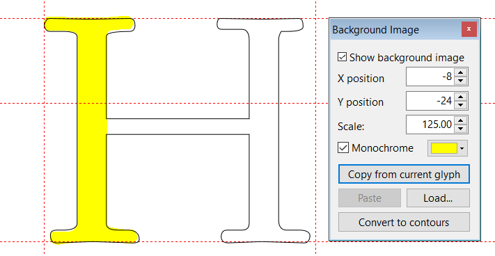
- Background Image.png (17.23 KiB) Viewed 7428 times
The lowercase glyphs need to match each other too, but are slightly lighter than the capital glyphs.
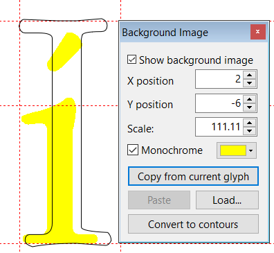
- Background Image Lowercase.png (13.71 KiB) Viewed 7425 times
Re: Two to try
Posted: Sat Feb 04, 2017 11:59 pm
by 1940LaSalle
Once edited (bearing the above in mind), any suggestions where (what I think is) the finished product ought to be posted?
Re: Two to try
Posted: Sun Feb 05, 2017 11:14 am
by PJMiller
1940LaSalle wrote:Once edited (bearing the above in mind), any suggestions where (what I think is) the finished product ought to be posted?
Deviant Art is a good site at
http://www.deviantart.com/, you have to register for a free account or you can pay for a 'premium' account, I stuck with the free one
http://pjmiller.deviantart.com/ .
If you want something specifically for fonts then Font Space is OK, it is at
http://www.fontspace.com/ you have to register but it is free.
Re: Two to try
Posted: Wed Feb 08, 2017 1:37 am
by 1940LaSalle
The latter looks like a live one since I'm not exactly an artist. Thanks.