Page 1 of 2
Even stroke width
Posted: Sun Feb 25, 2007 8:15 am
by highwaykind
Is there a fast/easy way to force all strokes to be an even, constant width?
(Scan ->me messing with it turning it into jpg ->import image caused an even stroke font to become a non-even stroke one).
Thanks!
Posted: Sun Feb 25, 2007 8:25 am
by Erwin Denissen
You should be able to get a 99.99% perfect import when you follow these instructions:
Import Images the Right Way (Size Does Matter!)
When you still notice non-even stroke widths after following the guidelines in the tutorial, then your source images are most likely not as "even stroke" as you may believe.
Posted: Sun Feb 25, 2007 8:45 am
by highwaykind
But is there an easy way to change that *after* you've already applied all other changes needed

? (aka : I've already put a lot of hours into this one and I'm not starting all over again).
Also I'm already doing somthing very similar to what's explained in the link, but scanning causes slightly jagged edges.
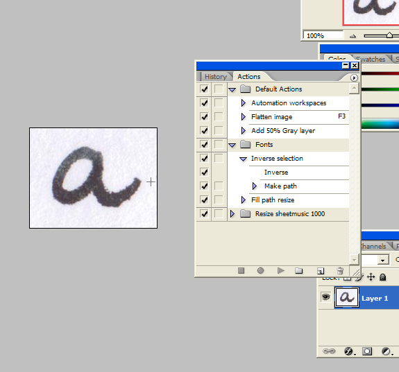
I scan at 600 or 1200 dpi, then import it all into Photoshop and create a path on a new layer, adjust the path so it's a perfect overlay, fill the path, delete original layer and save as jpg (now has the smoothest edges possible). Import those into FCP.
Settings : threshold of 100 and smooth, multiply often set at 3 or 4. Rest as in link above.
Then I have to delete quite a few points to get it all smooth again.
And somewhere along the lines the strokes start to vary. Normally I only do handwriting fonts where this doesn't matter that much (at least not after some dragging of points to get it optically accurate enough), but now I'm doing a non-handwritten one.
I also had to adjust all "connective strokes" (forgive the lack of proper terminology) on the right side to 45 degrees so they actually connect to each other when you type.
Posted: Sun Feb 25, 2007 9:22 am
by Bhikkhu Pesala
I don't think there is any easy way. Here are a few tips that might help:
- You could cut and paste a circle of known diameter into each glyph to check visually for any errors a bit more quickly than using the measuring tool.
- You can use the Align Tools to align nodes vertically or horizontally to make sure that strokes are perfectly horizontal/vertical.
- You can select two nodes and press "G" to set a guideline to check that strokes are in the same place in different glyphs.
- You can move through all of the nodes in Points Mode using the shortcut keys "Q" and "W", and nudge nodes with Control + Cursor keys
- Select multiple nodes with the lassoo tool to nudge them all at once to adjust the width of a stroke.
- To check if scripts join up as intended, use the Comparison Toolbar to show different glyphs before and after.
See also Dave Crosby's tutorial on
Construction Contours
Posted: Sun Feb 25, 2007 9:56 am
by highwaykind
Thanks!
I'm going to try the circle
Already had slanted guidelines but didn't know about the CTRL cursor keys.
Where is the align tool? (FCP5.0 pro) - I'm just snapping to a horizontal/vertical guideline now.. (which also works)
I really have to sit down and catch up on the forum tutorials here I thought I read most but that was about a year ago and I used to skip the ones that dealt with creating fonts from scratch because I never do that, but there probably is some very useful information in those as well.
Posted: Sun Feb 25, 2007 10:42 am
by Erwin Denissen
Then I have to delete quite a few points to get it all smooth again.
Although it is very common to manually adjust the import, I'm curious about your source image and the result you get after the import. E.g. the number of contours and points. I would also like to see the result of your manual efforts to improve the import and how many points you were able to remove. This might lead to a better understanding of how FontCreator is used, then I might be able to either improve the tutorial or make some enhancements in FontCreator. Thanks!
Posted: Sun Feb 25, 2007 11:20 am
by highwaykind
Erwin Denissen wrote:
Although it is very common to manually adjust the import, I'm curious about your source image and the result you get after the import.
Sent you a link to a zip file with screenshots in PM.
Posted: Sun Feb 25, 2007 10:15 pm
by Erwin Denissen
Thanks for sending the files. I have turned your source file (fcp5_fillpathresize.jpg) from black into red and positioned it right on the imported outlines. Without your modifications it contains 79 points and after your adjustments it is reduced to 46. To me the import seems 99.9% exact. Nevertheless I believe you have done a great job that makes the glyph look a lot smoother.

[import without modifications]
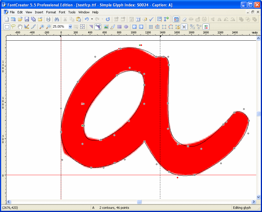
[manually adjusted import]
Posted: Sun Feb 25, 2007 10:56 pm
by Erwin Denissen
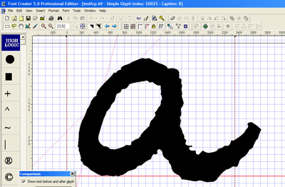
I forgot to mention if you reduced the source image size to 25% (with MS Paint for example) before the import, you would have gotten this result with 45 points:

Posted: Mon Feb 26, 2007 7:27 am
by highwaykind
Thanks !
And you forgot the import without any adjustments at all ( straight from resized scan - the b in the font that was in the zip)
250 points and not so smooth:
That is what my letters used to look like before I figured out this "trick" to smoothen them - takes some time before you import the jpg, but after that it saves time smoothening.
Especially with fountain pen ink on (most) papers the ink bleeds a little which becomes even more obvious when you scan at higher dpi's.
Posted: Mon Feb 26, 2007 8:16 am
by Erwin Denissen
The actual source image is just not good enough for your needs. Again FontCreator has a 99.9% perfect import, but since you don't like the source image, the result is just as bad.
Although your trick seems to work, I suggest you use a black marker to draw the characters. You will have to draw larger characters, to compensate for the thicker strokes. This way the ink bleeds are less disturbing.
See this
online tutorial.
Posted: Mon Feb 26, 2007 10:29 am
by highwaykind
Agree wholeheartedly.
You can see that FCP does exactly what it's supposed to do - outline the imported image as accurately as possible.
The "problem" is that you can't always control what another person writes with.
For the example I grabbed the nearest pen .. a medium nib fountain pen with dark green ink on printer paper. Not ideal.
All those jaggies are on the original as well, I just don't want them in the font.
Background
Posted: Mon Feb 26, 2007 6:03 pm
by Dave Crosby
You may want to try this technique:
viewtopic.php?t=1360
Posted: Mon Feb 26, 2007 6:38 pm
by highwaykind
From what I understand you import the scan as a background image and manually trace it?
I don't think that's going to take less time than what I'm doing now, and this works for me

, thanks anyway though.
Many Ways
Posted: Mon Feb 26, 2007 7:39 pm
by Dave Crosby
That is one of the FC strong points. There are many ways to do the same thing.