Page 1 of 1
Descender - cut off / adjust descender value?
Posted: Thu Nov 15, 2007 9:10 am
by highwaykind
I'm working on a handwriting font with pretty nice descenders and I've got a problem/dilemma.
(It obviously still needs a lot of work, and please ignore the typo's - I was typing with half the characters still missing

)
The descenders in the original writing overlap with the line of text below - resulting in them being cut off in pretty much every application.
1

With adjusted (Metrics - calculate) descender heights it looks like this
2

Is there a way to make the "overflow" visible in, say, Word? (Don't think so, but doesn't hurt to ask here )
What is common practice - leave them clipped since they will print out, or go for option 2?
Posted: Thu Nov 15, 2007 1:06 pm
by Dick Pape
I'm not sure I understand your issue. Version 2 lets you see the entire character and Version 1 does not.
Why would you want the clipped version? These adjustments are always needed on new fonts - like widening the width of the Space character (Glyph Metrics) to give better word separation.
Posted: Thu Nov 15, 2007 1:53 pm
by Dave Crosby
Hi Corien (Hope I got your name right),
The "overflow" works well for parts of the font to extend into glyphs
on the right or left side, but not top to bottom.
That is not an adjustment that can be made in the font, but it can be done by changing the line spacing in some applications
like wordPerfect, CorelDraw and CorelPhotoPaint.
I assume there is a way to do it in Words.
Definitely you want the unclipped choice 2.
By the way, it would be helpful to re-size your posted images to 800 pixels wide or less.
Posted: Thu Nov 15, 2007 1:54 pm
by highwaykind
@ Dick Pape: I would want the clipped version, since the original handwriting overlaps - as in the loop of the g runs through the letters on the sentence below - and thus clipped would resemble the handwriting of the person more closely than when I would adjust the descender height..
Like I said this font still needs a lot of work, so yes, eventually I will adjust the space width... and the connections, and I have to remove all bumps from teh scanning and......
In short I've only imported a few characters so far, and done nothing else yet.
Just wanted to know - since it doesn't seem like making the clipped descenders visible is an option - what the common practice was.
Keep it clipped so that printed (clipped DOES show then) it looks more like the handwriting, or unclip/adjust the space, thus making everything visible on the screen, but compromising on the resemblance to the handwriting.
Not sure how I can explain this better, hope this helps.
Posted: Thu Nov 15, 2007 2:24 pm
by Bhikkhu Pesala
Go for option 2, but used fixed line-spacing or proportional line-spacing in your Word-processor. Below, I used 80% leading (16 point leading on 20 point font size) just to exaggerate the effect. Normally I would use at least 120% leading with this font.
You can reduce the line-spacing until you get some collisions if you want, but the letter forms won't be clipped.
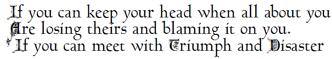
Default leading (single line spacing) for this font is 150% of point size. I usually aim for 120%, but the Gothic Drop Caps don't permit that here. With such tight leading I had to add a space before the third line to avoid an ugly collision.
Posted: Thu Nov 15, 2007 2:33 pm
by highwaykind
Thank you Dave C and Bhikkhu P!!

Option 2 it is !
Corien
Worshippy Gif
Posted: Thu Nov 15, 2007 3:42 pm
by Dave Crosby
Hey Corien,
Thanks for the Worshippy gif!
It reminds me of a joke we used to play on the new Boy Scouts at camp back in 1945.
To discover the Secret Of the Three Mysterious Cities of the East,
All of the newcomers would kneel facing east and while bowing, repeat the name of the next city in each position
(hands stretched overhead, bowed halfway down, hands touching the ground) until the Mystery was reveled to them.
The names of the cities are: Owa, Tigu, and Siam (Oh, what a goose I am).
Posted: Thu Nov 15, 2007 4:09 pm
by highwaykind
LOL!!
You're welcome!
Admittedly it took a while before I got it (only after saying it out loud in English it made sense)
Posted: Fri Dec 14, 2007 7:22 pm
by highwaykind
Thanks for the previous help!
A few further questions I hope you can help me with.
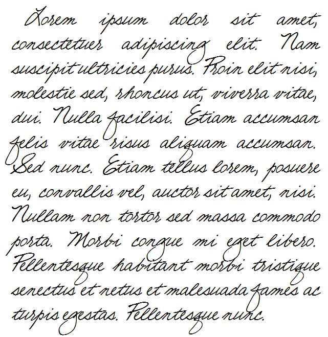
This is the finished font. Using Word 2007. Spacing set to 12.

This is the finished font. Using Photoshop CS2. (seems to auto space).

In Word 2007, is it possible to have this font ALWAYS load with a line spacing of 12pt when the font size is 12, or do I need to adjust it before I start typing every time?
Is there a way to make it NOT look chopped off on the screen in Word? (Have windows/Word 2007 show the "overlap" like it does when printed out, or in PS)?
Why does the top get clipped? I did the calculate metrics thing, so I thought it should be fine? (line spacing is huge due to the size of the descenders, especially of the Y.)
Basically I'd like it too look like Bhikkhu P's sample image in Word

Thank you!
Posted: Fri Dec 14, 2007 9:31 pm
by Bhikkhu Pesala
You can edit a paragraph style in Word so that it uses proportional spacing of 120% or 110% and save that style in your Normal.dot template for use with your font. I wouldn't recommend going down to 100% spacing. It looks too cramped.
Can you send me the font? If you calculated the metrics it shouldn't get clipped. Try Font Properties and double-click on Y-Max and see if that glyph crosses the WinAscent. If it does, try Metrics, Calculate, Maximum instead of Default.
Posted: Mon Dec 17, 2007 9:01 pm
by Bhikkhu Pesala
I reduced the default line-spacing for your font slightly by running the validation wizard, from Font, Validate. This removed off-curve extremes and allows the WinDescent to move up to touch the bottom of the glyphs after calculating the metrics again. This might cure the clipping problems.
I don't use Word. Probably there is an option for "Multiple" line-spacing that can be set to less than one. In OpenOffice 2.3.1 the minimum for proportional line-spacing that works is 55% which is illustrated below:
- McGuireIre.png (21.19 KiB) Viewed 13310 times
Posted: Tue Dec 18, 2007 8:38 am
by highwaykind
Thank you!!
I removed the signature in the font I sent you, which has the largest ascenders and descenders..
Will see if running the validation wizard on that version of the font works