Creating dingbat below base line

Get help with FontCreator here. Please do not post feature requests or bug reports here.
Post Reply
Cassel
Posts: 39
Joined: Mon Aug 15, 2011 9:54 pm

Creating dingbat below base line

Post by Cassel »

I have created a dingbat font to create banners, so i had to create each shape below the baseline, so that in graphic programs, the shapes would follow a path as it is "hanging" underneath. I tried it successfully with PSP (you can see the product result here).
Image
http://creationcassel.com/store/index.p ... cts_id=277

However, i have a few questions:
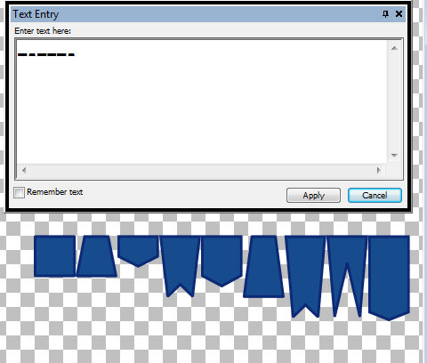
- in the drop down list of fonts, i can only see the very top of each shape, and not the whole shape
- if i try to use that font in Word (like when i did the font chart for users), it would only show the top of the font. Although i was able to use the font with the complete dingbats in PSP, i had no way to do the same with Word

I wonder if i missed a setting somewhere? When i had first created the font, i had the top of each shape set at 1000, but that required the user to always adjust the offset when they wanted to use the font on a path, and changing it whenever the size was changed, so that is why i modified it to make each shape start at a height of 0.
Bhikkhu Pesala
Top Typographer
Top Typographer
Posts: 9876
Joined: Tue Oct 29, 2002 5:28 am
Location: Seven Kings, London UK
Contact:

Re: Creating dingbat below base line

Post by Bhikkhu Pesala »

Try adding a set of uppercase glyphs A-Z with normal baselines, and use the lowercase glyphs for your banners. The uppercase glyphs could be banners too, but perhaps containing letters A-Z.
My FontsReviews: MainTypeFont CreatorHelpFC15 + MT12.0 @ Win 10 64-bit build 19045.2486
Cassel
Posts: 39
Joined: Mon Aug 15, 2011 9:54 pm

Re: Creating dingbat below base line

Post by Cassel »

I already have 50 glyphs using a-y and A-Y. Could i use another place, like digits?
Bhikkhu Pesala
Top Typographer
Top Typographer
Posts: 9876
Joined: Tue Oct 29, 2002 5:28 am
Location: Seven Kings, London UK
Contact:

Re: Creating dingbat below base line

Post by Bhikkhu Pesala »

With symbols like this it hardly matters which glyphs they are mapped to. The point of using A-Z for glyphs on the baseline is to get the glyphs to show up in font selection dialogues. If you create a Unicode font instead of a Symbol font, you can use thousands of code-points, but how easy it is for the user to select glyphs may be an issue.
My FontsReviews: MainTypeFont CreatorHelpFC15 + MT12.0 @ Win 10 64-bit build 19045.2486
Cassel
Posts: 39
Joined: Mon Aug 15, 2011 9:54 pm

Re: Creating dingbat below base line

Post by Cassel »

Thanks. Is there a reason why the bottom part of the glyphs do not show in MS Word? And is there a way to make the glyph visible when it is typed? Here is the example of my Text entry window in Paintshop Pro, and the result, in blue, at the bottom. As you can see, the glyph appears correctly on the project, but not in the Text entry window.

Image
Bhikkhu Pesala
Top Typographer
Top Typographer
Posts: 9876
Joined: Tue Oct 29, 2002 5:28 am
Location: Seven Kings, London UK
Contact:

Re: Creating dingbat below base line

Post by Bhikkhu Pesala »

If glyphs are being truncated its usually because they lie outside WinAscent or WinDescent.

Use the calculate (maximum) option on the Format, Settings, Metric dialogue to make sure that the whole of every glyph is within the recommended limits.

Calculate Metrics
My FontsReviews: MainTypeFont CreatorHelpFC15 + MT12.0 @ Win 10 64-bit build 19045.2486
Cassel
Posts: 39
Joined: Mon Aug 15, 2011 9:54 pm

Re: Creating dingbat below base line

Post by Cassel »

Thanks. I am mostly puzzled because they are not truncated in Paintshop Pro, but they are in Word. Just odd.
vanisaac
Posts: 337
Joined: Sun Mar 30, 2003 1:33 pm
Location: Washington State, USA

Re: Creating dingbat below base line

Post by vanisaac »

Cassel wrote:Thanks. I am mostly puzzled because they are not truncated in Paintshop Pro, but they are in Word. Just odd.
Different programs make different assumptions about advance widths, ascent and descent distances, and their relation to the glyph bounding box. You may find that if you print that document in Word, it will look just fine on the page, even though the letters got truncated on screen. WYSIWYG isn't a perfect science, yet.
Post Reply