What are Tricks to changing direction?

Get help with FontCreator here. Please do not post feature requests or bug reports here.
Post Reply
Dick Pape
Top Typographer
Top Typographer
Posts: 1360
Joined: Wed Oct 01, 2003 1:19 pm
Location: North Dallas, Texas

What are Tricks to changing direction?

Post by Dick Pape »

When I run Validate it shows "Contour index 0 with incorrect direction". Normally, I can fix it by selectively changing a contour or two. However, in a couple of instances, I haven't arrived at the correct order to change direction ending up with everything acceptably aligned.

Image

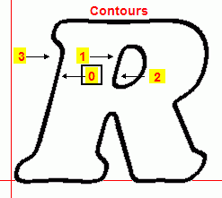
Glyph is capital R hollow/outline. It looks ok to the eye. Contours (from left to right): 3 - outside of character/line, 0 - inside of line, 1 - outside of R-bowl and 2 inside of R-bowl.

Depending upon which contours are selected and reversed the error list always shows misaligned contours and/or the glyph goes black. (It never is all okay even with a black glyph.) If I select 3 (outside) and change direction then char goes black and 0/3 are wrong. If I select 0 (inside) then char goes black and 0 is wrong. If I select all and change direction then contours 0,1,2,3 are wrong. Selecting and changing the bowl contours doesn't impact the rest of the glyph it seems.

Is there a trick, or is this one of those things I can kinda ignore?

Thanks, Dick Pape
Erwin Denissen
Moderator
Moderator
Posts: 11158
Joined: Fri Oct 04, 2002 12:41 am
Location: Bilthoven, The Netherlands
Contact:

Post by Erwin Denissen »

Last year, well just a few days ago, this problem was also mentioned by pia frauss:

viewtopic.php?t=416

What O.S. are you running?
Erwin Denissen
High-Logic
Proven Font Technology
Dick Pape
Top Typographer
Top Typographer
Posts: 1360
Joined: Wed Oct 01, 2003 1:19 pm
Location: North Dallas, Texas

Post by Dick Pape »

Pia Frauss did an awful lot of work in designing those fonts. I didn't have validation problems with any of them. Perhaps they have been changed since she originally posed the problem. The complex character was perfect as is.

I am running Win XP Pro on Dell Pentium 4, 1.4gb cpu. 120gb disk - 30gb free.

What does bringing things forward or backward do? I've tried it a couple of times without seeing any change. (Haven't read the manual however).

Dick
Erwin Denissen
Moderator
Moderator
Posts: 11158
Joined: Fri Oct 04, 2002 12:41 am
Location: Bilthoven, The Netherlands
Contact:

Post by Erwin Denissen »

Forward and backward will just change the order of how the contours are stored. This is not related to the direction issue.

I've received your fonts and have found the problem. The 'R' has a self-intersecting contour. Actually it has two points with equal coordinates. The validation feature didn't recognize this specific problem. It will be available in the next upcoming release.

Right now you could try to remove point with index 106 or 109 from contour with index 0.
Erwin Denissen
High-Logic
Proven Font Technology
Dick Pape
Top Typographer
Top Typographer
Posts: 1360
Joined: Wed Oct 01, 2003 1:19 pm
Location: North Dallas, Texas

Yes that did it!

Post by Dick Pape »

Erwin - thanks.

I also found the same problem on small letter w. Found (!) and deleted hidden point and the problem cleared up Nicely ... Now I am smarter too. I guess.

Dick
Jowaco
Posts: 331
Joined: Tue Oct 15, 2002 11:05 am
Location: York, UK

Post by Jowaco »

If there are self-intersecting contours, knots, indicated, when validating a font, it is often difficult to find their locations in order to correct the problem. High magnification is required and then the fill and contour lines disappear leaving only the points. It is not easy to judge, from the points, which points belong to which contour. The button to show joining lines between points is, however, available, and makes the solution far easier. If start point (green) and end point (blue) are also shown, the contour direction is easy to ascertain. This would have helped in showing that FCP was wrongly reporting problems with contour direction in Pia Frauss's much discussed logo glyph. I'd love to know how that glyph was done!

Joe.
Post Reply