terrible final result...why?

Get help with FontCreator here. Please do not post feature requests or bug reports here.
Post Reply
gunpowda_

terrible final result...why?

Post by gunpowda_ »

A program of mine uses a specific font for greek characters which is rather ugly, so I decided to replace all of the characters in the font with the verdana ones.

I did so, by copying and pasting, and checked that the glyphs looked exactly the same. I saved, and got the following result:

Image

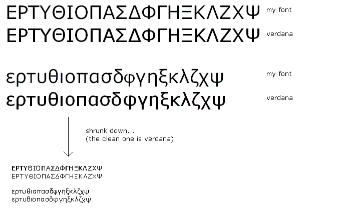
I searched the forum before posting and read the topics on poor scaling and bad quality results in word, but all I am doing is copying and pasting the exact same verdana characters, so I don't think that applies.

Please help!

Alex
vanisaac
Posts: 337
Joined: Sun Mar 30, 2003 1:33 pm
Location: Washington State, USA

Post by vanisaac »

You have run into the problem of hinting. The rasterizer (the program that turns characters into pixels on the screen) only has the glyph outlines to work with in your font. Verdana has a full set of hinting instructions with which to create the screen presentations, and hence, they come out quite consistent and legible at low screen resolution.
Post Reply