Page 1 of 1
Too much space between lines when I test font
Posted: Fri Sep 21, 2018 5:28 pm
by JoannE
I am new to FontCreator. When I first started my font, I could test it in the Test TTF/OTF window and it looked normal. Now, when I test my font, there is too much space between lines, so much so that if I print a page of the font, only four lines of small text appear on each page.
I'm wondering if I accidentally changed a setting somewhere in the font making process.
I attached a picture of what my font looks like when I test it in Test TTF/OTF.
Thank you for your help.
Re: Too much space between lines when I test font
Posted: Fri Sep 21, 2018 6:27 pm
by Erwin Denissen
Probably one or more glyphs have contours that are positioned way too high or way too low.
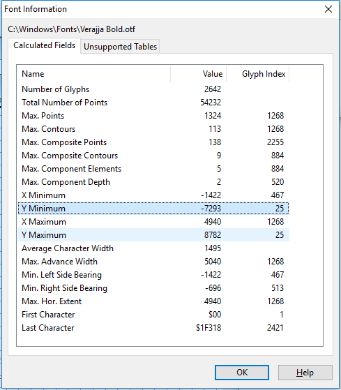
- fontinformation.png (22.12 KiB) Viewed 5144 times
Select Information from the Font menu to see the Y Minimum and Y Maximum values. You can double-click such entry to open the specific glyph edit window.
Re: Too much space between lines when I test font
Posted: Wed Sep 26, 2018 5:09 pm
by JoannE
What is the normal position? And what would I do to change it?
What is inside the normal? And can you explain how I change the high or low contours?
Thank you!
Re: Too much space between lines when I test font
Posted: Wed Sep 26, 2018 7:12 pm
by Bhikkhu Pesala
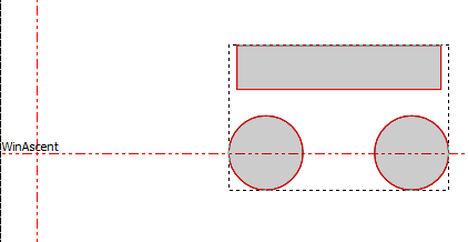
It is normal to keep all glyph contours within the WinAscent and WinDescent lines.
If you open the glyph edit window, then double-click the Y Maximum and Y Minimum lines in the Font Information dialogue it will take you directly to the problematic glyphs. Edit the glyphs to delete unwanted components, or move or edit the glyphs to use less vertical space. Recalculate the glyph metrics to fix the issue in Font Properties, Metrics, Calculate.
- Glyph Too High.png (3.37 KiB) Viewed 5099 times

- Glyph Too Low.png (3.47 KiB) Viewed 5099 times
Re: Too much space between lines when I test font
Posted: Thu Sep 27, 2018 1:44 am
by JoannE
This was very helpful. I found my problem and corrected it. Thank you.
Re: Too much space between lines when I test font
Posted: Thu Sep 27, 2018 8:19 am
by Bhikkhu Pesala
Keeping ascenders and descenders within the bounds of WinAscent and WinDescent avoids clashes even if line-spacing is set to 100% in word-processor or DTP applications. The default (Single) line-spacing should normally be at least 120% to make script faces more legible, but users can reduce line-spacing below 100% if they wish. The font designer should assume that single line-spacing will be used.

- Line-spacing.png (8.31 KiB) Viewed 5084 times
Re: Too much space between lines when I test font
Posted: Tue Oct 23, 2018 10:52 am
by Salguero
What's considered a standard for the default line-spacing btw? You said 120%, but I'm guessing that's at the lower side, right?
Re: Too much space between lines when I test font
Posted: Tue Oct 23, 2018 12:06 pm
by Bhikkhu Pesala
Salguero wrote: ↑Tue Oct 23, 2018 10:52 am
What's considered a standard for the default line-spacing btw? You said 120%, but I'm guessing that's at the lower side, right?
No. It is what I use for many of my body text fonts, but it depends on the font design. Gabriola has huge swashes, so the default line-spacing for single-spaced text is over 180% If used without the swashes it works fine with much less line-spacing.
- Georgia = 113.60%
- Arial = 114.67%
- Times New Roman = 114.94%
- Park Avenue BT = 120.08%
- Verdana = 121.60%
- Palatino Linotype = 134.94%
- Odana = 150.13%
- Gabriola = 184.27%
Re: Too much space between lines when I test font
Posted: Wed Oct 24, 2018 8:32 pm
by Leon Gauthier
Bhikkhu, that script font in your illustration above is gorgeous! Is it one of your creations?
Re: Too much space between lines when I test font
Posted: Wed Oct 24, 2018 8:42 pm
by Bhikkhu Pesala
It is not my creation, but I have edited a version of
Great Vibes as
Mahakampa