You probably need to look at some examples. Open type designer is difficult to comprehend at first, there is just so much going on there but look at some existing fonts with open type features and experiment with them. Then with your own font start off with a blank slate and add some simple things and again try a few experiments to see how they work.
You could use some free fonts which already have open type features like any of
Bhikkhu Pesala's fonts or even some of
mine. Bhikkhu Pesala's fonts all have open type features but I'm not sure if they all use anchors for diacritic positioning. Of my fonts probably the best ones to look at are either
Cadman or
Munson which both use diacritic mark positioning.
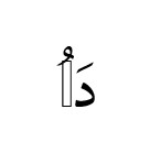
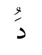
I have only ever done Latin and Cyrillic fonts but it should work the same in Arabic.
When designing a character you can place an '
Anchor' somewhere around the character and give it a name (the one on the character has to be a '
Base' anchor). When designing a combining diacritic mark to be used with that character you need to place another anchor with the same name but this time it has to be a '
Mark' anchor.
When the font is used in a text editor or other program which supports open type features and the character is typed and the following character is the diacritic mark then the diacritic mark will be re-positioned so that it's
mark anchor is in the same place as the preceeding characters
base anchor.
As an example when designing the character 'g' I would place a
base anchor above it called '
Top'. When designing the
combining tilde character I would adjust the barings so that it had no advance width and place a
mark anchor below it called '
Top'. When this is used in a program if someone types 'g' followed by a 'combining tilde' then the tilde will be moved so that it's
mark anchor is in the same place as the
base anchor of the 'g' character.
In practice this is extended so that all necessary upper and lower case characters have a
base anchor point called '
Top' and all necessary combining diacritics have a
mark anchor point called '
Top' and there can be as many different named sets of anchor points as you need.
If done this way then any combining diacritic can be used with any character and they will position themselves correctly.
Stacking diacritics takes this to a whole new level (
pun intended). The combining diacritics themselves can have
base anchor marks so that if the diacritic mark is followed by another diacritic mark then instead of using the base anchor of the character it will use the base anchor of the preceeding diacritic mark.
So in the previous example if the combining tilde character had a base anchor called '
Overstack' (
for example) and if all the combining diacritics had both
base and mark anchors called '
Overstack' with the mark anchors below the mark and the base anchors above then if the combining tilde was followed by another combining diacritic then it would position itself so that it's '
Overstack' mark anchor was in the same position as the preceeding diacritic's '
Overstack' base anchor so it would sit in the correct place relative to the tilde.
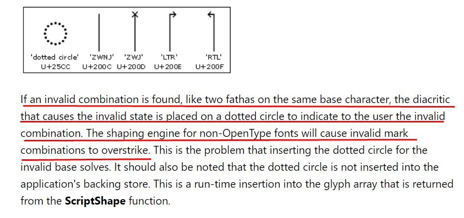
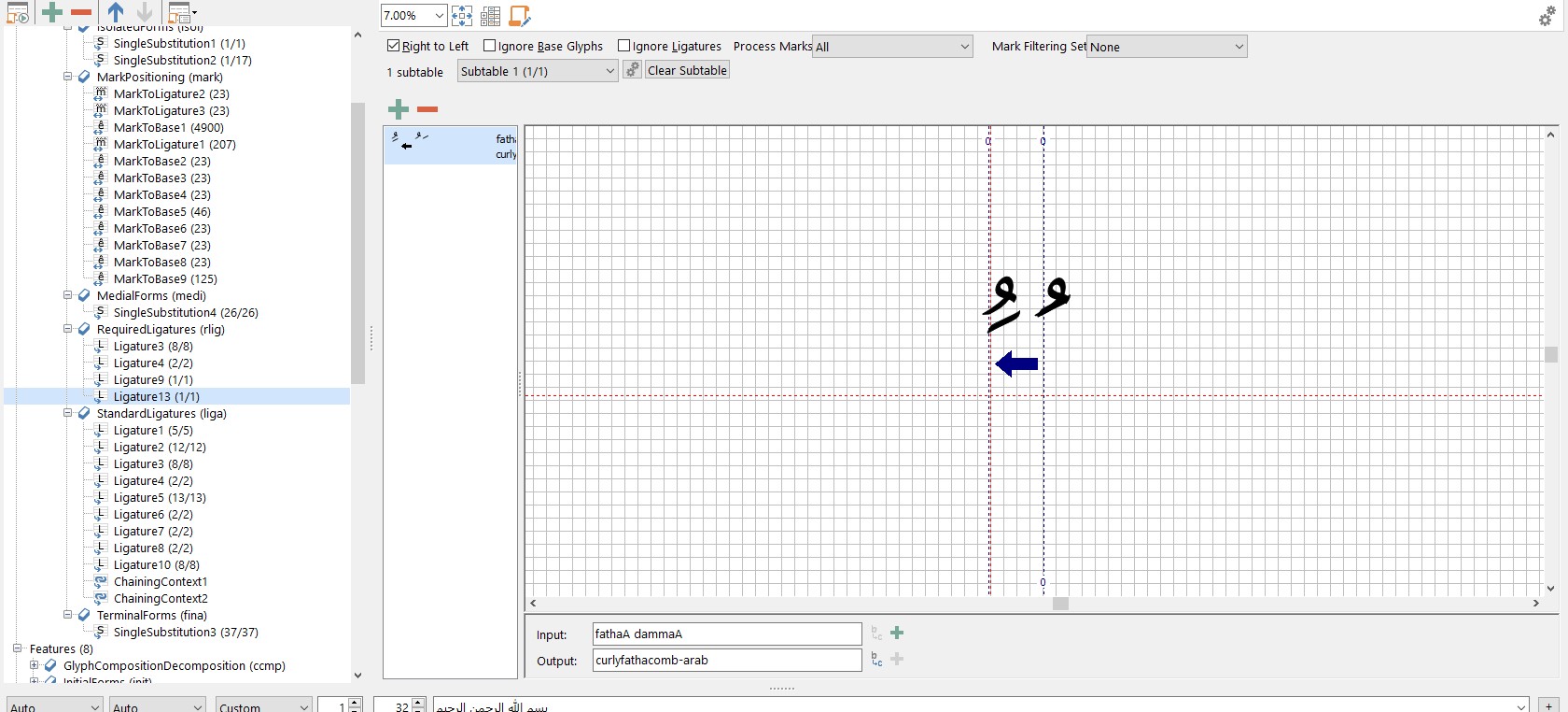
In an upright font the default is for the diacritics to stack vertically. In an itallic font they need to stack at an angle, I find that it is better to get them to stack at an angle a little less than the italic angle so that they look correct. Diacritics which stack below the base character need their anchors reversed (mark above, base below).
I know this is a lot to take in, it is a complex subject and it took me a long time to learn. The best way to learn is to break things and work out how to fix them. But always keep backups of previous versions so you can go back to them if things get really screwed up.
I hope this helps.