Many years ago, in 2003, I had a go at making a font for some percussion music notation, using separate fonts.
Later I added the glyphs into my Quest text font and added some extra glyphs.
The Quest text font is available free from the following web page.
http://www.users.globalnet.co.uk/~ngo/fonts.htm
It is for some music that I called Chloe and Phil music.
Chloe and Phil music is intended to be played either on professionally made untuned percussion instruments, such as a triangle and a drum and so on, or using improvised instruments made by tapping various items and so on. It is intended to be fairly slowly paced as a participation music of which most people can join in the playing. Pieces can be quite short. Please compare short, interesting pieces in this music format with haiku in the world of poetry.
The glyphs were designed to look good at 18 point on a PC, as that will often be 24 pixels.
Here is a gif that was produced at the time, in fact using a special version of the font in a non-Unicode font that could be used to produce diagrams using Microsoft Paint.
It is intended as a short piece for two players. Perhaps the upper line for a triangle and the lower line for a drum, or using whatever improvised instruments are available.
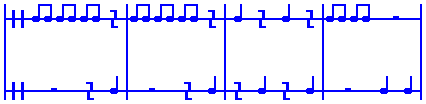
- font7004.gif (2.5 KiB) Viewed 8573 times
Now, this was all good fun at the time yet the reason that I am posting this now is because if the Quest text font is opened in FontCreator and the grid size set to 256 font units, and the metrics lines set to be solid, then the way that I have tried to design the glyphs to look good at 18 point, with lines being 88 font units on each side of a grid line may be helpful in deciding how to proceed with a proper music font. Certainly there will be more lines, so maybe 64 font units on each side, or maybe just one side, of a grid line.
I hope that this is helpful.
William Overington
29 August 2013