Page 1 of 1
Can anyone please help with this font name? I've searched for days..
Posted: Sun Sep 25, 2016 12:05 am
by cas3
I'm trying to figure out which font is used on the words "love" and "home". I think some glyphs were used, and I've found some similar fonts, but I really like this one. Please help if you can! Thanks.
Re: Can anyone please help with this font name? I've searched for days..
Posted: Mon Sep 26, 2016 9:08 pm
by Dick Pape
I believe it's: Laura Worthington, Samantha Upright SWASH.
It's a very detailed open type with over 2600 glyphs. I could find 4 of the characters which were on the two words:
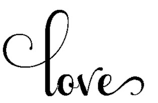
- love1.jpg (9.15 KiB) Viewed 5444 times
Re: Can anyone please help with this font name? I've searched for days..
Posted: Mon Sep 26, 2016 9:49 pm
by cas3
Oh wow! You are wonderful! Thank you so very much!

Re: Can anyone please help with this font name? I've searched for days..
Posted: Tue Sep 27, 2016 11:09 am
by Dave Crosby
cas3 wrote:Oh wow! You are wonderful! Thank you so very much!
Yes he is! He has the correct answers before the rest of us get started.
Re: Can anyone please help with this font name? I've searched for days..
Posted: Tue Sep 27, 2016 12:56 pm
by Alfred
Dave Crosby wrote:cas3 wrote:Oh wow! You are wonderful! Thank you so very much!
Yes he is! He has the correct answers before the rest of us get started.
There has been the odd occasion when I've got there first, but I usually have a six-hour head start because of our different time zones.
The /o in this one looked familiar, but it's been quite a while since I last used this font and I couldn't place it. It's a hugely complex font, with up to twenty stylistic sets for some of the characters.
Here is a comparison of the default /o and the alternatives from 13 stylistic sets:
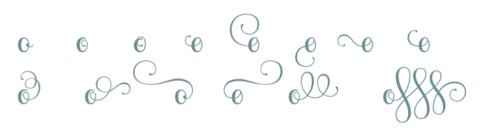
- Samantha_o-ss13.png (20.01 KiB) Viewed 5432 times
And here is the default /e with the alternatives from 16 stylistic sets:
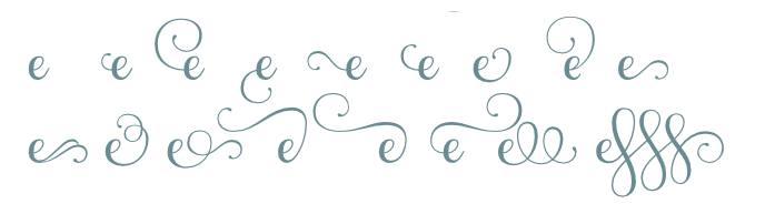
- Samantha_e-ss16.png (23.24 KiB) Viewed 5432 times
If you overlay the 'out of the box' text on the supplied image, you can see that some tweaking has taken place (mostly to reduce the height of the ascenders on the /l and the /h, and to lift the /e in 'love' to the baseline so that it doesn't get tangled up with the word 'is' on the line below).
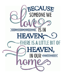
- someone-we-love.png (51.9 KiB) Viewed 5432 times