Synchronising Four Typestyles
Posted: Mon Jun 05, 2006 11:36 am
A task I frequently need to do is to check for inconsistencies between the four different type-styles of a font: regular, italic, bold, and bold italic. Some fonts may have an even larger family of styles.
I used to check for errors by installing the fonts, opening a document in Serif Page Plus with a full range of characters, then I would select all and toggle italic and bold on/off to compare the type-styles. Any obvious errors would jump out, but still many were hard to spot.
With the improvements in Font Creator 5.5 making the Preview Toolbar easier to use with text wrap and a shortcut key to toggle it on and off, I found a better method.
Setting up the Overview
Adjust the Preview Toolbar to display the glyphs in one row at a decent size, and use Control F6 or Control Tab to toggle between the four Type-styles. Now it is very easy to spot the slightest inconsistencies. There are still some glaring errors in my superscripts.
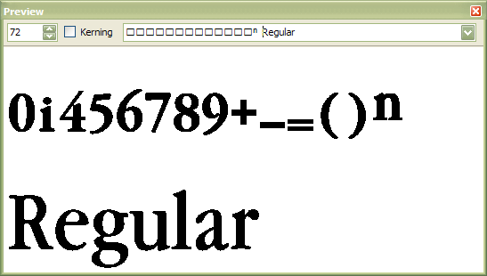
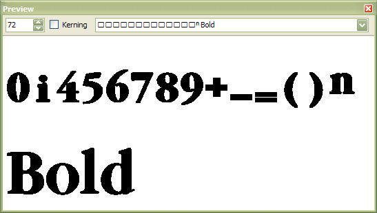
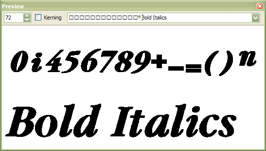
The spacing is not regular, and the superscript minus, plus, and equals are out of vertical alignment.
You can compare glyphs very quickly in this way, and since you are working in FontCreator you can correct the errors at once. Either you could compare the glyphs row by row as you work through the font, or in logical groups of glyphs.
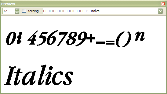
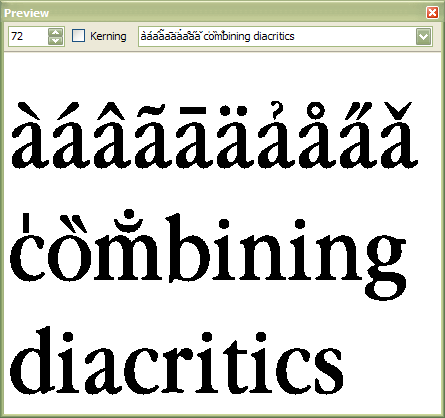
When comparing combining diacritical marks, or other glyphs with zero advance width, you will need to edit the text string in the Preview Toolbar to add spacing before the Unicode escape character "\" in order to see the glyphs separately, or you could type text characters to see the combining accents combined with suitable base glyphs.
It is probably best to turn off Kerning on the Preview Toolbar for this tutorial.
I used to check for errors by installing the fonts, opening a document in Serif Page Plus with a full range of characters, then I would select all and toggle italic and bold on/off to compare the type-styles. Any obvious errors would jump out, but still many were hard to spot.
With the improvements in Font Creator 5.5 making the Preview Toolbar easier to use with text wrap and a shortcut key to toggle it on and off, I found a better method.
Setting up the Overview
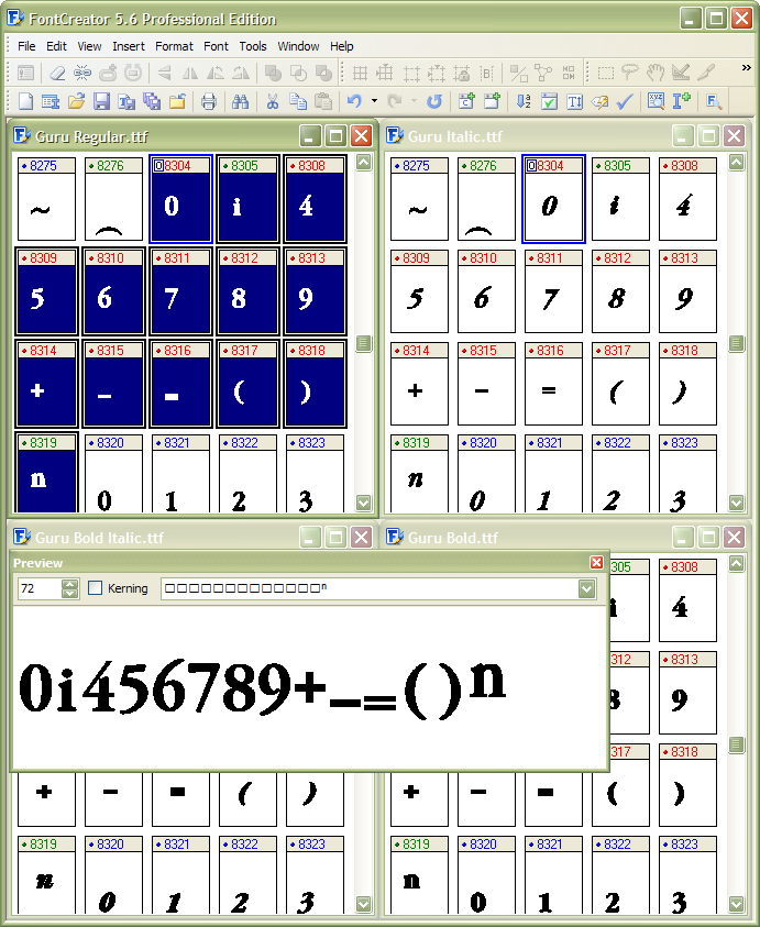
- Open all four type-styles of the font in this order: italic, regular, bold, bold italic.
- From Tools, Options, Overview, turn on the caption, and set the Glyph width to 46 pixels and the Glyph height to 61 pixels. (This is for a 1024 x 768 monitor)
- Turn Off the Status bar (F4)
- Arrange one row of toolbars at the top, and one at the side.
- Tile the Windows. You should find that you have ten columns by four rows of glyphs in each tiled window. The number is not important for this tutorial — you can set it up differently if you have a bigger monitor or sharper eyesight.
- Set a bookmark by pressing Control Shift 0 in the Regular type-style where you want to start checking for errors. For this tutorial, I started at glyph 8304, Superscript Zero.
- Use Control F6 or Control Tab to switch to the next type-style
- Press Control 0 to go to the bookmark
- Repeat Control Tab, Control 0 twice more to synchronise all four type-styles
- Select the range of glyphs you want to examine for errors and press "P" to add them to the Preview Toolbar, and to display the toolbar.
Adjust the Preview Toolbar to display the glyphs in one row at a decent size, and use Control F6 or Control Tab to toggle between the four Type-styles. Now it is very easy to spot the slightest inconsistencies. There are still some glaring errors in my superscripts.
The spacing is not regular, and the superscript minus, plus, and equals are out of vertical alignment.
You can compare glyphs very quickly in this way, and since you are working in FontCreator you can correct the errors at once. Either you could compare the glyphs row by row as you work through the font, or in logical groups of glyphs.
When comparing combining diacritical marks, or other glyphs with zero advance width, you will need to edit the text string in the Preview Toolbar to add spacing before the Unicode escape character "\" in order to see the glyphs separately, or you could type text characters to see the combining accents combined with suitable base glyphs.
It is probably best to turn off Kerning on the Preview Toolbar for this tutorial.