
I started off drawing one character at a time, scanning it in, pasting it into FCP, and making final adjustments there. It took a lot of time.
I soon found it was easier for me to just do the whole thing from scratch in FC using the Contour Drawing Tool.
But then Erwin made such great advancements in the program that it is now possible to go back to that original procedure with great results.
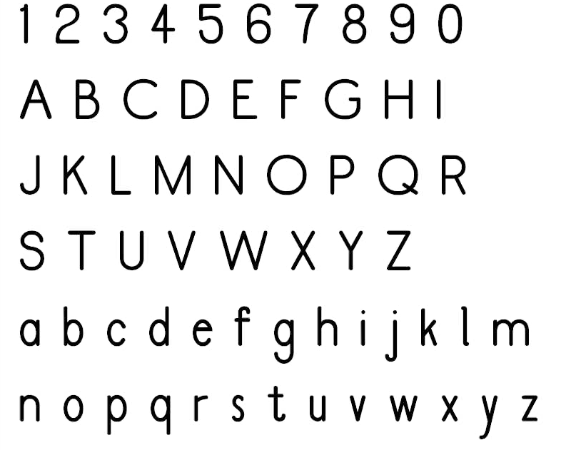
In fact it is now possible to draw the whole alphabet, scan it into your computer, and paste the entire thing into FC in one fell swoop! That way you can have quick results with the major work done, allowing you to make new decisions in design improvement before you get old and gray.
Here is the whole process:
Make some basic decisions about your new font. Take time to use FCP to look at the fonts you already have, and decide how tall and wide you want your typeface to be.
If you have a good memory for dimensions you can “have at it.”
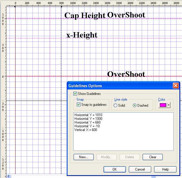
If not, you will probably want to start off with a bunch of guide lines.
You will need horizontal lines for: overshoot, Cap height, Ascender height (which might be the same as either of the above), overshoot x-height,
regular x-height, (the Base Line is already there), over (really under)shoot, and Descender.
There was a problem in accidentally moving these guidelines in the past.
If you haven’t done so already, download the new Version of FCP 4.2.6 (Release Date 9 July 2004) and
try out the new Lock Guidelines feature found under View. Your “fonting” life just got better!
Draw the whole alphabet. Five or six characters per line works best. Scan and copy each character, line, or the whole alphabet (experiment and see which works best for you) to the clip board.
Open conveniently spaced FCP editing windows and Paste it in. This saves a lot of switching back and forth between applications.
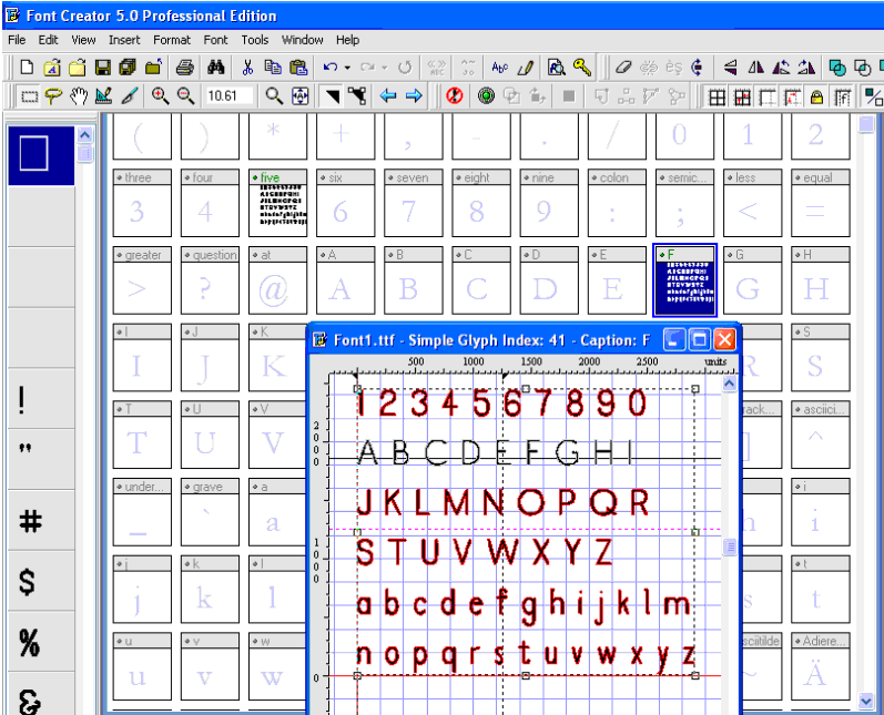
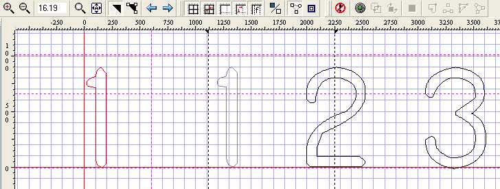
Delete all but the character line you wish to use (hold down Shift to add groups of contours) in that section of glyphs, then move them to the baseline.
Then select all and stretch them to the desired height.
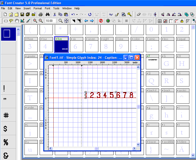
EDIT NOTE: You may chose instead to place ALL the glyphs first, SAVE your font, then use Tools, Glyph Transformer, Outlines, Scale (right pointing arrow), and experiment with 150%, 200% until you get the size you want.
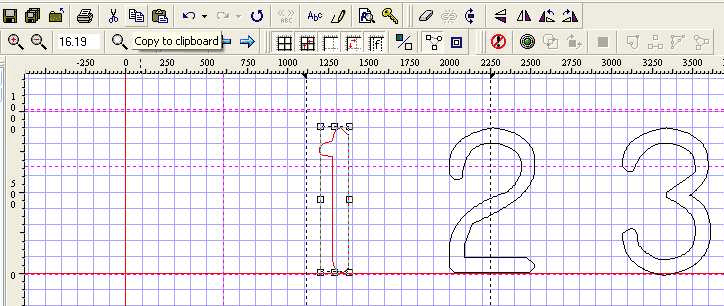
Copy the individual characters to the clip board one at a time, and use the blue arrows to distribute the characters into their proper boxes.
Use Construction Contours (see Circle Secrets) to make final adjustments, add punctuation, use Auto-metrics to set glyph bearings, and voila!
You have a great new font!
#######################
http://www.high-logic.com/manual/recommendedglyphs.html
First re-name and save the font under the new name in case you should later change your mind.
In FCP Version s 4.2.2 and above, go to Edit, Select incomplete, Edit, Delete.
NOTE: Bhikkhu Pesala mentioned in the Bug Reports forum viewtopic.php?t=604 that this feature at present also selects 'space' characters. Erwin assures us there that this issue will be resolved in the next release.
In the meantime, you may prefer to select a beginning glyph window in the main screen, hold down the shift key, and drag the cursor over a range of glyphs and delete them in groups.