Page 1 of 1
Autokerning Improvements
Posted: Wed Jul 12, 2006 8:12 am
by Bhikkhu Pesala
Now that I have started looking at improving the kerning of my fonts, I find that it is a complex task. Since my fonts contain many accents from many different languages, there are many impossible kerning pairs. The default kerning pairs are not sufficient, and the maximum number of kerning pairs is soon reached if one tries to add all permutations.
In Pāli, if we just look at the accented capitals there are relatively few possible pairs, but many impossible pairs.
ĀḌĪḶṂṆṄÑṬŪ
Possible: ḌḌ ṆṆ ṬṬ ÑÑ
Impossible ĀĀ ĪĪ ŪŪ ṂṂ ṄṄ ḶḶ ĀṂ ĪṂ ŪṂ AĀ IĪ UŪ AĪ EĀ IĀ OĀ OŪ etc.
Is there some way to improve the auto-kerning algorithms to take account of impossible pairs? At least it should be possible to avoid pairs like these:
aT bT cT oV etc.
In my brief research of the subject I found this
kerning service that takes account of impossible pairs of accented characters, but since it is €300 for kerning one set of four typefaces, I'm looking for a better DIY solution.
Posted: Wed Jul 12, 2006 8:58 am
by Bhikkhu Pesala
I think this would be an improvement to the Comparison toolbar. Add a scroll field with the kerning value for the current pair, which adjusts the kerning pair value automatically if the user changes the value in the field.
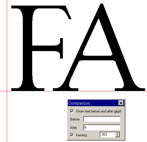
- Kerning.png (4.62 KiB) Viewed 11316 times
The manual kerning dialogue could use a few improvements too.
1. The dialogue could use the full screen — at leat 800 x 600 pixels. Currently, it is just 598 x 405 pixels.
2. The pair kerning list could allow quick search. By typing in the field the cursor jumps to the first pair of the character typed
3. The scroll bar movement is too rapid. Currently 196 funits. A grab hand on the preview would be good or reduce the movement to 100 funits. Alternatively, if the preview field has focus, use the cursor keys to nudge the kern pair — Shift left = 100 funits, Left = 10 funits, Control left = 1 funit — just like moving contours in the Glyph Edit Window.
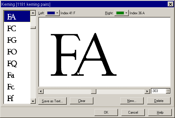
- KerningWindow.png (6.68 KiB) Viewed 11319 times
Posted: Mon Jul 31, 2006 3:44 pm
by Bhikkhu Pesala
The easist way to add kerning to a font is to use the auto-kerning option with import from file. A kerning file contains lists of kerning pairs. The auto-kerning wizard generates new values for those pairs in the current font. The tightness of the kerning and the minimum value can be set in the wizard, and whether to allow positive values.
What is needed then is more text files with default kerning pairs to supplement the current two — standard and extended. One could add, for example, additional kerning pair files for Small Capitals: at, lv, lw, etc.
Re: Autokerning Improvements
Posted: Sat Aug 08, 2009 4:57 pm
by Bhikkhu Pesala
This autogenerated kerning pair with a value of -611 is clearly wrong. The white space value was set to 200.
An option on the Autokern dialogue to limit the "Maximum absolute kerning value" might help in some cases, but it wouldn't solve this particular problem.
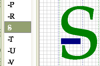
- Excessive Kerning.png (3.71 KiB) Viewed 11288 times
Re: Autokerning Improvements
Posted: Wed Jun 02, 2010 4:55 pm
by Dick Pape
In the Kerning Vein:
When kerning a font with accented characters is there a way to assign the same kerning values to all instances of the base letter so you don't have to repeat the table entry for each? A+ Aacute, Agrave, Acircumflex, etc. Similar concept to kerning classes.
Dick
Re: Autokerning Improvements
Posted: Fri Jun 25, 2010 2:21 pm
by Dick Pape
Or put differently ...
In checking Arial and Times New Roman kerning I do not find any accented pairs (except upsilondieresis). Kerning pair lists from many sources also don't have accented letters.
Why aren't the others defined? Is there a way for using programs, such as MS Word, to use the kerning of the basic pair so the accent pairs don't have to be specified? How does that work?
Re: Autokerning Improvements
Posted: Fri Jun 25, 2010 4:44 pm
by Bhikkhu Pesala
Dick Pape wrote:Kerning pair lists from many sources also don't have accented letters.
That's the way it is. Kerning is not often done thoroughly. Some Vista fonts like Constantia have a lot of kerning pairs.
Dick Pape wrote:Is there a way for using programs, such as MS Word, to use the kerning of the basic pair so the accent pairs don't have to be specified?
I'm not aware of any word-processor that is smart enough to do this. It really should be done by the font designer. The kerning of Ta should be different to that for Tä. I have added some kerning pairs for accented composites in my fonts, but it is a time-consuming process. Kerning classes or better automation would be a great feature, but also an expensive one to implement in terms of development time.
Re: Autokerning Improvements
Posted: Fri Jun 25, 2010 11:20 pm
by Dick Pape
My version of Constantia (5.00) had 20,444 kerning pairs and for the first time seemingly all the accented letters.
I'm wondering if it was autokerned as each value generally ends in 0 -- 20, 140, etc. Would surely help!
Re: Autokerning Improvements
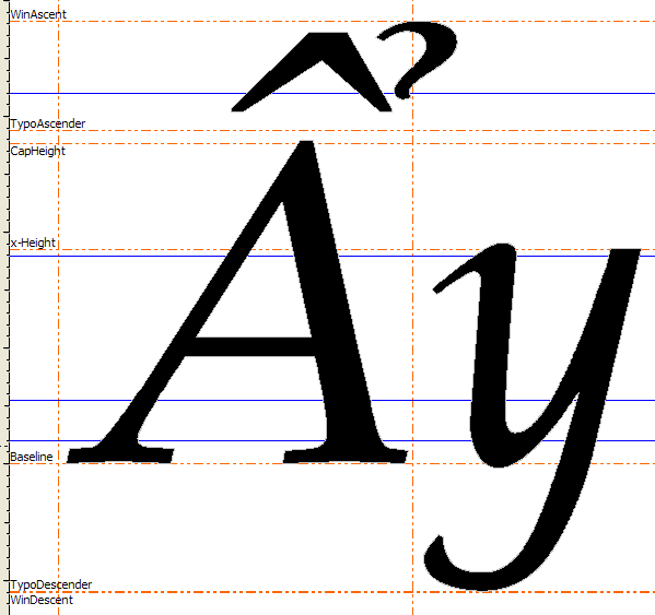
Posted: Sun Apr 03, 2011 8:13 am
by Bhikkhu Pesala
The kerning dialogue could make better use of available space. Although the WinDescent is as low as it can go without clashing, there is a good deal of space wasted above WinAscent.
Scaling the glyphs up to use the full vertical extent of the grid would make for more accurate kerning.
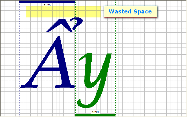
- Kerning Dialogue.png (10.36 KiB) Viewed 10435 times
- WinAscent WiNDescent.png (11.17 KiB) Viewed 10435 times