Page 1 of 1
[CLOSED] Positioning of Anchors on Glyphs C and c
Posted: Mon Jul 01, 2019 5:48 am
by Bhikkhu Pesala
When I use anchor based positioning, the top and bottom anchors on Capital C and lowercase c are offset, as one might expect for an italic font, but the font is not italic. Why are they positioned like this?
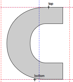
- Anchor Positions.png (6.13 KiB) Viewed 4862 times
The anchors for the italic style are also offset from the font's italic angle.
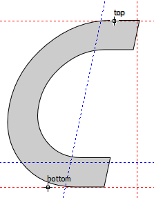
- Italic Positioning.png (7.05 KiB) Viewed 4861 times
Re: Positioning of Anchors on Glyphs C and c
Posted: Mon Jul 01, 2019 9:01 am
by PJMiller
I have also noticed this.
The positioning of anchors on some glyphs is not in an optimal position. This only happens with asymetrical glyphs but is especially noticable on 'C', 'G' and 'c', I guess estimating the optical centre is difficult. The diacritics over these glyphs look as though they are going to fall off to the right.
I usually don't use the 'anchor based reposition' option or at least only once then I have to go through the alphabet re-positioning them to what I feel are the correct positions. It has a good go at positioning and most are correct, it is a good starting point.
After that I only use 'ancor based' so it will not re-position them.
Re: Positioning of Anchors on Glyphs C and c
Posted: Mon Jul 01, 2019 10:12 am
by Erwin Denissen
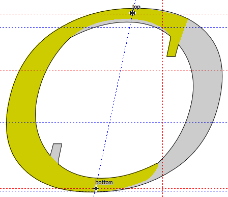
FontCreator calculates the anchor positions based on characteristics of the specific character. Currently for "C" is tries to place the top anchor near the middle of the top visible outline.
And for bottom the center of the full outline.
See:
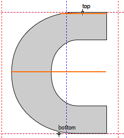
- AnchorsC.png (7.71 KiB) Viewed 4853 times
Let us know if another approach works better for most fonts.
Re: Positioning of Anchors on Glyphs C and c
Posted: Mon Jul 01, 2019 10:48 am
by Bhikkhu Pesala
I think they work best when aligned with the visual centre. I don't know about all fonts, but here is how it works best for standard body text fonts like Pali.
Geometric Centre for C Pali Italic
Drag a vertical guide to the centre, and rotate by the italic angle about the centre. The left guide is the geometric centre, but it is too far left.
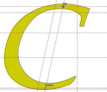
- C Geometric Centre.png (14.89 KiB) Viewed 4852 times
Visual Centre for C Pali Italic
Rotate a duplicate by 180° and join
- C Visual Centre.png (18.78 KiB) Viewed 4852 times
Re: Positioning of Anchors on Glyphs C and c
Posted: Mon Jul 01, 2019 2:03 pm
by PJMiller
Bhikkhu Pesala wrote: ↑Mon Jul 01, 2019 10:48 am
I think they work best when aligned with the visual centre. I don't know about all fonts, but here is how it works best for standard body text fonts like Pali.
Geometric Centre for C Pali Italic
Drag a vertical guide to the centre, and rotate by the italic angle about the centre. The left guide is the geometric centre, but it is too far left.
C Geometric Centre.png
Visual Centre for C Pali Italic
Rotate a duplicate by 180° and join
C Visual Centre.png
I have just tried experimenting with this method on two fonts (Tobias and Bainsley) I am working on at the moment, on the 'c', 'C' and 'G'.
It produces very good results, the two characters have to be overlapped correctly but the geometric centre of the combined character is a very good approximation of the optical centre of the original character when it is pasted back in. It works for the upright characters as well.
Thank you very much Bhikkhu Pesala, I have learned something today.

Re: Positioning of Anchors on Glyphs C and c
Posted: Mon Jul 01, 2019 2:22 pm
by Erwin Denissen
This looks nice, but seems too complex to automate.