Page 1 of 1
how to create signature/log fonts???
Posted: Mon Dec 01, 2003 5:13 pm
by permutations
I am unable to create a fonts for my signature and company logo. Either it's unreadably small, or it's so large that it doesn't fit in the square for the character.
Could someone step me through how this works? How big should the bitmap be? Should I resize it in Font Creator? Do I need to change sizes or boundaries somewhere in the program?

Posted: Mon Dec 01, 2003 6:47 pm
by vanisaac
I would use as large a scan (and hence bitmap) as possible in order to get as much detail as possible. If the program can handle the image, I say do it. Tweak the image until the contours are simple enough for you - delete extraneous points until you have a good working version of the symbol or signature. You can then scale the glyph down using the transform toolbar until it's the right size for the rest of the font.
Posted: Mon Dec 01, 2003 10:39 pm
by permutations
Thanks. I tried this, but now I have another problem. My logo is fairly wide, and the very far right of the image is cut off. I've tried all kinds of things to prevent this. I've shrunk the bitmap, shrunk the image in the font window, changed the ratio of the logo so it's not so short and wide, made sure the bearings are correct, etc. Nothing helps. What is wrong? Why is the last letter cut off, always in the same place?
Posted: Mon Dec 01, 2003 11:18 pm
by Erwin Denissen
This post should help:
viewtopic.php?t=369
This seems to be a very common problem

, I have to put this issue (and a solution) higher on the to do list.
Posted: Mon Dec 01, 2003 11:34 pm
by permutations
I'm not expert enough to decipher all these acronyms. Could you explain the problem in very simple terms and tell me what to do to fix it?
Posted: Tue Dec 02, 2003 12:46 am
by Erwin Denissen
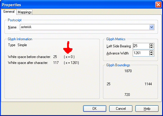
You need to change the glyph's Left Side Bearing by right-clicking a single glyph in the Glyph Overview window and selecting the Properties menu item. When you see ( x=0 ) the left side bearing is exactly where you want it to be.
Posted: Tue Dec 02, 2003 1:51 am
by permutations
I was able to eliminate the clipping by setting x=0 and setting zero white space before the character. If I set any white space at all, it was clipped.
Also note that my original x value was not negative, as you posted. It was positive--something like 200. So this is a slightly different problem.
Posted: Tue Dec 02, 2003 2:43 am
by permutations
Is there a way to set x=0 for all the characters in a font at once, or do I have to select the properties for each one individually?
EDIT: I can't set x=0 through properties. In fact, I can't figure out how to set it, and I'm having another display problem.
I have a character that is small, but a somewhat complicated drawing. I adapted this from a character in another font. The original displays it perfectly (and x=0), but even when I copy it with no changes, the character displays faded and unreadable in my font.
Posted: Tue Dec 02, 2003 5:09 am
by vanisaac
Yeah, that happens when you copy or alter a character in FCP. The original font that you got the glyph from has this gargantuan table within it which contains hinting information. Hinting is what makes fonts display well at small sizes in low-resolution. The reason FCP can't copy that and gets rid of it is because it does not have support for hinting tables in the program (is that even on the list, Erwin?), so it can't copy the hinting information from another font, and it doesn't know whether a change you make means you would want different hinting or not. So it just deletes them so you can do things like print your font and modifications without the pre-existing hinting info masking your hard work. I know that sounds horribly complicated, but it really means that you should try printing your character instead of relying on screen displays. That goes for any font you would make. The resolution of even a mediocre bubble-jet printer far surpasses even high-end monitors. Do yourself a favor and really see your art at work. If you are willing to take the time to include hinting, you might want to start at
http://www.microsoft.com/typography/creators.htm
Posted: Tue Dec 02, 2003 7:41 am
by permutations
I'm a newbie to this stuff--didn't know about hinting. That explains some other things I'm seeing, too.
I don't know the tools market in this area. I downloaded Font Creator just because it was the first thing I found. Are there any (moderately priced) truetype tools that support hinting tables?
Posted: Tue Dec 02, 2003 6:59 pm
by vanisaac
Well, FCP kind of does support them, in that it won't automatically kill the whole table like a lot of apps will. But really, there is no good font software that will do hinting. Microsoft has a couple of free tools for hinting, but they are not at all user friendly, and FCP is the only reasonably priced font creation software I've ever seen. We are talking several hundred dollars for the next cheapest, and it has no more functionality than FCP in terms of hinting and probably would even delete hinting tables (as opposed to each individual modified character) as a matter of course. As a simple user, I have no problem saying that you have in your hands the best there is.