Dave Crosby wrote:Hi William,
The Z is a good suggestion. E could also be used, but perhaps E, F,G ... should be reserved for Seasonal, National, Sports or whatever strikes the fancy of a collector. We could each make up our own scheme.
Hi Dave
Thank you. The idea for Z rather than E was so that you, as originator of EyeSort, could have space to extend the EyeSort system by using E and so on if you wished. Likewise with the 99 feature.
From my perspective I would far sooner have one EyeSort system, with rules decided by you, than have the facility to make up my own scheme. One EyeSort system means that the information is interchangeable with other people. I am thinking of trying to classify each of my own fonts that I have produced using the EyeSort system. If I find one that I cannot decide how to classify it, I can ask in this thread. That could result in either someone explaining to me how the font should be classified using the EyeSort system, or maybe in the EyeSort system being extended.
Dave Crosby wrote:
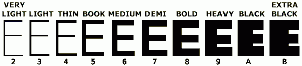
After all,
In their Introduction, Monotype states:
Hewlett-Packard does not restrict the use of PANOSE Classification Numbers in typeface products developed by third parties.
Somewhere in this I want to keep the Panose third digit:
Do you think that using lowercase letters for what Panose has as the third digit would help?
So for Panose third digit of 2 through to 11, one would use b through to k.
Not understanding Panose very well, I am wondering quite what Any and No Fit mean for digit 3 and how they differ. I suppose that a lowercase a could be used for the digit 1 if a digit 1 is needed. If a lowercase letter is need for the digit 0, then maybe a lowercase p could be used.
The reason that a lowercase p is suggested is because I once, long ago, devised a way of expressing hexadecimal characters as 16 letters and I used a for 1, b for 2 and so on, which gave o for 15, so I used p for 0 so that it could all be produced on a keyboard and handled as ordinary text and the last four bits of the character code gave the hexadecimal value.
I suppose that a lowercase z would only be useful in this context if a typeface weight could be "other", though, at the moment, I cannot think how it could be, because typeface weight is quantitative whereas typeface family and typeface tool are qualitative so there could, in principle, be an "other" for them.
Using lowercase letters would mean that a typeface would have an EyeSort classification of capital letter, followed by number, followed by lowercase letter. For example, a particular font could have the following EyeSort classification, B8e and another particular font could have the EyeSort classification A13e.
I like the EyeSort system. It is straightforward to use and the visual guide helps to make a decision on how to classify a font.
William Overington
1 February 2011

