Not sure what to do with the accents
Not sure what to do with the accents
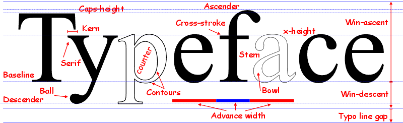
I've been making fonts with Fontcreator for a couple of decades now, but I never understood what I'm supposed to do with the glyphs that contain only the accents like tilde, cedilla, all the accents et cetera. How are these used? Do they need spacing? Should they be at caps height or x height? And what is the difference between an 'asciitilde' and a regular tilde for example?
-
Bhikkhu Pesala
- Top Typographer

- Posts: 9878
- Joined: Tue Oct 29, 2002 5:28 am
- Location: Seven Kings, London UK
- Contact:
Re: Not sure what to do with the accents
The accents, aka, the combining diacritical marks, are combined with the base glyphs to form accented characters.
For example, to type résumé with the correct French spelling, one should use é acute. On an International keyboard, the accent is typed first, followed by the base glyph, and the result is an accented glyph. Accents are usually “dead” keys, i.e. nothing seems to happen at first, but when a vowel is typed, the accented vowel appears àèìòù or áéíóú.
The tilde accent is similar ãẽĩõũ and also ñ as used in Spanish. The asciitilde ~ is not an accent, but a regular glyph, which is a symbol for “about.” In a font, it has a different design and different spacing. Since it is used as a Maths symbol, it is a good idea, IMO, to design it on the figure width, aligned vertically with other symbols like += and ÷ thus ~
Combining diacritical marks (accents) have zero advance width, and a negative left side-bearing. They are usually designed to be positioned above lowercase glyphs, without any vertical adjustment, so they are above the x-height. They are shifted up by the font for capital accented letters: Á É Í Ó Ú.
A common practice is to align accents vertically about their centres, but the font designer may prefer to use bottom alignment. That will depend on the font’s design. Some fonts may have smaller accents for use above capital letters, where vertical space is limited.
Examine any of my free fonts to see how they are designed, or any standard Windows fonts.
For example, to type résumé with the correct French spelling, one should use é acute. On an International keyboard, the accent is typed first, followed by the base glyph, and the result is an accented glyph. Accents are usually “dead” keys, i.e. nothing seems to happen at first, but when a vowel is typed, the accented vowel appears àèìòù or áéíóú.
The tilde accent is similar ãẽĩõũ and also ñ as used in Spanish. The asciitilde ~ is not an accent, but a regular glyph, which is a symbol for “about.” In a font, it has a different design and different spacing. Since it is used as a Maths symbol, it is a good idea, IMO, to design it on the figure width, aligned vertically with other symbols like += and ÷ thus ~
Combining diacritical marks (accents) have zero advance width, and a negative left side-bearing. They are usually designed to be positioned above lowercase glyphs, without any vertical adjustment, so they are above the x-height. They are shifted up by the font for capital accented letters: Á É Í Ó Ú.
A common practice is to align accents vertically about their centres, but the font designer may prefer to use bottom alignment. That will depend on the font’s design. Some fonts may have smaller accents for use above capital letters, where vertical space is limited.
- Low Profile Diacritics.png (12 KiB) Viewed 4918 times
Re: Not sure what to do with the accents
Thanks a lot for explaining, Bhikkhu! Much appreciated!
Turns out, I've been doing it exactly right from the start, haha
Turns out, I've been doing it exactly right from the start, haha