Hi,
I have been working on my first font and following along with the handwriting tutorial...but I am having a tough time with the spacing...I have tried to use the kerning tool but nothing shows up in the dialog box....and since I am new I am still trying to get my head around using metrics.
Can someone give me a shove in the right direction?
Thanks,
Ponyack
Some Guidence Please...spacing, kerning and metrics...
-
Bhikkhu Pesala
- Top Typographer

- Posts: 9877
- Joined: Tue Oct 29, 2002 5:28 am
- Location: Seven Kings, London UK
- Contact:
Spacing is one of the hardest things to get right. Try using the Comparison Toolbar and scroll through your font checking how each glyph looks next to the comparison glyphs. Then try with a different pair, e.g. Capitals.
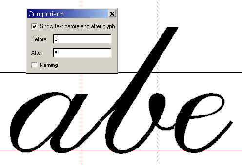
Adjusting the position of the glyph in the em-square and the right-side bearing is the first step (left side-bearing is best left at zero). Then check for vertical alignment. Letters with flat bases should sit on the baseline, while letters with round bases like c,o,s should descend below it.
Also use the Preview Toolbar to show an entire alphabet a-z or A-Z or 0-9 to see any letters that look out of alignment.
Kerning may be necessary finally, but it is the last aspect of letter spacing to adjust. Some applications do not support kerning.
-
Erwin Denissen
- Moderator

- Posts: 11158
- Joined: Fri Oct 04, 2002 12:41 am
- Location: Bilthoven, The Netherlands
- Contact: