(It obviously still needs a lot of work, and please ignore the typo's - I was typing with half the characters still missing
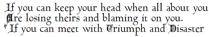
The descenders in the original writing overlap with the line of text below - resulting in them being cut off in pretty much every application.
1

With adjusted (Metrics - calculate) descender heights it looks like this
2

Is there a way to make the "overflow" visible in, say, Word? (Don't think so, but doesn't hurt to ask here )
What is common practice - leave them clipped since they will print out, or go for option 2?